Introduction
Technology and cultural heritage: a combination often important to the cultural heritage institutions willing to innovate the communication process with their visitors. However technology is a very powerful tool, and actually implementing it in the right way in order to produce the expected results is a really challenging process for the operators involved. The fruition model in museum and art exhibitions places the collection of exhibits at the center of the communication process, between the curators and the visitors.
The medium usually employed to facilitate the flow of the information along the communication chain can range from a simple written caption placed near the exhibit to a human guide, an audio guide or a combination of such tools. A more technologically advanced tool such as a video guide system can be successfully placed in the communication chain only if it maintains the original purpose of facilitating the flow of information and it is not implemented just for showing the power of modern mobile devices. This kind of approach was the starting point for the whole project and influenced most of the choices we made to construct the software, as discussed in this paper.

Figure 1: The communication chain.
The History of i-muse™
The history of i-muse™ is actually a history of an entrepreneurial project. Davide Orlando had the idea of creating a video guide system during a visit to the exhibition “Joan Mirò. Alchimista del segno” in 2004, the first of the yearly temporary exhibitions organized by the City of Como inside Villa Olmo. He used an audio guide to visit the exhibition. He enjoyed the effectiveness and ease of use of this medium to enrich the visitor experience. As a developer of educational software for PDA mobile devices, he thought he would have been able to further enrich the visitor experience by using a more powerful device such as a PDA.
Although PDAs were mainly used only by computer enthusiasts at that time, the idea certainly wasn't new, so he started researching for references by examining experimental projects involving the use of mobile devices in cultural heritage structures. In 2005, he submitted to the Centro Volta research center ( http://www.centrovolta.it ) the feasibility study for his project, thanks to the contribution of a due diligence technology voucher provided by Regione Lombardia.
The study focused on examining the challenges and opportunities of the technologies involved, in particular the implementation of Wi-Fi and Rfid radio technologies for the localization of the visitor inside the exhibition structure. The study contributed also to building the basis for a business plan evaluating the entrepreneurial value of the idea. The Gantt diagram produced at that time actually reflected the evolution of the project.
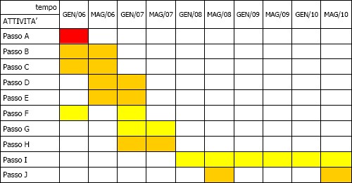 Figure 2: The Gantt diagram.
- Intellectual property analysis
- Content management system design
- Content management system usability
- PDA application design
- PDA application usability analysis and Rf-id implementation
- Internal resources organization
- External partners evaluation
- Prototype testing and correction
- Market placing of the system
- System updating
Davide Orlando's initiative then continued in two parallel directions: examining the results of projects involving the implementation of mobile devices in cultural heritage structures made by universities and private companies in Italy and abroad, as well as assembling the team to work with in order to start the construction of the application. His competency in software design and programming required him to search for people with the complementary skills and experience to produce a competitive product. In 2006 the team was assembled thanks to collaboration with Luca Fadigati, a graphic artist and Web designer with experience in videogames development, Guido Panini, a marketing manager experienced in product market placement, and Paolo Sinigaglia and Samantha Vanossi, owners of Oplà Srl, a cross-media communication and content production company.
When the team was complete it began working on the project requirements of the video guide system. They searched for a local cultural heritage structure willing to support the actual implementation and experimentation of the system. They found in the Educational Silk Museum of Como the logistical support needed for the experimentation phase of the system. The Educational Silk Museum of Como is a private organization that officially opened in October 1990. It was created thanks to the initiative of the “Amici del ‘27” Association with the collaboration of the “Ex-Allievi del Setificio” Association. The Museum, recognized by Regione Lombardia, covers an area of about 900sm. It is a collection of machinery and textile tools involving an educational tour showing all the steps in silk processing, from the birth of the thread to the finishing phase. As Davide Orlando designed the software, Luca Fadigati took care of graphics style, and Paolo Sinigaglia and Samantha Vanossi produced the contents with the collaboration of the museum's curators; the heterogeneous and complex group of people involved in the project became another challenge for its proper coordination and management.
Since October 2006 this informal group of professionals has received the support of the Startup Accelerator of the Politecnico of Milano thanks to Como's Chamber of Commerce Special Prize received at the Startcup Milano-Lombardia 2006 competition, enabling the exploitation of the network of services and excellent resources provided by the Politecnico. In a few months the first version of the video guide was finished, and during July and August 2006 the usability test phase was carried out at the Educational Silk Museum. The project, started with the objective of producing an innovative tool which would make the traditional audio guide systems obsolete while maintaining their flexibility and user friendliness. This involved dealing with a number of challenges:
- Building the container: which software and hardware design approach would work best?
- Producing the contents: what would we put inside the video guide?
- Intellectual property issues: who owned the rights of the contents?
- Understanding users: what methodology we would use to test the system?
- Sustaining economics: what value could the entrepreneurial project have on the current market?
Building The Container: Software And Hardware Design
Since the beginning, the aim of the project has been to create an innovative product resulting from the best combination of the most suited mobile hardware devices and the most flexible and highest performance software architecture able to fully exploit the capabilities of these devices.
Hardware
The hardware we evaluated was of three different kinds: the PDA providing the processing power and an integrated touch screen display providing both the user's input and the video-output capabilities at the same time; the wireless headphones connected to the device using Bluetooth technology providing the audio-output and the Rfid antenna inserted into the SD card slot of the PDA providing the capability to detect passive tags placed along the exhibition tour at short range (8cm max). The hardware is considered as the first kind of container for the whole system. As such it implies a number of constraints we needed to take into account during the application design process. The typical Personal Digital Assistant has a 3.5” TFT screen operating at a resolution of 240x320 pixels (QVGA, Quarter VGA) at 16bit color depth (65535 colors). We choose to use the high end Windows Mobile based devices with a VGA TFT screen (480x640 pixels) in order to ensure the maximum visual impact of the contents and user interface.
The input method chosen was the most natural one: the user's thumb. No other input methods, like the stylus, the PDA's hardware buttons or virtual keyboards is ever used. The PDA itself is actually enclosed inside a protective and stylish custom-made cover, which leaves visible the high resolution touch screen only. This input method choice was a key constraint in the user interface design. The other key component of the hardware system is the integration of the Rfid technology. A series of standard ISO15693 passive tags were placed on the caption-holders located near the exhibits or behind wall-mounted pieces of plexiglass according to the preference of the museum's curators. The visitor has to bring the PDA guide with the integrated Rfid antenna close to a proper-made icon hiding the tag in order to automatically play the content's exhibit. One of the challenges we faced in using this technology was the interference from the metal plates of the caption-holders. We had to use special tags isolated from the metal plate by a 1mm thick ferrite layers. This allowed the tag to be activated by the magnetic field generated by the PDA mounted antenna, although it reduced the detection range down to 3cm in optimal conditions.

Figure 3: Tag on metal.
The issues of the rechargeable batteries of the mobile devices also had to be taken into account, especially from a user experience point of view, since users shouldn't worry about power consumption during their visit. This has been solved by using increased capacity and better performing batteries and by accurately balancing the power requirements at the different states of the application. We made hardware related choices according to the best devices currently available in the mobile consumer market due to obvious constraints of time and money resources available. However we're considering the production of a custom device thanks to collaboration with selected hardware partners, a device which could integrate all the hardware features together thus reducing maintenance costs in the medium-long term.
Software
The first layer of software placed between the hardware and our application is the operating system. We choose Windows Mobile based devices due to Davide Orlando's past experience with this operative system and its similarity and interoperability with Windows based desktop systems. Between the Thin Client and Thick Client application development approaches http://www.dmreview.com) we choose the second one and developed a "native" application which is actually based on a proprietary framework able to run just on top of the operating system and providing the high performance required by a videogame-like multimedia application. The proprietary framework has been designed in order to be as much independent as possible from the supporting operative system. Each module of the framework is actually self-contained, including only the essential calls to the operative system, and if needed it could be easily and quickly ported to other major mobile platforms (e.g. PalmOS, Symbian).
The process of designing the user interface and the underlying logic, started by examining the key features of most of the audio-only devices produced by the main competitors currently in the market. As well as testing the experimental attempts of PDA based systems available in Italy whenever it was still possible, since most experimental projects didn't get to the permanent deployment phase. A visit using a standard audio guide doesn't require any specific skill from the user, who, in the typical user scenario, just has to select the number of the exhibit using the keypad and listen to the audio commentary. User controls such as modifying the volume, advancing or rewinding the commentary usually do not require any instructions. Audio guides have been around in cultural heritage institutions for a long time and when well designed, have proven their effectiveness for giving information to visitors and for improving their learning experience. (Colazzo et al., 2005)
The visit with an audio guide grants the visitor the freedom of movement since he is free to choose the commentary he would like listening to and he has most of his attention on the exhibit as he's using only his hearing sense. The quality of the contents and the professionalism of the speaker hold the key to deliver the correct curators’ message to the visitor. This one way communication model, working like a sort of monologue, isn't the best approach according to museum educators (Xanthoudaki, 2000) and curators since they consider the dialogue between a human guide and his audience the best way to facilitate an active learning process inside the visitors' mind. Adding video to the basic audio guide system doesn't automatically expand the capabilities of the device or make the learning process more effective. It could actually be counter productive, if poorly implemented.
Most early video guide systems based on the Thin Client application development approach used the Web browsing capabilities of the PDA devices connected through a wireless network to access the exhibit information. Due to the limitations of the mobile browsers, users compared this to a full featured browser running on a desktop PC, with a large amount of text to read which prevented the visitor from keeping his eyes on the real object exhibited. This factor added to the challenges posed by the Wi-Fi network connections, resulted in the worst approach to enrich a visitors experience, compared to the audio guide systems.
As already explained, this analysis led us to the choice of developing a custom native software application which could take control of the whole device itself down to the lowest level while exposing the user to an interface he could easily access in order to focus on the purpose of his visit: feeding his need for cultural information.
User Interface
Other more advanced experimental applications used customized software although they failed in their approach to access the contents: they allowed the visitor to browse them like a kind of small and reduced quality catalogue with audio or video commentary where available. In this way the user easily missed the direct relationship between the contents and the exhibits, thus actually missing out on most of the fun. These additional considerations led to the choice of a videogame-like approach for the design of the user interface in our system. A series of homogeneous and graphically pleasant screens were built, each with its particular purpose: one for the maps management, one for the content fruition, one for the options, and so on. The layout of the user interface was designed in order to allow the interaction with the thumb, the most natural way to interact with a touch screen display.

Figure 4: User interface.
The Hardware Outside The Video Guide
The museum directors gave us the support of its internal staff and the availability of their structure for the installation of the system. This meant that there wasn't a customer-provider relationship between us. This allowed us freedom of choice about the software design, and we all collaborated to find the best installation options for the Rf-id tags along the planned visit route once the software was almost ready to be tested. They agreed to place a series of new caption-holders, vertical stands and small rectangular layers of plexiglass on the walls to mark some of the 34 exhibits described by the video guide. However, they chose the icon with the lowest visibility level to be placed on the lower right angles of the A4-sized caption holder plates among the different solutions we proposed. This was explicitly in order to avoid too much contrast between the icon and the rest of the caption. This solution caused some problems for a number of users when they were looking for the next icon to interact with. A series of so-called affordances signs, such as plates with the room names on the wall or arrows indicating the suggested route on the floor, would have improved user navigation and facilitated passage in critical spots such as moving from one room to another, but we were not able to get agreement on that. We simply adapted our solution to the existing structure, and this challenge helped us to improve the adaptability and reducing the invasiveness of the system.
Producing the Contents
We chose to use three of the nine rooms in the museum to produce the contents for the guide in order to reduce the amount of work, as well as being able to get to the testing phase as soon as possible. We chose the first room, which is about silkworm breeding and silk reeling, and the following two rooms where the last two phases of the silk processing are shown. These are the dyeing and printing sections, which represent two processing phases, which Como still excels in. By focusing on the three rooms, we managed to produce a rich and an in-depth contents compared to the usual route described to visitors by the museum's guides. In fact, if a visitor watched and listed to all the 34 content segments of the video guide, his visit would last up to 50 minutes. The contents are available in three languages: Italian, English and French. The first language available was the Italian, then we translated and recorded the other two languages using native speakers.
Producing the screenplay in order to synchronize the spoken text correctly with the proper pictures, videos and animations had to be done carefully taking into account the learning process typically adopted inside museum structures and now utilized by a PDA mobile device. As educators elaborated (Hein, 1998), the preferred learning method is based on the “constructivist” approach. This allows visitors to build new knowledge by making associations between new pieces of information acquired in front of the exhibit and past experiences they had related to the new elements they're introduced to.
We adopted this approach in three ways. We inserted a series of historical images showing daily work along with the description of the machine’s characteristics and functions while maintaining the clarity of explanation of the silk processing phases. This contributed a lot in generating the same atmospheric scenario of the old work places, surrounding the visitors and helping them feel involved in what they were watching and listening to.
In the second instance, we described the workings of the most important and complex machines exhibited, using the richest media we could provide. In some cases we used old audio-video to show how workers were operating the machines. When possible we recorded videos while operating the machines in the museum; in other situations we made brand new animations showing how the machines were operated in the factories. Users were very impressed by these contents, as without them they would not understand how these machines were operated.
Finally, the experience of enhanced reality is achieved only if the real exhibit in front of the visitor captures the visitor's attention for most of the time. We had to find the best balance for the so-called “eyes up/eyes down” (Monaci, 2005) ratio; that is, the time the visitor is looking at the exhibit and the time he is looking at the PDA screen. We fine-tuned this ratio and used a pleasant and un-invasive special sound effect to alert the visitors when the picture on the PDA changed, with a nice transition effect so that they could move their eyes back to the PDA screen. We found that the users quickly understood by themselves this particular mechanism after just watching the first contents and adjusted themselves accordingly, to optimize the ratio according to their visit profile.
We chose to produce contents for a unique generic visit route along the selected three rooms in order to satisfy most of the different kinds of visitors and kept the script easy to understand, even by people listening to a description about silk processing for the first time.
A series of repetitions about some particularly complex silk processing steps was used to allow visitors who missed a part of the content exhibited containing an essential piece of information, not to loose the comprehension of the whole factory processing. To help the users plan the visit, we separated the contents into three different categories: the “introductions”, the “primary” and the “secondary” contents: in this way the users could decide whether or not to skip content according to the amount of time they wanted to spend visiting the exhibition. The flexibility of the software however, allows extensions of this concept by producing different routes with contents adjusted to address specific needs, for example for children, or alternatively, silk experts.
The production of the contents for the prototype also allowed us to refine the underlying data structures in the software. Once defined, we proceeded with the construction of a Content Management application which presents the content makers with an easy-to-use interface to actually organize and assemble the contents and generate the digital resource packages the PDA video guide will play out.
Intellectual Property Issues
At the beginning of our collaboration with the Educational Silk Museum, we signed an agreement stating the intellectual property rights of the text, photos, illustrations and videos, or photos and videos shot inside the museum, remained the property of the museum. We also had to inform the curators before using anything other than their elaboration to produce the contents for the video guide. In our case, intellectual properties issues did not pose any challenge since the rights of most of the source contents we used were the property of the museum association. When this was not the case, such as with some historical publications by Nodolibri (http://www.nodolibri.it), we asked for the rights from the owner and formal permission to use them for our project. The only situation where the use of the museum resources went beyond the particular use to produce the guide's contents, was about the public gallery of pictures shot of people using our video guide during the usability tests. The museum directors permitted us to publish only one picture per person in front of the Gift Shop.
Usability Tests
We started the usability test phase of our system at the Educational Silk Museum with the purpose of evaluating our design choices inside a real environment. During July and August 2007 we invited more than 70 people, dedicating about one hour and a half to each one of them. Those invited belonged to different age groups, had different levels of education and had different occupations ranging from freelancers to engineers, students, retired people and so on. The single test was actually a balanced mix between a usability test and a satisfaction survey. We simulated the deployment of the system by starting from the museum’s Gift Shop, which is the place where visitors buy their tickets. There we briefly introduced the guide and gave it to the testers. If the testers were particularly technologically timid, couch potato persons, we also reassured them, telling them that the guide would be very easy to use.
We recommended them to listen carefully to the brief introduction tutorial and then they were free to go and explore the three rooms covered by the guide. We followed them at a distance trying to remember that the more you would like to measure something, the more you influence it, a principle similar to the Heisenberg uncertainty principle. This had us moving around the museum rooms with an eye on the critical spots and events of the visit, such as the selection of contents through the Rf-id tags detection and the movement from one room to the next. We intervened only if a visitor-tester had a critical problem and needed external help to continue the visit. At the end of the visit, we asked for free general comments about the guide and then we proceeded with specific questions about the software features if they did not introduced the argument by themselves. We also asked the testers to perform a series of specific tasks, like adding content to the favorites list, in order to check for specific usability issues of the software. At the end, we also submitted to the testers a 22-question paper feedback questionnaire that further stimulated verbal discussion and served to gather significant statistical data about the visitors.
Understanding Users
It isn't good practice classifying user types into a pre-determined series of classes (Balboni, 2007) since every person is unique, brings his experiences during the visit, and builds new knowledge by making associations with such experiences. This consideration challenged us to create a video guide suitable to every possible user approach to it. From the user who never interacts with the touch screen and complete the visit only by interacting with the Rf-id tag placed on the caption holders, to the expert user who heavily interacts with the software and would love to bring the list of his favorite contents back home.
During the visit and the following verbal discussion, we carefully examined the body language of the tester. Studies (Pease, 2004) describe the interpretation of the body language as a key factor in determining the interlocutor’s feelings. During human interaction, spoken language accounts for just 30% of the communication process, while body language accounts for 68% of it. Observing the body movements during the visit helped us examine critical points such as the way people hold the guide in their hands, how they point it toward the caption holder, how they move around the exhibits, and so on.
Usability tests are all about interpretation. By inviting only people we already knew, we could observe them with the key advantage of being able to interpret most of their body language movements and foresee their approach to a completely new tool (in most cases) such as our video guide.
Usability tests were mostly useful in confirming or denying the value of a number of our design choices. The first contact that the visitor has with the video guide is via the graphics of the female guide. We wanted to present the visitor with a characterized agent to introduce her as the virtual guide and make him feel at ease almost as if he was going to be accompanied during the visit by a human-like guide. The virtual guide has also the purpose of describing the main elements of the interface and simple operations ranging from map navigation to contents selection during an introductive tutorial. We revised the tutorial many times with an iterative process in order to find the best balance between the minimum quantity of information needed to be delivered to visitors in order to allow them to move autonomously just a few minutes after they received the guide in their hands and the time taken to clearly explain these basic concepts. Usability experts (Norman, 1988) recommend designing things with common sense in mind in order to ensure the highest level of usability. We followed this approach in designing the user interface and, compared to the first revisions of the tutorial, we cut all the sections describing intuitive and self-explanatory elements in the following revisions.
Navigating through the museum rooms lacked the visual aids we discussed in the previous section, thus preventing the user from perfectly matching the real and virtual space representations. We chose a stylized graphics style to represent the room geometry and placed the numbered content icons according to the position of the caption holders where the printed icons were placed. This helped visitors locate the icons they couldn’t easily find by just looking around in the exhibition. During usability tests, we also suggested to the user to change from a bi-dimensional spatial map to a linear mono-dimensional one. The second one was useful to look at the logic and ordered sequence of the exhibits, but lacked the spatial information needed by visitors. It could be useful in other environments or structures. The interaction with the Rf-id tags also allowed representing the position of the visitor on the spatial map near the last selected content. The position is not updated in real time as the visitor moves, but only when he selects the next exhibit tag: this looked like a good approximation for the visitor. This “indirect” location awareness method added great value to the map navigation and user orientation. In structures where real time location awareness would be a requirement, we would consider the implementation of industry standard Wi-Fi based middleware. Some users, typically women (Pease, 2004), did not like using maps. This finding gave us the idea of allowing the user to view the map only by explicitly selecting it; otherwise he was free to search for the next exhibit of interest by just looking around the exhibition.

Figure 5: Map navigation.
Another good choice was the introduction of the favorites list so that visitors could mark their favorite contents for retrieval later. This feature allows us to offer the museum a number of additional Web-based information services, aimed at improving the user experience before and after the real visit.
We considered accessibility options during the design process of the user interface. We tried creating software adaptable to even people with minor disabilities without needing creation of an ad-hoc interface or ad-hoc contents. For the hearing-impaired, we used subtitles synchronized with the audio commentary so that they could read the text on the screen as the slide show progressed. For sight-impaired people, the feature implemented was similar to the one used in software made to enhance the user experience on desktop PCs. If enabled, the name of the interface buttons is repeated in order to give audio feedback based on the user’s actions. Another interesting option we used was for left-handers. If enabled, the scroll bar of the favorites list was mirrored and placed on the left side of the screen so that the user would not cover it with his hand while scrolling the list.
Sustaining Economics
We choose a stand-alone approach for our video guide system, in which each mobile device can be used independently and without requiring complex client-server hardware architecture. Having just a plug or a battery change at the end of the visit, grants a competitive advance over similar systems and allows us to employ the business model used by audio guide producers as a reference for our entrepreneurial project, making our video guide a more advanced product. Compared to the audio guide business model, in our case, producing multimedia contents is certainly more expensive than producing the audio only contents, but the benefit is much more significant. The cost of the hardware is often overestimated: the PDA is still regarded as a high end and expensive device. It is the physical device sitting in the hand of the user, so its perceived value is significantly higher than it actually is. Prospective clients we have dealt with up until now, fully acknowledge the benefits of our system once they have tested it in real conditions, such as the one we set up at the Educational Silk Museum. In addition, offering i-muse CMS, the full-featured Content Management System used to assemble the contents played by the video guide, opens the way to collaborate with the exhibition's curators or external partners for content creation. Our internal market research and business evaluation clearly show our offer answers to an increasing need by visitors to enrich their visiting experience through enhanced reality tools such as a video guide. As well, the video guide is a powerful tool for curators searching for new and effective ways to convey their cultural message to most of the visitors.
References
Balboni Brizza M. T. (2007). Immaginare il museo. Riflessioni sulla didattica e il pubblico. Jaka Book
Colazzo, S., F. Garzotto and P. Paolini, Let's Go Mobile! Design Issues In Multichannel "Accessible" Applications For Cultural Heritage, in J. Trant and D. Bearman (eds.). Museums and the Web 2005: Proceedings, Toronto: Archives & Museum Informatics, published March 31, 2005 at http://www.archimuse.com/mw2005/papers/colazzo/colazzo.html
Hein, E. G. (1998). Learning in the museum. London, Routledge
Monaci, S. (2005). Il futuro nel museo. Milano, Edizioni Guerini
Norman, D. A. (1988). The Psychology of Everyday Things. New York, Basic Books. Inc.. Publishers.
Pease, A. (2004). The definitive book of body language. RCS Libri
Xanthoudaki, M. (2000). La visita guidata nei musei: da monologo a metodologia di apprendimento. Nuova Museologia N°2. Available http://nuovamuseologia.org/n2/art5.pdf
Cite as:
Orlando, D., i-muse™ Interactive Museum: The Case Of An Innovative Video Guide System , in International Cultural Heritage Informatics Meeting (ICHIM07): Proceedings, J. Trant and D. Bearman (eds). Toronto: Archives & Museum Informatics. 2007. Published October 24, 2007 at http://www.archimuse.com/ichim07/papers/orlando/orlando.html