
![]()
![]()
![]()
![]()
![]()
![]()
![]()
![]()
![]()
![]()
![]()
![]()
![]()
Archives & Museum Informatics
158 Lee Avenue
Toronto Ontario
M4E 2P3 Canada
ph: +1 416-691-2516
fx: +1 416-352-6025
info @ archimuse.com
www.archimuse.com
| |
Search A&MI |
Join
our Mailing List.
Privacy.
published: March 2004
analytic scripts updated:
October 28, 2010

From GUI to Gallery: A Study of Online Virtual Environments
Stephen Lawrence Guynup, Georgia Institute of Technology, USA
http://www.lcc.gatech.edu/idt/
Abstract
This paper began as an attempt to clarify and classify the development of Web3D environments from 1995 to the present. In that process, important facts came to light. A large proportion of these sites were virtual galleries and museums. Second, these same environments covered a wide array of architectural interpretations and represented some of the most cutting-edge work in the medium. It became clear that there is a relationship between galleries and virtual environments. At a fundamental level, both are information spaces. A primary difference is that the Web3D environments are bound to the computer and currently limited by mouse and screen. Factoring this in, we merge the GUI and the Gallery to create a native foundation for the development of virtual space. This paper discusses the relationship of GUI and gallery, and the impact of mouse and screen, and then showcases the exploration of several on-line virtual museums and galleries.
Keywords: Virtual Environment, Web3D, GUI, Virtual Reality, VRML, Shockwave 3D
A. Foundation
Introduction
The digital landscape is littered with failed virtual
environments. Questions of their native design remain unresolved. Examining
an architectural genre, one similar in functionality to virtual space,
would lay the foundation for a deeper understanding of the nature of medium.
The question then is "What type of physical space best represents the
native form and function found in virtual environments?" In terms of flexibility
of design and overall function, one choice clearly stands out — the
modern museum. Unlike other spaces like restaurants, bathrooms or garages,
the purpose of a museum is not a physical one. It is an educational, often
experiential, even spiritual one. With a degree of spatial freedom found
nowhere else, museums structure space and house the widest possible array
of objects and information.
It is this array of objects, and the ability to access them, that brings
us to a second similar design genre —that of the graphical user interface
(GUI). GUIs are typically two-dimensional in nature and are usually designed
to suit the affordances of mouse and screen. Moving the GUI into three
dimensions and making it immersive is the functional imperative of virtual
environments. Here again the construct of the museum emerges. A comment
by William Rubin, former Director of MOMA, sets the stage: "Museums
are essentially compromises ... Their weakness is that they are necessarily
homogenized - emptied of all connotations other than art, and that
is an artificial situation." To the author, this implies the same processes
and the same "necessities" that drive interface design. The
museum is the original virtual interface. The outcome of these statements
is the belief that the future of virtual design is a merger of GUI and
gallery.
Historical Structures and Philosophic Overview
This function of displaying objects and information is the key connection in the historical development and definition of the museum. From the early groupings of precious objects in ancient tombs, temples and churches (Schatzkammen) and the collections of art that hung in the galleries of English country homes and French Castles, to the Italian studiolo, the German Wunderkammer and Kunstkammer, there is an order purposely imposed on the objects and space. It is a space designed to support information, in access and understanding.
In the abstract, a virtual environment can be interpreted as a pure information space. Within it, the functional imperatives of the GUI merge with the appearance of physical space. Like a GUI, information is divided, categorized, placed within a narrative framework, and then presented to the user. The user is then given paths to follow to access the information. This mirrors real world galleries. Space itself facilitates the access of art. At their best, museums and galleries are flexible spaces that uplift, amuse, educate, classify and present information with a degree of spatial freedom found in no other structures. In this sense, the purpose of the gallery is the same as the GUI. For the designer, art = information in its widest array of configurations.
This is somewhat different from the earlier connection made
between virtual environments and museums. "Museums are ideal candidates
for hybrid cyberspaces" (1990 Kellogg, Carroll, Richards), and their proposed
"Natural History Cyberspace Museum" is a fully immersive installation
complete with goggles and gloves. Through it, visitors can pretend to
be dinosaurs such an Archaeopteryx. While this application of virtual
space is clearly valuable and could be very useful to educate the public,
it does little to express the affordances of virtual space. Rather than
apply virtual space to the museum, we apply the museum to virtual space.
Secondly, and perhaps controversially, we equate Web3D environments with
virtual environments. We do this not as Ken Hillis does in "Digital
Sensations", completely removing technology on philosophical grounds.
Instead, we see the future as undefined. Therefore, the legacy of currently
widely available technologies is liable to hold a greater sway over this
future than imaginary plot-devices such as the holodeck. Within current
Web-based environments in mind, we accept the limitations of mouse and
screen.
Interpretations
A diverse series of interpretations
of 3D space have been produced. Most attempt to copy real world spaces
exactly. In them, we see faux track lighting, cushioned benches and display
cases. Real approaches often go back in time, like the "Natural History
Cyberspace Museum." Opposing them are those whose work represents
a rebellion against the limitations of real world architecture. The "Virtual
Guggenheim" by Asymtote is such a space. The structure was envisioned
to morph between three different forms, while all the while rooms flow
like blood vessels through it. Still others, like the early works of Stan
George and Daniel Wise, resemble abstract data spaces envisioned by sci-fi
authors. Often visually stunning, none of these approaches has yielded
the results predicted by their creators. Each suffers from the imposition
of philosophies that do not take into account the affordances of this
new media.
Hillis (1999) points to "the promise and hype of VR
and ITs more generally is part of an ideology of the future, produced
in an amnesia and loss of history that forgets the broken promises of
past technologies such as the 'universal educator' [TV] and 'too cheap
to meter' [nuclear power]. Whereas Hillis dismisses the virtual
entirely, we take a practical approach and look to design in a useful
medium, based on facts and not what Hillis deems "wishful thinking."
The goal of this paper is to briefly discuss these failings of virtual
space and then provide examples that point toward a native virtual architecture
based on the GUI and the gallery.
The Impact Of Mouse And Screen
Examining Failure
The reasons for failure are diverse. The literal copying of the physical space into virtual space has been less than successful. As we address these failures, we reinforce the previous assertions of gallery and the GUI. We can begin with a common misconception, that virtual reality works just like physical reality. This idea completely fails to account for the hardware through which we interact. Screen-based, mouse-driven, virtual environments (SMVEs) utilize a vastly different interactive methodology. Two issues that quickly become apparent are navigation and interaction.
Unseen Feet
Navigation issues arise on the ends of the spectrum; wayfinding in larger environments and short, goal-oriented, precision movements. To understand precision, one can look to video game design. Games that require precise positioning in their environment use a third-person viewpoint. Less immersive than the first-person viewpoint, the third-person perspective allows a uniquely powerful navigational advantage — you can see your feet. As simple as that sounds, it makes all the difference. Like a cursor in a GUI, feet show the absolute position of the user in the environment.
More precision issues lie in the standard movements allowed by most Web3d applications: move forward/backward, turn left/right. Compared to the flexibilities of human mobility, the two-button mouse is quite handicapped. The issue is evident when the user zooms in to see a work close-up, and then wants to see another section or detail of that work close-up. The diagram below shows the unwieldy process by which most users try to see the detail. Note Step 03: users need to position themselves in front of the detail without seeing it.
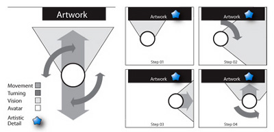
Figure 1: S. Guynup. Diagram of Short, Goal-Oriented Movement
Again, video games have addressed this issue by allowing the user to strafe. Strafing is the ability to move perpendicular to your viewpoint. This side-to-side motion is very useful for first-person shooter games where the purpose is to move quickly and kill. Some Web3D technologies allow for sliding, yet even the most experienced users fail to change their navigation preferences for such seemingly short actions.
A last, hidden issue relates to the purpose of the space. The design and action in a game environment are driven actively by the computer and the narrative. In the (usually) more subdued genre of museums, the addition of strafing navigation ability is helpful, yet not as effective. In the museum, Art drives the user's action. The mindset of users examining art makes them more sensitive to the limitations of the interactivity.
Wayfinding, the cognitive process of navigating and interpreting the environment, carries a subtle problem. Typically, it takes time to understand the spatial mapping of any environment, real or virtual. We seem to forget how easily we get lost in new surroundings. Factor in the lack of nuanced cues like physical wear, and the problem grows. Wayfinding becomes even harder as designers, free of construction restraints, build large spaces. Free of natural physical laws, they build using their own site-specific logic. (For a secondary reference, look how often we get lost in a two dimensional Web site.) Over time, the user does learn how to interpret the layout of the space. Unfortunately, unlimited time is something we do not have.
Mouse vs. Body
Interacting with virtual environments carries issues similar to navigation in Web environments. The mouse is not the hand. This sets up the following dynamic; Visually, we cue to items that we interact with in the real world. If the interaction is beyond the scope of the mouse, we can frustrate the user. Typically, the question they ask is "why bother?" Below is a unique example.
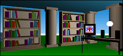
Figure 2: Library in "Town Square at Ariadne" - J. Sonstein
http://ariadne.iz.net/~jeffs/
Each book links to a topic in the Yahoo� database; the computer is a link to a Bosnian info site. Metaphorically, the layering of informational structures (i.e. books and computers) inside a virtual space is thought provoking. In terms of functionality, it is less than optimal. Books and computers were created for use by human hands. The mouse was developed for two-dimensional interfaces.
Leaving the Real
The reasons for merging GUI and gallery are becoming apparent as mirrored reality approaches falter. As technology advances and allows for more natural manipulation and navigation, we realize that the greatest empowerment may still lie beyond the current notion of reality. Take, for example, the fundamental mechanism of interactive design - the button. Does the button exist in nature? Do birds and bees press buttons? This abstract means of control constructed with finger operation in mind and placed within arm's reach has become to us second-nature. Recognized by repetitive cause and effect, the button becomes intuitive. Even when the mechanism below the button is beyond the user's comprehension, such as physics and the codes that make my computer keyboard operate, the action feels natural. As we move toward a native virtual design, vast possibilities emerge, possibilities that stem from a legacy of mouse and screen. The next section moves into abstract territory, presents issues inherent when reality is left behind, and then offers harbingers of future design.
Harbingers of Native Design
A Realm of Pure Information
Authors like William Gibson and architects such as Michael Benedikt left reality behind. Space as interface, as database, a "realm of pure information", this was the desire of early virtual reality theorists. Abstract visionary environments were designed for the human mind, not the body. Information in graphs and charts surround the user. The philosophic papers of this genre are deeply moving - these environments, these dynamic hyperspaces are beautiful works of art. Yet, overloaded with imagery and force fitted with data, their functionality is forgotten. Despite the ability of three-dimensional space to hold vast amounts of data, it is important to remember that; "Less is more".
Data representation in three-dimensions is difficult because spatial-visual information generated by the space does not support and often contradicts the data the developer wants represented. Perspective and shading throw a wench into our ability to compare and quantify. Furthermore, the informational narrative created by moving through or rotating the space offers little practical benefit for data that is not inherently spatial or placed with that in mind. To delete the spatial information is to return to two-dimensional space. This then becomes a dilemma of purposes: navigatible space requires visual-spatial information that cues the users, allowing them to move through it, but data representation seeks clarity and comparability.
We can summarize the failings of prior works in two general categories: realistic environments that did not compensate for the affordances of mouse and screen, and data driven environments which could not structure the information to the required level of clarity. The former is a function of technology, the latter of purpose.
To find solutions is a two-fold process. In the next section, Towards a New Interaction and Architecture, we'll briefly address native navigation and interaction techniques. For the second part, the question of purpose, we move from realistic or data driven ideals and return to William Rubin's issue — that "museums are ... emptied of all connotations other than art." We explore connotations and connections in the section entitled Examples of Exploration.
Towards a New Interaction and Architecture
To address the root issues of user interactions, we must design objects to be user friendly. Size is often the simplest fix: larger objects are easier to see, easier to click on and proportionately easier to correctly navigate to. Smart objects are possible, and they occupy a range of possibilities. Most Web3D languages allow for "Billboard" objects. These flat panels or even full 3D objects automatically turn to face the viewer. If the panel contains visual or interactive elements, this is an easy way to allow the user to read or touch it head on. Beyond turning on the y-axis, the objects or panels can gently slide into the path of the user. A more aggressive approach is having the interactive object grab the user and position him or her as needed. The effect of this is somewhat jarring to the user and, if used, ought be supported by the narrative of the space (i.e. the designer can provide an alternate reason for moving the user).
A designer can also break from the interior of the space and place information into a heads-up display or even into a side HTML frame. This pop-up can be based on user positioning or be activated by a button on the user's "dashboard". While a level of immersiveness is lost, the ease by which the user can interact is greatly enhanced.
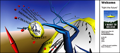
Figure 03: S. Guynup. Surreal Menu
When designers remove items like chairs, tables, lamps from a screen-based, mouse-driven virtual environment (SMVE), a sense of emptiness appears. The effect is emotional as the user has few pre-existing cues to guide the relationship with the space. Real world items also form a basis for comprehending the size and layout of the space. In appropriate amounts, these elements cue the user's navigational behavior (in larger - or even just realistic amounts they can be cumbersome). To compensate, some virtual architects take a deconstructive approach. They add visual interest and navigational cues by breaking the flat planes of wall and floor. Slight angles and wire frames can reinforce the user's sense of three-dimensional space. Some authors add background animation to give "life" to a space.
Patrick Keller's Alternate Fabrique shows the classic architectural interpretation of virtual structures. To generate a sense of space that appears full yet lacks benches and lights of the realistic spaces, Keller breaks and bends his galleries, extends faux structural elements outwards. Lines stretch like taut ropes and help define forms that are weighted yet weightless.

Figure 04: P. Keller. The Alternate Fabric gallery "Expo 1:prothese digital" http://www.fabric.ch/La_Fabrique00/prothese.html
Often, designers use bold colors and oversized visual elements to fully fill their virtual space. This effect, usually fun and visually engaging, plays off the user's previous knowledge of two-dimensional animated cartoons. There is a second benefit to scaling elements in the environment upwards. Large elements are typically easier to see and interact with. Large elements give the user a larger area for proper positioning and can be a solution to problems of precision navigation
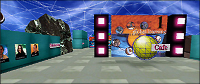
Figure 5: an information space from VGTV's Global Learning Prototype , — K. Dudesek, founder. http://www.vgtv.com/p,500029,1.html
Both of these approaches represent a lateral expansion of reality. To understand this, compare the real world environment of New York City to that of the Arctic tundra. Visually, they are extremely different, yet the same laws of nature and physics apply. Gravity is always active, and the ground is solid. In virtual environments, these rules are flexible; they are at the whim of the world builder. At a deeply fundamental level, there are abstract concepts governing reality that are subject to review. In real environments, objects are persistent and shared. In the virtual, these rules are by default, reversed. Objects are typically unshared and non-persistent. While this is seen as commonplace within a GUI, the long-term impact on the design of virtual space is unknown.
As we exploit the native characteristics of SMVEs, a path becomes clear. We merge the speed and clarity of two-dimensional interfaces with the immersive, experiential aspects of three. In structuring space as subsets of explorable data, we can group and display information in new ways. We can add a level of connection and to some extent the connotations that were previously unreachable.
Examples of Exploration
The following museum built by Christiano Bianci typifies the subtle border of lateral expression. It has a strong and controlled color scheme and presents its exhibitions within wire frame boxes. At the same time, real world new media trade shows and art exhibits have a very similar sense of place.
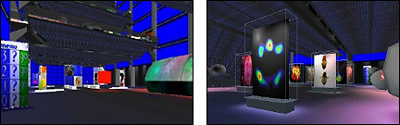
Figure 6: C. Bianchi. Interior of "The Science Museum"
Stairs could have been used to connect the three floors of this virtual gallery, but in these environments, stairs are difficult to use. So instead, we teleport, using what appears to be a kiosk (left image). Note that while it resembles a kiosk, it utilizes a GUI menu structure that in fact even says "menu".
The Navigatible Database
This discussion begins, surprisingly enough, with a space that responds to the user's movement. Although not typically seen as mobile, databases possess a formal order that is navigated and manipulated. We can transcribe the database into a three dimensional form. The example below by Christiano Bianci does just that. As the users move through the space, the data appears to them. The left image is a screen capturel; the right is an illustration of action.
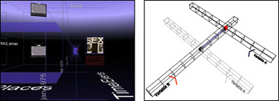
Figure 7: C. Bianci. A database as gallery structure
Image this structure within a database table. Related rows and columns slide to present the intersection between the data types. The intersection is given in full detail and the corresponding row and column is given in outline. To navigate this environment, we enter it and we exist at the intersection. As we move, so does the row and column. Data in full is presented around us. The upper right diagram illustrates the layout. Variable B is a timeline; variable A are the members of the band known as the Sex Pistols�. The choice was made because of the diversity and availability of information about the band. Within each database unit, we find text, images, sounds and movies.
Relating space to information can be done on many levels. The gallery on the following page does just that. In the distance, it is an object, a spinnable timeline of the 1950s to the 1970s. The goal was to create a relationship between the distortion of perspective caused by the user's vantage point and the data. Above, it highlights the differing viewpoints on the 1960s. In concept it is as simple as saying, "In the eyes of 1950s, we see the 1960s as 'X' while those looking back from the 1970s see the 1960s as 'Y'."
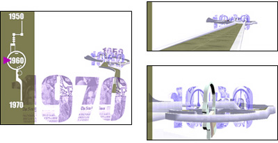
Figure 8: S. Guynup.� "Timeline" an immersive pathway
Secondly, the timeline object can become an environment. The user can move into the space and navigate towards the center, the 1960s. In doing so, a narrative is produced that colors the user's opinions of that controversial decade. Depending on which entry point, either from the 1950s or the 1970s, a distinct outlook is formed. In this sense, we mirror the real world: our previous experiences deeply influence our opinion of what follows. Lastly, to the left is a heads-up display (HUD) that tracks the user's position in the timeline. Visually, the user is able to relate his environmental position to the abstract point in time.
Divisions of Information: Kiosks within a Menu
Information in a virtual scene can be brought to the user in any quantity desired. This ranges from a single audio file or image to entire worlds that hold a variety of informational objects. In the middle range is an installation, or to use a more functional analogy, a kiosk. A virtual kiosk is a complete unit of information accessible to the larger whole via a menu.
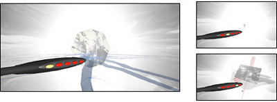
Figure 9: S. Guynup. "Untitled Memories" virtual installation
Clicking on the red buttons in the menu arm gives the user access to the other installations / kiosks. Five separate, yet related informational structures are within easy reach of the virtual visitor. With a single click, users can see the information they came for and decide if they wish to explore it in detail. This could have been created in a single large space holding all five installations. Does the users' travel between installations have value, or is it (in this instance) time consuming and possibly disorientationg? The users may get lost. If they demand quick access, as most do, they will grow frustrated with the one-space design's inability to meet their needs.
And of a New Art
We have addressed issues of usability and have hopefully provided practical information on the nature of virtual design. Looking forward, we see not only new structures and interfaces, but new art as well: an art that will allow us to explore the relationships between our bodies, minds and world. The variety of works and the galleries that support them is vast. Much has already been done.
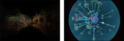
| Figure 10: Left, M. Clifford, "The Aleph" immersive paintings. http://www.rre.net/welcome/matrix/public/ | Figure 11: J. Klima. Right "Glasbead" dynamic interface / musical instrument. http://www.cityarts.com/glasbeadweb/ |
The painter Maurice Clifford has translated his abstract art into animated, almost hypnotic flowing sculptures. In John Klima's Glasbead, art and interface design merge into uncharted territory. Spun by the user, the hammers freely rotate around the center. When a hammer collides with another, a tone is made, and so the physical rhythms of spun hammers create a new musical form.
Earlier we discussed the gallery structure created by Patrick Keller. Conceptually he had designed it to hold virtual works of art. The virtual six artists invited to show in the space were confronted with a unique problem. For artists accustomed to infinite space, the real-world-sized rooms were in effect very small. The smallness of space became the starting point for many of the artists. Taking a cue from the cramped quarters, Andy Best filled his small space with a large fiery animated animal. Steve Guynup added a single button. When pressed, it caused all but the entrance and exit portals to flitter away. With walls removed, the users found themselves in an abstract Chinese garden. In addition, as this was a multi-user space, the users could now interact with others in wholly separate visual environments.
The most ingenious tack was taken by Christiano Bianchi. His work consisted of boxes that float in space at a height that matched users' heads. With collision turned off, the users can actually enter the box. Upon entering a box, users found Christiano had altered their walking speed, making them move more slowly. As the primary tool for judging the size of abstract space is the speed through which one moves, he had in essence created a larger space inside the box. He programmed it so that infinite boxes were placed inside each other and in each, the users moves a little more slowly. Adding letters to the boxes, he entitled the space, "Infinite Babel"

Figures 12-14: Examples of the show at "Expo 1: prothese digital" http://www.fabric.ch/La_Fabrique00/galerie.html
Top left: "Infinite Babel" — C. Bianci. Top right: "Animal" — A. Best. Bottom: "Digital Zen Garden" — S. Guynup
A Goal
Towards a Deeper Understanding
The goal of the museum is "not to create subject matter mastery, but to accomplish certain appreciative goals�to awaken interest, to broaden perspectives, to induce deeper understanding, to enrich aesthetic sensitivities, and so forth" (Lee 1968). To do this, we can look beyond the real and the dreamscape to the new.
The gallery below supports two installations. The center holds a sculptured body circled by NATO and Serbian emblems. In the middle of the figure is a map of Kosovo. The interaction is simple. The art attacks the user. NATO and Serbian forces fire lasers and the user can fire back. The only damage they do is to Kosovo. In the upper gallery, images of the destruction are circled around a piece of rotating text that declares "...this is not a game." As cultures become reared on video games and see war as just another image on TV, it becomes crucial that we use our technology not as trip in time or as an escape from reality. It the end, virtual reality must reinforce the real.
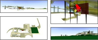
Figure 15: S. Guynup. "Kosovo — Unfinished"
Conclusion
In describing virtual space, we have encouraged a broader perspective in terms of structural design and the end use. As time progresses, virtual spaces on the Web will become more commonplace. To start this process, they must accept the current affordances and limitations of mouse and screen. In creating a new interactive methodology, we also redefine the means by which we can interpret our world and ourselves. Broad new vistas of human experience are not far off, and yet, they are distant enough to be unknown. This paper offers at best only harbingers of that future. All that can be said for certain is that the path to this end lies in the merger of the GUI and the gallery.
References
Asymtote."Virtual Guggenheim"— Asymtote http://www.guggenheim.org/exhibitions/virtual/index.html
Benedikt, M. (1991), Cyberspace: Some Proposals. In M. Benedikt (Ed.) Cyberspace: First Steps. Cambridge: MIT Press, 119-224.
Benedikt, M. (1991), Introduction. In M. Benedikt (Ed.) Cyberspace: First Steps. Cambridge: MIT Press, 1-25
Bianchi , Christiano. Infinite Babel. How small can you get to find a meaning, 2000, http://www.cristianobianchi.com/html/canal.html
Bianchi, Christiano Bianchi. "Infinite Babel ", "Database Gallery", " Science Museum" — http://www.keepthinking.it
Bianchi, Christiano. "Beyond the Desktop." An experiment in user interface and responsive spaces, 1999, http://www.cristianobianchi.com/html/beyond.html
Clifford, Maurice. "The Aleph", http://www.benjaminremembered.com/welcome/matrix/public/
Hillis, K.,(1999) Digital Sensations, Minneapolis: University of Minnesota Press.
Keller, 2000. Patrick Keller. "Expo 1:prothese digital " http://www.fabric.ch/La_Fabrique00/galerie.html
Kellogg, W., Carroll, J., & Richards, J, (1991), Making Reality a Cyberspace. In M. Benedikt (Ed.) Cyberspace: First Steps. Cambridge: MIT Press, 1-25
Klima, 2000. John Klima. "Glasbead", http://www.cityarts.com/lmno/
The Meetfactory Andy Best, Creative Director. http://www.meetfactory.com
Mullet, K. & Sano, D. (1995) Designing Visual Interfaces, Mountain View: Sun Microsystems
Newhouse, V. (1998) Towards a New Museum, New York: The Monacelli Press.
Shaw 2001. Chris Shaw.. Data Visualizations CS 7497 Virtual Environments, Georgia Tech Class 2001 http://www.cc.gatech.edu/classes/AY2002/cs7497_spring/
Sonstein, Jeff. "The Town Square", http://ariadne.iz.net/~jeffs/
VGTV - Karel Dudesekwww.web3dart.org