
![]()
![]()
![]()
![]()
![]()
![]()
![]()
![]()
![]()
![]()
![]()
![]()
![]()
Archives & Museum Informatics
158 Lee Avenue
Toronto Ontario
M4E 2P3 Canada
ph: +1 416-691-2516
fx: +1 416-352-6025
info @ archimuse.com
www.archimuse.com
| |
Search A&MI |
Join
our Mailing List.
Privacy.
published: March 2004
analytic scripts updated:
October 28, 2010

From On-site to On-line: Experience on Transforming Exhibition
Wendy Siuyi Wong, Department of Design, York University, Toronto, Canada
http://www.cooper.edu/art/lubalin/cgd
Abstract
The Herb Lubalin Study Center of Design and Typography at The Cooper Union School of Art periodically offers The Lubalin Curatorial Fellowship to enable recipient to engage in art and design related research and curate a public exhibition based on the research. In 2000, The Center granted the Fellowship for the exhibition "Chinese Graphic Design towards the International Sphere," which displayed the works of more than 70 prominent Chinese graphic designers and studios from China, Hong Kong, Taiwan, and Macau. The exhibition ran September 4 to December 1, 2001, at The Gallery of Herb Lubalin Study Center, enriching the visual experiences of the American audience and providing students of graphic design with a greater understanding of the historical perspective of design in the Greater China region. After this exhibition closed, The Center began exploring the possible transfer of the exhibition to a virtual presence on the Worldwide Web. Upon receipt of this suggestion from the Center, the exhibition's curator began analyzing the critical issues involved in "transforming" a physical exhibition into a hyper-reality environment. After considering the various display possibilities available in Web format, the curator decided to adopt a visual based mouse-over technique rather than a data based html coded web page. This paper examines how the curator utilized the Web as a medium to extend the exhibition previously restricted by physical accessibility and time. Comparisons will be made between the original display system design of the exhibition and the final interface and interactive design for the on-line exhibition.
Keywords: Chinese graphic design, exhibition design, on-line exhibition, site design, Greater China
Introduction
The Lubalin Curatorial Fellowship 2000, offered by The Cooper Union School of Art, was awarded for a proposed research project examining the history of Chinese graphic design. The ensuing research resulted in a public exhibition at The Gallery of Herb Lubalin Study Center of Design and Typography, which held from September 4 to December 1, 2001. This paper reviews how this public exhibition was transformed into an on-line exhibition. The background of this exhibition project is given to enhance the reader's understanding of the project. The paper continues with an interpretation of the design concept and exhibition contents. It also summarizes the difficulties the curator encountered in transforming the physical exhibition into an on-line format, with the limited resources available. It examines how different Web design techniques can be utilized to construct a virtual exhibition approximating a physical exhibition as closely as possible. The paper's objective is to document the design processes of both the on-site and on-line exhibition devoted to Chinese graphic design.
Background
The Herb Lubalin Study Center of Design and Typography at The Cooper Union School of Art offers The Lubalin Curatorial Fellowship periodically to enable recipients to engage in art and design related research, and later to curate a public exhibition or public performance based on the results of that research or creative exploration. In early 2000, The Center released through various media a call for applications to the Fellowship. The Center received a large number of proposals, making competition for the Fellowship keen. Interviews of finalists were conducted in April 2000, and the winner of the Fellowship was announced the following month. The Fellowship was awarded for the proposal entitled "Chinese Graphic Design towards the International Sphere," an emerging area that is as yet unknown to many American/Western audiences and designers.
The information available to the Western world about modern Chinese graphic design has been limited, and its history and development is likewise little known throughout much of the Greater China region. Unlike the Western world, design in Greater China has a relatively short history, and is not yet recognized as a twentieth-century phenomenon expanding simultaneously with industrial development, commerce, economy, and culture (Wong 2001). All disciplines in design are relatively new, and all the more so throughout Mainland China. Matthew Turner (1995), one of the few Western historians to examine Chinese design, has recovered the early history of Hong Kong industrial design and product manufacturing. Chinese-trained design scholar Shou Zhi Wang (1995) focused his observation on design activity under communism before the start of the Open Door Policy in 1979. Both Turner and Wang first published their work on Chinese design history before the economy of Mainland China took off in the 1990s. Their work demonstrated the common academic practice of separating investigations of Chinese society, addressing Hong Kong, Mainland China, and Taiwan separately, rather than using the relatively new concept of "Greater China."
The parameters of the Chinese graphic design research as completed for the Fellowship encompassed not only works by designers in the Chinese speaking region, but also included design styles that represent interactions between Western graphic design theory and Chinese cultural symbols, values, and aesthetic directions from the 1960s to 1990s. The expression of this style sometimes occurs as a direct representation of Chinese cultural icons, or alternatively as an abstract ideological or metaphorical interpretation of Chinese cultural values through universal symbols. This visual style provides evidence of the relationship of design and its cultural context, which work together in response to change over time.
The development of the international scene in graphic design first included contributions almost exclusively from the West, mainly the United States and Europe, and then some elements from Japan were introduced in the 1970s (Wong 2001). The full picture of international graphic design up to the present will be enhanced with the addition of contributions from China. At the same time, international elements have gradually been introduced into graphic design in Mainland China, thus creating a two-way exchange of influence. As non-Chinese theories and creative techniques were introduced in the Greater China region, the region was moving onto the international stage and completing a creative logic that incorporated influences of East and West.
Yet, the proposal for the Fellowship suggested strengthening the link between these two spheres by examining and introducing graphic design works from Hong Kong, Taiwan, Mainland China and Macau to the international audience through the exhibition at The Herb Lubalin Study Center of Design Typography at The Cooper Union School of Art. The exhibition aimed to de-mystify the image of Chinese cultures through contemporary graphic design from the Greater China region, using this exhibition as a communicative medium, a product of research and expression of information messages (Kaplan, 1995). The exhibit endeavored to increase awareness of Chinese graphic design by bringing it onto an international stage.
Research Parameters
Although Chinese graphic design is of major significance in world graphic design history, it has not yet been systematically examined, in part because of the tendency in Hong Kong, Taiwan and China for practitioners and academicians to more in separate spheres. Whatever the reason, the historical development of modern Chinese graphic design should be considered an integral part of the story of world graphic design history.
The scope of the research focused on commercial graphic design work, including posters, logos, books, editorials, promotional literature, advertisements, and Chinese typography from throughout the Greater China region since the 1970s, with basic visual and narrative establishment of background from earlier decades. To a certain extent, graphic design in Greater China is developing with similar contextual factors as in the Western countries, but still differs in regards to time frame as well as political and cultural influences (Wong 2001).
Among fundamental differences between graphic design in the West and in Greater China, political climate is one of the most critical. During the past decade, with important political solidifications taking place, the various locales within the region have increased cultural and economic exchange to the extent that it no longer makes sense to consider each locale as a separate entity. The research project took the potentially controversial position that Chinese design history should be studied as one unified whole, rather than individual studies of several separate entities. The objective of the research was to unearth "a" history of Chinese graphic design and begin building the foundations of this history from a unified perspective.
Research Methodology and Process
The research for the exhibition used a historical perspective to trace major developments in the history of Chinese graphic design from the past three decades in Greater China. The research focused specifically on graphic design, examining artistic and commercial visual communication activities. Through conducting interviews, archival research and a longitudinal examination of commercial graphic design works in different locales of the region, it demonstrates the struggle for the expression of Chinese style throughout the years by integrating modern graphic design theories and creative techniques with Chinese cultural heritages.
The first phase involved the identification of creative directions pursued in Chinese graphic design in the past three decades. In this phase, the procedure was divided into four parts according to locale, with the examination carried out in the same way for each. First, design professionals were identified and interviewed about their understanding of graphic design, experience and works. Secondly, representatives of professional design associations were interviewed about their history and activities. Then, design educators and institutes were visited and interviewed about their history, teaching method, and philosophies of design and education. Lastly, secondary research was conducted using publications such as trade journals and design award annuals.
A total of 72 designers were interviewed and included in the exhibition, including 26 from Hong Kong, 14 from Taiwan, 29 from Mainland China, and 3 from Macau, with more than 220 pieces of work displayed in the exhibition. After both artifacts and secondary materials the were collected, a triangulate method was conducted to cross-check the accuracy of information obtained. This accuracy check, along with the creation of a database of designers, works, and events, concluded the first phase of the research project. The second phase analyzed the artifacts and materials collected for evidence of historical trends, evidence of influence from one designer or local to another, stylistic developments, and significant themes. Through this analysis, labels and definitions were developed for particular styles and themes of collected design works.
Categorization of the Artifacts
The contents of the exhibition have been categorized into 11 groups in order to provide a longitudinal examination of collected works from different locales. The collection assembled is a reflection of the diverse culture and facets of modern Chinese life that have influenced the region's evolving graphic design.
The first group presented the "origins and development before the 1970s" of graphic design in the region by displaying artifacts ranging from a communist propaganda poster from the 1960s to commercial works by Henry Steiner in the same period. The second group created a picture of the "Western influences in the Design Education of Hong Kong" in the 1970s. The third group demonstrated the emerging "hybridizing West/East Elements in Design in the 1970s and 1980s," while the fourth was devoted to the developing concept of "national identity" through the title of "remapping the territory in the 1990s." The fifth group on display collected "cultural and film posters" from the four locales in the region. The sixth group was dedicated exclusively to one of the most internationally known Chinese graphic designers, Kan Tai-keung, whose signature works have appeared in prominent international design magazines. The seventh collection provided a unique space for the "hit hot items" of CD packaging design, graphic design books, and experimental publications. The eighth display consisted of current design activities within the region under the title of "inter-regional thematic poster exhibition since 1995." The ninth and tenth groups presented samples of "promotional posters" and "experimental posters" respectively. Finally, the last group exhibited samples of poster, designed for China's bid for the 2008 Beijing Olympics under the title of "future event." Together, these ten collections devoted to separate eras and themes were united to form a cohesive exhibition.
On-site: The Design of the Exhibition in a Physical Space
The Exhibition Environment Study
The Herb Lubalin Study Center of Design and Typography at The Cooper Union School of Art is located on the second floor of the Foundation Building. The Center consists of an office, an archive library and exhibition areas for public displays. The archive library also serves as a reading room for The Center's users. The exhibition area is comprised of two gallery rooms with display showcases in different sizes, and two respective hallways with walls and display showcases. Due to the size limitations of the various showcases, the design of the expedition faced some challenges. The exact measurements of each display unit and wall space in each exhibition section became crucial factors in the selection of exhibits.
Exhibition areas are divided into East Gallery, West Gallery, South Hallway and West Hallway. There is no specific or designated entrance or exit to the exhibition areas. In addition, The Center is adjacent to The Houghton Gallery, the main exhibition gallery of the School of Art at The Cooper Union. With these two physical constraints, the exhibition needed to create a clear flow of direction for its display system, as well as establish an identity distinguishable from the concurrent exhibition being held at The Houghton Gallery.
The Designing Process
Since the curator was located in Hong Kong during the yearlong research period to conduct all interviews throughout the Greater China region in person, most communication between the curator and the Center was conducted via email and the exchange of visuals in digital format. To maintain clear and accurate communication throughout the design process of the exhibition, the curator first took study photos of the exhibition environment while physically present at The Center. With ample assistance from The Center's personnel, including Mr. Philippe Apeloig, the curator of The Center and professor of graphic design, Ms Ann Holcomb, the director of the archive, and her assistant, Ms Alyse Yang, the physical design and execution of the exhibition were carried out smoothly. The Center's provision of a detailed floor plan of the exhibition environment enabled the curator to compose the layout of the exhibition design visually. Using the exact measurements of each exhibition section and display showcases, the curator produced a design and production visual for The Center staff to refer to.
First, a design plan with actual exhibits placed in a grid background was produced.
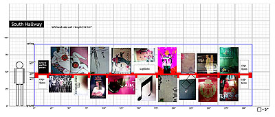
Figure 1: The Design Plan.
The design plan of each exhibition section was first composed using desktop publishing software, then saved in jpeg format for email attachments. Upon receipt of the curator's email, The Center was able to download the attached visual plan file, and print out a hard copy in color to use as a guideline for the exhibition layout. Secondly, to ensure clear communication, the curator also created a set of photomontages in Adobe Photoshop illustrating the desired finished appearance of the exhibition.
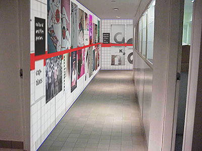
Figure
2: The Photo-Composition of the Exhibition Design Layout.
With both detailed measurement plans and visual references, the exhibition production staff and Center assistants had a clear picture of the desired design of the exhibition.
The Exhibition Design
The design issue of the exhibition formed the major concern of the entire project. The curator identified the major design problems of the exhibition to be the different circulation patterns and showcases present within the exhibition environment. The creation of a unique visual identity for the theme of the exhibition, "Chinese graphic design," was also a challenging task for the curator. Since the exhibition encompasses contemporary Chinese graphic design from different locales throughout Greater China, each locale had its own visual identity within the main framework. The design works from each locale shared both similarities and differences, and the cross-cultural differences were obvious to the curator, a native of Hong Kong. The curator was also concerned with the amount of understanding the largely American audience had about Chinese cultures and their preconceptions of Chinese image and cultural identity. With the goal of the exhibition to introduce contemporary Chinese graphic design to an American audience, the curator decided not to use clich images associated with the American/Western perception of Chinese culture.
The exhibition design adopted a clean visual approach and system by using a color scheme of red, white and black, and free of any traditional Chinese symbol or motif likely to be known to the Western audience. Red was selected for its frequent appearance in Chinese societies in the past and present, and the curator hoped this color would bring just a touch of traditional Chinese design to the modern exhibition. Also, in order to solve a weakness of the physical environment identified by the curator, an 8-inch red stripe was placed approximately 42-inches from the floor throughout the exhibition areas to create a wrap-around effect. This continuous red stripe served to indicate the starting point of the exhibition, beginning at the entrance of The Center area.
The English title of the exhibition (designed by Ms. Mindy Lang, the director of The Center for Design and Typography) appeared on the left-hand side of the entrance area, and the Chinese title (designed by the curator) was located on the right-hand side together with the continuous red-stripe.
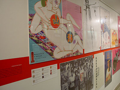
Figure 3: The exhibition location photo #
The red stripe created a continuous look and identity for the exhibition while simultaneously serving as a directional indicator. All exhibits were displayed along the red-stripe, while a guest book for visitors to sign was placed at the end of the exhibition to indicate its end.
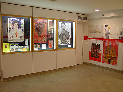
Figure 4: The exhibition location photo #2
Design of the Object Identification System
With the limited exhibition space available in The Center, the creation of an object identification system for more than 220 exhibit pieces became another design problem for the curator. As Belcher (1993) declares, "(i)t is frustrating for the visitor if objects are placed on display and are not identified" (p.149). The task was to create an easy object identification system for all exhibits that would work within the limited space available.
In addition, the object labels needed to include basic information about each artifact, such as title of the piece, type of object, creator name, year of creation, locale of origin, and an interpretation of the object (Belcher 1993). Since most of the exhibits were in the Chinese language and the typical visitor would most likely lack the cultural background to understand the context of the design works, the object labels became very important for enabling the visitors understanding of the exhibits. Thus, the creation of labels not only addressed the need for a direct translation of the exhibit but also provided brief contextual information. For example, the object label for a propaganda poster produced in 1960s Mainland China reminds the visitors that English was not included among the six languages the headline was translated into, and that "this omission reflects China's political stance towards the English speaking world at the time"
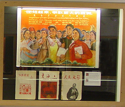
Figure 5: Chinese propaganda poster, 1960s
Throughout the curator�s process of writing the object labels, Ms. Ann Holcomb of The Center contributed greatly by offering her points of view as an American audience member. Due to the limited space available in the exhibition areas and the design of the exhibit display system, it was not possible to place each individual object label directly under the corresponding exhibit. In order to save space, the type size of the object label was set in Trebuchet 8.5 point with 1/2-inch margins. The labels were printed on white photo-grade paper using a bubble ink-jet printer and mounted on display board.
The object identification information for each exhibit piece was gathered into groups, and placed in an appropriate position in each section of the exhibit. This system used a one-inch image captured from the exhibit as a visual indication to enable the visitor to identify the object referred to. Object information such as title, type, designer's name and so forth was placed immediately next to this visual indication.
Figure 6: Sample of object label
Though more than 220 works were displayed, visitors have no problem identifying objects with the help of this visual referencing system.
Figure 7: sample of visual object identification system
On-line: The Design of the Exhibition in a Hyper-Reality Environment
The Goal
The exhibition ran from September 4 to December 1, 2001. Although the exhibition was interrupted due to the events of September 11, 2001, it was reopened to the public about a week after the incident. A public lecture by the curator, "The Past and the Future: Politics and History of Graphic Design in China," also needed to be rescheduled, and was finally presented on October 1, 2001. The Center hosted this public lecture to provide an opportunity for the public to interact with the curator, and gain greater understanding of the background and contents of the exhibition. The lecture was an enjoyable success, with about 100 people in attendance. Unfortunately, the public lecture would be the sole opportunity for face-to-face interaction between the curator and the public. The Center hoped to provide more opportunity to keep communication open, but was unable to do so because of venue, budget and internal constraints.
Because of this limitation, after the exhibition ended The Center expressed interest in continuing this on-site display in virtual space, and the exhibition curator began considering the possible critical issues involved in "transforming" this physical exhibition into a hyper-reality environment. The goal of the on-line version of the exhibition were identical to those of the physical display, and included extending the interaction between the exhibit, the Center and people who were unable to visit the exhibition in person. Due to this objective, the curator was committed to maintaining the originality and impression of the overall physical exhibition in the on-line version, and to reconstruct as closely as possible the overall visitor experience of the 3-dimensional exhibit.
Technical Considerations and Constraints
Unfortunately, The Center was unable to allocate extra funds for the production of this on-line exhibition. This budget constraint did not allow the curator to employ a technical helper to assist with the computer programming of the web site. With a background in graphic design, the curator voluntarily executed the entire production herself, with assistance from Ms. Ann Holcomb in negotiating with a technical assistant from Web server management at The Cooper Union. Most publications on producing of Web sites that the curator consulted, such as Web Style Guide by Patrick Lynch and Sarah Horton (2001), offered a technical checklist to consult in the beginning of such a project.
However, the curator found it difficult to obtain information regarding what technical functions The Cooper�s web server could support, and there was no indication that it could support database searches, but only basic functions such as email messages from readers. The production of the on-line exhibition was carried out under a number of technical constraints and without the benefit of a long-term Web master. Given these constraints, creating the site using basic production techniques seemed a practical strategy.
Study of Other On-line Exhibition Sites
Considering the constraints encountered in all aspects of production, the curator carefully studied the various display possibilities for on-line exhibition that are available on the Internet. There are numerous on-line exhibition sites out currently on the Worldwide Web. The curator used the Museum of Fine Arts, Boston: Monet in the 20th Century (http://www.boston.com/mfa/monet/exhibit) as a typical example on how an exhibition may be presented on-line. The exhibits included in this virtual exhibition used a "slide-by-slide" technique, rather than trying to resemble or reconstruct the visitors experience of the original.
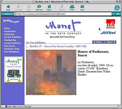
Figure 8: On-line exhibition of Monet in the 20th Century
Some sites surveyed were embedded with a searchable feature, and some of them were database driven. Most of the site designs were unified in look, style, page grid, and overall graphic design standards.
More examples are available in the "Best on-line Exhibition" sites from the finalist list of Museums and the Web 2002 and are useful to consider when planning the best design of an on-line exhibition. Some sites provided html and flash versions to accommodate the different preferences of viewers, such as Jacob Lawrence: Over the Line (http://www.phillipscollection.org/lawrence). With the increasing use of high-speed Internet connections, animated flash versions of sites are also common. One example is George Washington: A National Treasure (http://georgewashington.si.edu). This Web site has an animated opening page and advanced interactive scripting that allows readers to access information from the next level and beyond the exhibit.
The JavaScript language can also enhance the interactivity of a Web site, as in History Wired: A few of our favorite things (http://historywired.si.edu/index.html), which created a "wired" effect to echo the concept and theme of this on-line exhibition. The Sport of Life and Death: The Mesomerican Ballgame (http://www.ballgame.org) Web site provides very interactive educational content and games. Flash-based web sites are more interesting in term of their visual presentation, but users usually have to deal with a slower download time. In addition to these Flash-based sites, there are some sites enabling audio function, such as Treasures From the World�s Great Libraries (http://www.nla.gov.au/worldtreasures), and downloadable quick time movies, as in Artists Take on Detroit (http://www.dia.org/artists). Unfortunately, this kind of technology is not very user-friendly unless the users are accessing the Internet using a high-speed connection, and a suitable movie player plug-in is also required.
The Solution
After the preliminary study of on-line exhibitions available from the Internet, the curator considered both the technical constraints and goals of the site design, and decided to adopt a visual-based mouse-over technique rather than a text-based html or a Flash-based site. This technique provided interesting visual effects by inviting the participation of the in discovering the exhibition. The site was mainly created in two Web production applications, Fireworks 4.0 and Dreamweaver 4.0. The page size was set at 600 x 400 pixels, and the basic composition of the site's graphic design was done in Freehand 9.0. After the drawings were completed, they were transferred into Fireworks4.0 for additional production.
The interface pages were cut into different slides and interactivity was added in Firework 4.0, creating the desired "roll-over" effect. Then, the Fireworks 4.0 file was exported as a Fireworks html file, and reopened in Dreamweaver 4.0 for further manipulation into the final Web site. The sliding and mouse-over techniques chosen enable visual images to be downloaded as small jpeg files and form a 600 x 400 pixel image. By using this method, individual Web pages do not require extra downloading time, as in the Flash-based site.
The goal of the on-line exhibition was to reconstruct a visit experience similar to the 3-dimensional exhibit held at The Cooper Union. The on-line exhibition design followed the design and color scheme of the on-site exhibition by transferring all the exhibits and information into cyberspace. The first page of the virtual site opened with the Chinese and English title on the left hand side, and exhibition information on the right. The reader could click on the word "enter" and access the introduction page of the exhibition exactly as it was once posted physically in The Center. Then, in the third page, a floor plan of The Center provided the introductory navigation system to visitors, and this floor plan also showed the readers how the physical exhibition environment looked. The virtual visitor was allowed to choose any point to enter this on-line exhibition, but they could also follow the suggested sequence as shown in the mouse-over images. Unlike the on-site exhibition, this on-line version was not able and not intended to restrict the navigation patterns of the users.
After entering the main exhibition areas, the Chinese and English title-marks were placed on the left upper corner with the exhibition title in English serving as the signature graphic to indicate the name of the exhibition. Below this block of graphics, additional information showed the location of the exhibition areas. Basic user instructions were added for visitors who are unfamiliar with the mouse-over display techniques used in the site. Interface and graphic navigation links were created as a thumbnail of the display system found in the on-site exhibition design and were placed on the lower part of the page.
To indicate the scale of the exhibits in relation to people, a human figure was placed next to the display set. By moving the mouse over the exhibits on the display units, Internet visitors could experience the exhibition in a way similar to physical attendees by going through each exhibit individually. Unlike the on-site exhibition, users could enjoy the greater freedom and interactivity provided by the Internet. This set of graphic navigation and interactivity links formed the basic site design system. Also, interactive links to other exhibition areas were placed on the left hand side along with consistent and predictable navigation buttons. It created a sense of the site's organization and made the logic and order of the site clear.
This page layout style covered four exhibition sections in five pages: East Gallery, West Gallery,
South Hallway and West Hallway (Left and Right). The design was a very close approximation of the actual on-site exhibition display organization. The virtually site also included a page giving the names of participating designers, and another of acknowledgements. Finally, the exit page wrapped up the exhibition, addressing the results of this Fellowship project and exhibition and provided email contact information for the visitors. From this page, users could elect to either return to the on-line exhibition site or to the homepage of The Cooper (figure 9: The site design of Chinese graphic design on-line exhibition). Overall, the on-line exhibition achieved the goals set by the curator, although the project sacrificed some potential with no database function available. The on-line exhibition has been available in cyberspace since June 2002, in spite of the technical and budget restraints the project was confronted with.
Conclusion
This paper reviewed the production considerations for an on-line exhibition based on a physical exhibition, "Chinese Graphic Design towards the International Sphere," held at The Gallery of Herb Lubalin Study Center of The Cooper Union September 4 to December 1, 2001. The research project culminating in the physical and on-line exhibitions was undertaken in fulfillment of The Lubalin Curatorial Fellowship awarded in 2000. Both exhibitions provided valuable examples of graphic design in Greater China to American viewers and a worldwide Internet audience. The exhibition is an example of cross-cultural communication, which introduced designers and designs largely unknown to the Western audience but artistically important to the development of graphic design. The exhibition was also used as a visual reference for students involved in a poster design project, under the direction of Mr. Philippe Apeloig, professor of graphic design at the School of Art, during the exhibition period at The Cooper.
The on-site exhibition created an alternative cultural and learning experience for the American audience, which was continued through the Internet. The design strategy of the on-line exhibition was an attempt to approximate as closely as possible the physical exhibition and so to recreate the on-site experience for a virtual audience. This approach has not often been seen in on-line exhibition Web sites. The mouse-over effect projected images and information to the viewers in an unexpected way, and the Web site projected a unified look and identity as did the original exhibition at The Center.
The goals of on-line exhibition were achieved, as visitors were provided with an educational experience closely approximating that of the on-site event. However, the site was unable to include all the curator s desired features, such as a searchable database function and audio and movie clips, due to budget constraints. It is the curator's hope that, since the Fellowship project and exhibitions were devoted to Chinese graphic design, a Chinese language version of the entire on-line exhibit may eventually be produced for visitors from the Greater China region. Designers and scholars must continue to carry out the work of increasing the visibility and availability of Chinese graphic design to the world in the future.
References
Belcher, M. (1995). Exhibitions in Museums. Washington, DC: Smithsonian Institution Press.
Kaplan, F.E.S. (1995). Exhibitions as Communicative Media. In E. Hooper-Greenhill (Ed.) Museum, Media, Message. London & New York: Routledge, 37-58.
Lynch, P. J, and Horton, S. (2001). Web Style Guide: Basic Design Principles for Creating Web Sites (2nd Edition). New Haven, CN: Yale University Press.
Turner, M. (1995). Early Modern Design in Hong Kong. In D. Doordan (Ed.) Design History: An Anthology. Cambridge, MA: MIT Press, 200-212.
Wang, S. Z. (1995). Chinese Modern Design: A Retrospective. In D. Doordan (Ed.) Design History: An Anthology. Cambridge, MA: MIT Press, 213-241.
Wong, W.S. (2001). Detachment & Reunification: A Chinese Graphic Design History in Greater China since 1979. Design Issues, Vol. 17(4): 51-71.
Web sites
Museum of Fine Arts, Boston: Monet in the 20th Century: http://www.boston.com/mfa/monet/exhibit
"Best on-line Exhibition" Museums and the Web 2002: http://www.archimuse.com/mw2002/best/final_virtual.html
Jacob Lawrence: Over the Line: http://www.phillipscollection.org/lawrence
George Washington: A National Treasure: http://georgewashington.si.edu
History Wired: A few of our favorite things: http://historywired.si.edu/index.html
The Sport of Life and Death: The Mesomerican Ballgame: http://www.ballgame.org
Treasures From the World's Great Libraries: http://www.nla.gov.au/worldtreasures
Artists Take on Detroit: http://www.dia.org/artists