
Papers

Reports and analyses from around the world are presented at MW2005.
| Workshops |
| Sessions |
| Speakers |
| Interactions |
| Demonstrations |
| Exhibits |
| Best of the Web |
produced by
 |
Search A&MI
 |
| Join our Mailing List Privacy Policy |
Introducing Standards Into Your Museum's Web Site
Ted Drake and Brian Rountree, Superior Pixels, USA
Abstract
Is your Web site ready for a facelift? Are you paying for bandwidth on your server and looking to save money? Are you interested in offering visitors with PDA devices access to your site or collections? Are you struggling with accessibility laws? Are you looking for an opportunity to cancel the maintenance agreement you have with an outside Web design company and to bring it in-house? Do you want better search engine results? Do you want your Web site to download faster?
Yes!
What if you could find the answer to all of these questions in a paper about one workshop at the Museums on the Web conference? It may sound like snake oil but the answer is simple, and you will walk away with an understanding of the Internet's future and how you can transform your museum's site and projects.
Keywords: standards-based, style-sheets, accessibility, standards, cross-browser, programming
The revolution begins
For many years, Web developers had to use tables, invisible images, java-scripts, non-breaking spaces, and many other techniques to make a Web page look acceptable in multiple browsers. At the same time, Microsoft and Netscape were busy introducing new features that could be used with their browser, but not the other's. This led to many Web sites that look great in browser X but not in browser Y.
Recently knighted Tim-Berners Lee and several other technology leaders began a project in 1994 to bring sanity back to the Internet's development community. TheW3C (World Wide Web Consortium) recognized the importance of developing standard protocols and getting the browser manufacturers to build their products with them in mind. With the latest versions of standards-compliant browsers, the world of Web design is ready for its revolution.
Standards-based Web developing has several key elements.
- Separate style, content, and function.
- Use semantic coding. Let a tag do what it is meant to do.
- Associate data with its context, for instance: Title: The Thinker
- Build a Web site that looks and works well in all browsers and devices
Standards-based Web sites also bring with them many benefits
- Web pages download much faster, require less server traffic, and save money in infrastructure.
- You can redesign a Web site by simply changing the style sheet
- The code does not require HTML experience to maintain.
- They are inherently more accessible and get better search engine results.
- They can be viewed in PDA devices and cell phones, opening new opportunities for your museum.
Let's get started
This workshop will introduce you to the basic elements of standards-based design. We will show you how to take an existing site and create the standards-based version of it. You will see the steps required, how to use tags properly, and how the style sheet presents the pages to the public. You will see how the final product gives you the YES you desired in the opening paragraph. This workshop will be presented for all levels of programming knowledge.
The top-10 reasons to convert your museum Web site to standards-based programming
There have been numerous Museums on the Web presentations on the importance of accessibility, usability, and portability of information in museum Web sites. While it may have seemed these demands were not conducive to cutting edge design, the times have changed.
For programmers, the new methods are exciting and make Web site design fun again. Jeffrey Zeldman, the 2004 Museums on the Web keynote speaker, compared style sheet programming to drug dealers giving away free drugs to new customers. Once you try it, you will be addicted and keep coming back. Standards-based programming can be frustrating at times, but there is nothing like the satisfaction of building a site that is faster, accessible for all audiences, easy to maintain, and ready for the future.
So, how do you start? How do you convince your management that the Web site, kiosk, and future projects should be re-designed? Let's start with a top ten list of advantages and work our way through the basics of Web standards.
The Top 10 reasons to use standards-based programming
- Pages download faster.
- Code is easier to maintain and does not require HTML expertise.
- Style sheets allow a site to be re-designed, tweaked, and expanded quickly.
- Semantic coding is inherently more accessible.
- Standards-based Web sites are more search engine friendly.
- Data is given context and will prepare your Web site for cross-museum search engine functionality.
- Web sites are built for the future, not the present requirements.
- Pages are cross-browser and cross-platform compatible; removing the need for browser specific pages, printer-friendly pages, and allowing your site to be viewed with cell phones, PDA devices, and screen-readers for the blind.
- Smaller pages require less bandwidth and save money for those that pay for server traffic.
- Money! Standards-based Web sites are cheaper to maintain, cheaper to host, provide accessibility options to enhance grant opportunities, and provide new avenues for presenting collections. All of these factors decrease the cost of maintaining a site or provide better grant-writing opportunities.
Semantic Coding
To understand the future of the standards-based Web, you need to understand the mantra:
Be Separate
Be Semantic
Be Valid.
Be Separate
Who knows what the Internet will be like in 5, 10, 15 years? Will people continue to use computer monitors to browse their favorite museum Web site? Will there be a variety of devices, from wall-sized monitors to screens we wear like a pair of glasses? Perhaps we will be viewing the Web in our cereal bowls and coffee cups, making it easier to check the traffic reports before heading off to work. Braille readers, screen readers, and voice commands are already becoming more prevalent. With this uncertainty, it doesn't make sense to lock your Web site into one particular format.
Standards-based Web design separates the content (the information about your upcoming exhibitions), the design (the layout of the page, pretty buttons), and the behavior (slide-shows of the collection, re-sorting tables.)
Be Semantic
We wouldn't use a hammer to bolt together a book shelf. Unfortunately, the same cannot be said about our virtual libraries. HTML tags have been used and abused to force page layouts. Semantic coding requires choosing the proper tag. This gives context to your content. Proper use of tags let databases know what the data is and how it is used.
Be Valid
Now that there is a set of standards to work with, it's important to actually use them. We have the ability to tell a browser to use all of the latest and greatest features because this page will perform as expected. If the page is not actually written to those standards, the browser will have trouble displaying it. There are various resources to validate a page before it is considered finished.
The History Of Web Design As We Know It
The unauthorized biography of the miracle table
Once upon a time, there was a patchwork of computers among scientists, mathematicians, teachers, and all-around geeks. This patchwork allowed information to flow quickly and for dialogues to develop. One day, a technique was discovered to make this information pretty. Images could be added to these inter-linked documents and viewed in a new "browser" called Mosaic. This made the esoteric patchwork appealing to the average person and the Internet as we know it today was born.
It didn't take long for browsers to become more sophisticated. Mosaic evolved into Netscape Navigator and was the way most people accessed the World Wide Web. Microsoft decided they needed to build a different browser.
The Browser Wars had begun
Netscape Navigator and Internet Explorer began creating two versions of the Internet, each filled with super features that only worked with one browser. Netscape would jab, and Microsoft would counterpunch. It was an exciting free-for-all, and the ones hitting the mat at a dizzying speed were the Web page designers trying to make their sites look decent in both browsers.
The Internet soon became filled with pages that were a mishmash of misunderstood code, boring layouts, and really bad writing. In 1996, David Siegel released his book Creating Killer Web Sites, and the Web was changed forever. Siegel introduced the world to the graphic use of tables to layout a Web page.
While tables were meant to be used to display information in a tabular format, Siegel said "Wait!" We could take this ugly Web site, throw in a table, chop it up again, take some big happy images, cut them into smaller pieces, reconstruct them with yet another nested table, add some text here, a little color there, maybe a shadow or two, throw in some images to keep the cells from collapsing, and voila! A Web page that looks decent in Netscape and Internet Explorer!
The miracle table was born
Life in Internet land seemed to be full of bliss. Pages were beginning to look interesting, Web sites were fairly easy to build, and the miracle table was flexible enough to contain the growing design challenges. However, Netscape and Internet Explorer continued to fight for the biggest share of the browser market. Designers found their sites only looked and behaved properly in one of the two browsers. People began building mirror sites for those with slow Internet connections, Netscape users only, Internet Explorer users only, and more. The population of users also began expanding. Screen readers were developed for those who are blind. WebTV brought the Internet to living room television. People began asking for Internet access on their cell phones and PDA devices.
The miracle table was beginning to crack under the pressure.
The revolution begins
Luckily, there was a group of rogue developers fighting to stop the browser war madness. These underground heroes fought with guerilla tactics unseen in any previous battle. They created the World Wide Web Consortium and started pounding sense (standards) into the Internet Community. They issued doctrines (suggestions) and distributed propaganda (w3c.org). They promised that if the browsers began to work together and adopted a set of standards, the world would be happy and free again. Surprisingly, this bloodless coup d'etat actually worked.
To table or not to table, that is the question…
The Internet is really a big library of information, with the smattering of cake recipes, photos of celebrities, and bad cartoons thrown in for flavor. Unfortunately, most of the information out there is junk. The data has no reference or connection to other bits of data. While this is fine for the average visitor who can make the visual connection between an image and the text below it, those without the benefit of sight cannot.
The connection between data and context is one of the most important benefits of standards-based programming. When the visual dressings are removed from a page, the information continues to make sense.
| Image1. A photo of a bizarre fish, used as an example in a table. |
||
| The Happy Fish, 2001 The Fish Museum, 2002:23 |
||
| This assemblage of a happy fish and packing boxes reflects the struggle of creatures with bulges on their heads in society. |
Old style programming
Here is a simple table with information about a work of art.
Borders are displayed to show how table cells are used to provide margins between the work of art table and other content on the page.
The code for this simple table would be:
<table cellspacing="0" cellpadding="0" border="1">
<tr>
<td><img src="spacer.gif" width="10px" height="10px" alt=""></td>
<td><img src=" spacer.gif" width="200px" height="10px" alt=""></td>
<td><img src="spacer.gif" width="10px" height="10px" alt=""></td>
</tr>
<tr>
<td><img src="spacer.gif" width="10px" height="10px" alt=""></td>
<td><img src="happyfish.jpg" width="200px" height="150px" alt="photo of The Happy Fish by Salvador Dalicious"></></td>
<td><img src="spacer.gif" width="10px" height="10px" alt=""></td>
</tr>
<tr>
<td><img src="spacer.gif" width="10px" height="10px" alt=""></td>
<td><i> The Happy Fish<i>, 2001<br />
Mixed Media, 16"X12" <br />
Salvador Dalicious, Spanish<br />
The Fish Museum, 2002:23</td>
<td><img src="spacer.gif" width="10px" height="10px" alt=""></td>
</tr>
<tr>
<td><img src="spacer.gif" width="10px" height="10px" alt=""></td>
<td><p> This assemblage of a happy fish and packing boxes reflects the struggle of creatures with bulges on their heads in society.</p></td>
<td><img src="spacer.gif" width="10px" height="10px" alt=""></td>
</tr>
</table>

Fig 2. An illustration of a simple definition list gallery item
There are 6 elements to this object: an image, 4 specific details, and a description. These bits of information are scattered and there is no connection between one cell and another. The table requires 25 lines of code and 9 images, 8 of which are invisible. We will see that a standards-based solution has only 8 lines of code and only one image.
Choose the most appropriate container for your data.
This example is for a questionable work of art, and all of the information is directly related to it. This would be a good place to use a Definition List. The definition list features data terms and data descriptions. It can include multiple terms and multiple definitions. For this example, we will use a single term, the work of art's title. The other elements will be definitions that support the title. Style sheets would give the preferred look to the information.
<dl>
<dt>The Happy Fish, 2001</dt>
<dd><img src="happyfish.jpg" alt="photo of The Happy Fish by Salvador Dalicious"></dd>
<dd> Mixed Media, 16"X12"</dd>
<dd>Salvador Dalicious, Spanish</dd>
<dd>The Fish Museum, 2002:23</dd>
<dd> This assemblage of a happy fish and packing boxes reflects the struggle of creatures with bulges on their heads in society.</dd>
</dl>

Image 3. An illustration of a more complex definition list gallery item
We could expand the information into more detail. A data term and definition set are used for each piece of information. To illustrate the flexibility of this tool, we will add a second artist to this piece. A <dt> can have any number of definitions affiliated with it.
<dl>
<dt class="thumbnail">
<dl>
<dt><img src="happyfish.jpg" alt="photo of The Happy Fish by Salvador Dalicious"></dt>
<dd>photo credit: The Getty, 2001</dd>
</dl>
</dt>
<dt class="title">Title</dt>
<dd>The Happy Fish </dd>
<dt> Creation Date</dt>
<dd>2001</dd>
<dt>Media</dt>
<dd> Mixed Media </dd>
<dt>Dimensions </dt>
<dd>16"X12"</dd>
<dt>Artists </dt>
<dd>Salvador Dalicious, Spanish </dd>
<dd>Andy Warhole</dd>
<dt>Owner </dt>
<dd>The Fish Museum </dd>
<dt>Accession # </dt>
<dd>2002:23</dd>
<dt>Description</dt>
<dd> This assemblage of a happy fish and packing boxes reflects the struggle of creatures with bulges on their heads in society.</dd>
</dl>
Use a table for tabular data.
Use a table when there are columns and rows and their intersection provides the answer to your question. For example, how much does it cost to ship a Tiny Tim CD to Canada?
| Shipping Costs for Tiny Tim Compact Disks |
||
| Quantity |
United States |
Canada |
| 1 |
$1.00 |
$1.25 |
| 2 |
$1.00 |
$1.25 |
| 3 |
$1.25 |
$150 |
| 4 |
$1.25 |
$1.50 |
| 5+ |
$2.00 |
$3.00 |
To give the data in this table more context, there are some rarely used tags and attributes that give it super powers.
First, we are going to remove unnecessary attributes that are now handled with CSS. We will keep the cellspacing="0".
<table cellspacing="0">
We begin with a caption tag that defines the purpose of the table
<caption> Shipping Costs for Tiny Tim Compact Disks </caption>
Next, we define the header of the table and define the scope of the particular elements. This table uses the top row to define the data and each column has a header.
<thead>
<tr>
<th scope="col">Quantity</th>
<th scope="col">United States</th>
<th scope="col">Canada</th>
</tr>
</thead>
We have defined the header and explained how the column headers will define the information below them. Now we will begin the body of the table.
<tbody>
<tr>
<td>1</td>
<td>$1.00</td>
<td>$1.25</td>
</tr>
<tr>
<td>2</td>
<td>$1.00</td>
<td>$1.25</td>
</tr>
<tr>
<td>3</td>
<td>$125</td>
<td>$150</td>
</tr>
<tr>
<td>4</td>
<td>$1.25</td>
<td>$1.50</td>
</tr>
<tr>
<td>5+</td>
<td>$21.00</td>
<td>$3.00</td>
</tr>
Now it is time to close the table
</tbody>
</table>
The style sheet will define the look of the caption, border details, cell padding, table margins, background colors, text-alignment, etc.
Navigate around the table
Tables have traditionally been used to build navigation elements. But once again, this is not the most appropriate container for the information.
| HOME |
| ABOUT US |
| CONTACT US |
| STORE |
| FUN STUFF |
| LEGAL STUFF |
Navigation buttons are not tabular data; they are simply a list of links. There are three types of lists, the Definition List, the Ordered List, and the Unordered List.
We have already looked at the definition list and this doesn't seem to be the right place to use it. There are no terms and definitions, just a list.
An ordered list has a hierarchy, such as:
- xxx
- xxx
- xxx.
This would be appropriate if these links were chapters in a book and you needed to read them in a particular order. This doesn't seem appropriate either.
The unordered list is used for data that has no specific connection or order. This seems to be the best solution for our navigation bar. We will apply a class to the navigation list to customize it in the style sheets.
<ul class="navigation">
<li><a href="home.html" class="here" title="return to the home page">HOME</a></li>
<li><a href="about.html" title="Find out more about our museum">ABOUT US</a></li>
<li><a href="contact.html" title="Get information on how to contact us">CONTACT US</a></li>
...
</ul>
Here is a sample style sheet:
ul.navigation {list-style: none; width:200px; border:none; border-top:1px solid #000; margin:5px; padding:0;}
Don't use any bullets, make the navigation bar 200 pixels wide, only put a border on the top, make it 1 pixel wide, solid and black. Give the list a margin of 5 pixels on all sides and give it no padding inside.
ul.navigation li {border:1px solid #000; border-top: none; list-style:none;}
Give each list item a border on all sides but the top. This, combined with the above code will keep the borders from doubling up, giving them a uniform look.
ul.navigation li a {display: block; padding:2px 5px; background-color:#999; text-decoration:none; }
Make the links fill the space in the list containers, give them some padding on all sides, make the background light grey, and remove the underline from the link.
ul.navigation li a:hover, ul.navigation li a.here {background-color: #000; color:#fff;}
Make the background on the link black and the text white when the mouse hovers over the link or to show the visitor which page they are on.
Building a standards-based form
Most Web sites will require a form or two. Purchases, tour requests, contact forms, and even "Guess the number of dust bunnies under the curator's desk" contests all require forms. In the past, forms were set up with the miracle table and that worked just fine. After all, they looked pretty. What more could we want?
How about an accessible form that can be navigated with a keyboard instead of a mouse? A form that can be used by the blind? A form that allows people to purchase stuff on their cell phones? How about all of this and more in a format that is much easier to build and maintain with faster download times?
Does this sound impossible? Miraculous? The answer, once again is semantic coding. Let's go back to the beginning of the HTML and look at some simple tags and their proper use.
A form can include one to many inputs. On larger forms, these inputs can be grouped into similar subjects, such as personal information, address information, credit card information, etc. Somehow, we need to label the inputs to give users an idea of what they should tell us. These basic demands are the building blocks of the standards-based, accessible Form-O-Rama.
The Wrapper

Fig 4. Photo of Russian nesting dolls
Forms use a <fieldset></fieldset> tag to group similar inputs. The entire set of inputs can be grouped inside one fieldset and sub groups can be nested within the fieldset, creating one big set of fieldsets. Think of it as a set of Russian nesting dolls.
Or the form could have one or more fieldsets that are not nested within each other. It all comes down to the subject matter.
Look at your information and decide if there should be one or multiple fieldsets. Visually, there is a border around the fieldset by default. This border can be removed with style sheets. Use background color and border styles carefully, Internet Explorer will not show them correctly.
Nested fieldsets
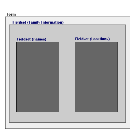
Fig 5. Illustration of nested fieldsets
Non-nested fieldsets

Fig 6. Illustration of non-nested fieldsets
Fieldsets have a convenient <legend></legend> tag that goes directly after the opening <fieldset> tag. The legend tag is used for adding a short descriptive header to the fieldset. The default styling features a square box around the legend text. The border can be removed with the style sheet.
<fieldset>
<legend>Describe the Form</legend>
</fieldset>
The Inputs and Labels
To make a form comply with accessibility standards, each input needs a label. Conveniently, there is the easy to use <label></label> tag.
These are very flexible. The label could go anywhere on the page and it would still be associated with the input field. If someone were to click on the label, it activates the input field, making it much easier for someone with limited mobility to activate a check box or radio button. We need to associate the label with an input field by adding (for="xxx") attribute to the label and the input gets (id="xxx"). This tells the label to look for the input with the same value.
<label for="name">Enter your Name</label>
<input type="text" id="name" size="15">
Let's put together a simple form:
<form action="joinmailinglist.php" class="simpleform">
<fieldset>
<legend>Join our mailing list</legend>
<label for="name">Your Name<label>
<input type="text" size="25" id="name"/>
<br />
<label for="email">Your E-Mail Address</label>
<input type="text" size="25" id="email"
/>
<input type="submit"/>
</fieldset>
</form>
The <br /> tag will keep the fields from running together. Style sheets can give the form the look desired.
To make the form more accessible, we should include a tab index in our inputs for those who cannot use a pointing device. The tabindex="x" attribute allows the user to use the tab key to move from one input to another in a logical order. The first input should have the lowest number and the final submit button usually has the highest number. Care should be taken to not create any conflicts with tab indexes assigned to navigation elements in other parts of the page. If the tabindex attribute is not included, the user can still tab through the form but the order of the inputs focused may not be appropriate.
Style sheets – the fashionable member of the fab three
Now that we've begun creating Web pages that are full of information and have no presentational mark up, we are staring at text and list items on a plain white background. They look just like your standard memo or term paper written in Word or, gasp…a typewriter.
Now we need to make our museums information look fabulous. We want colorful headers, drop shadows, sans-serif fonts with leading to make the text easy to read. We want the paragraphs to flow around the images and we want dancing kitty cats to appear after the page is loaded. Your Cascading Style Sheet can handle all of these design ideas but would probably try to talk you out of the dancing kitties.
Cascading style sheets allow you to personalize data by focusing on how specific your demands are. You may want all of the links to have an underline that disappears when the mouse hovers over it. This would be a global style
a:hover {text-decoration:none;}
To make the links in the main section of the page a pretty shade of green, use selectors to narrow the focus.
#mainsection a {color: green;}
If there are some links in the main section of the page that link to a sister Web site and you want them to have their logo sit next to the link, add a class to the link:
#mainsection a.sisterWebsite {background: url(sisterlogo.gif) no-repeat top left; padding-left:20px;}
This is the cascading part of the cascading style sheet name. You specify a global style and then specify styles for targeted objects. The styles applied to a specific object will over-ride the more generic styles.
The style sheet is a file stored on your server and each page will request it when loaded. When your museum decides it is time to update the site, you only have to change one document to transform the look and feel of the entire site. If your marketing department decides orange is the color du jour, you simply open up the style sheet and change the color from green to orange and every page on your site will reflect the changing tastes of a marketing director.
Dave Shea created the CSS Zen Garden, www.csszengarden.com, to showcase the creative possibilities of style sheets. It invites designers to submit their own interpretations of the page. The HTML of the page never changes, only the style sheets. The gallery has brought forward an amazing variety of Web page designs.

Figure 7. Screen shots from various CSS Zen Garden designs
Style sheets are easy to read and use
As designers we need hooks to apply our styles. Normally, we will use the tag itself to apply a style (img, a, body, table, li, …) If we need to target specific instances of a tag, we will either describe certain nesting behaviors (images inside list items: li img, paragraphs inside a form: form p ) or we will place an id or class on an item (id="maincontent" class="thumbnail"). An id can only be used once on a page; a class can be used many times. The style sheet will refer to an id with a # symbol and the class with a period. (div#maincontent or #maincontent, img.thumbnail or .thumbnail.)
It is good practice to describe the function of the style rather than the description of the style, for instance #main-nav vs. #greenlinks. Main-nav will still be an accurate description when your marketing director decides it should be orange.
Contemporary browsers will recognize style sheets and apply the directions competently. If your museum decides to support the more archaic browsers, such as Netscape Navigator 4.7, you will need to hide your more complex designs to keep the old browser from having a heart attach. This is done by creating a basic style sheet with font, color, borders, and general styles and using the import behavior to attach additional style sheets for layout.
If you are the type that enjoys banging your head against a wall, you will absolutely love Internet Explorer and its anachronistic approach to some styles. Many times, designers will insert hacks in the style sheets to make Internet Explorer act like more standards-compatible browsers. While this may sound daunting, there are many resources available on the Internet to learn the work-arounds (www.alistapart.com, www.positioniseverything.com, www.ericmeyers.com, www.superiorpixels.com ) Mozilla's Firefox, Opera, Netscape, and Apple's Safari are the most popular fully compatible browsers.
You can also specify the delivery option for a style sheet. This allows you to create a style sheet specifically for printed pages, computer monitors, and projection screens. Hopefully the variety of mobile devices, cell phones, PDA, etc will accept the media="handheld" designation and we will have more consistent control over new platforms. Opera has developed a powerful browser for mobile devices, one that is becoming more popular in Europe.
Behaviours – the final piece of the puzzle
To further assist multiple platform compatibility, Web site behaviours are also written to be more generic and taken out of the HTML pages. This could be as simple as placing JavaScript to the deprecation of seemingly innocent attributes that allowed HTML to tell a browser what to do. For instance, in the past we would put (target="_new"/) in a link to open a new window. Since mobile devices, screen readers, and other devices do not like to open new windows, a JavaScript is now used to check for compatibility and if possible open a new window (onclick="window.open(this.href); return false;").
Standards-based Web design also takes advantage of the page structure to create specific actions. The Document Object Model considers how parent and child elements are nested in a document and then targets particular relatives to do specific actions. This allows a visitor to re-sort a table (by clicking on a column header without waiting for a page to re-load), to expand menus, and many other useful behaviors. Many standards-based designers focus on creating Web sites that are enhanced by JavaScript actions rather than depending on them. This creates sites that are more accessible for non-javascript reading devices.
Web Standards And Your Museum
Museums have an obligation to preserve and present important objects and historical concepts. As educational facilities, they also have a desire to expand their outreach. Designing with Web standards will help your museum reach these goals. Your Web sites will be fast, accessible, and affordable. Your extra time and resources can be spent on new projects to further expand your Web presence.
While most sites would benefit from total standards-base re-designs, it is possible to modify your site in stages. Begin replacing extraneous presentational markup with a style sheet, replace nested table elements with unordered lists, definition lists, or other appropriate tags. Use style sheets to create background images and buttons. Start working today to make tomorrow much better.
Cite as:
Drake, T. and B. Rountree, Introducing Standards Into Your Museum's Web Site, in J. Trant and D. Bearman (eds.). Museums and the Web 2005: Proceedings, Toronto: Archives & Museum Informatics, published March 31, 2005 at http://www.archimuse.com/mw2005/papers/drake/drake.html
April 2005
analytic scripts updated:
October 2010
Telephone: +1 416 691 2516 | Fax: +1 416 352 6025 | E-mail: