
Papers
Reports and analyses from around the world are presented at MW2005.
| Workshops |
| Sessions |
| Speakers |
| Interactions |
| Demonstrations |
| Exhibits |
| Best of the Web |
| produced by
|
| Search A&MI
|
| Join our Mailing List Privacy Policy |
Bringing Collections On-line for Children: Using Front-End Research to Develop an Interface
Jill Fruchter, Independent Evaluator/Project Manager and Beth Alberty, Brooklyn Children's Museum, USA
http://www.brooklynkids.org/emuseum/code/emuseum.asp
Abstract
Brooklyn Children's Museum, the world's first museum created expressly for children, is also the first children's museum to put its collections on-line, at Collections Central Online. The site is designed for children ages 8 and up and was recently cited by Forbes.com as a "Best of the Web" children's museum Web site. It features a growing number of artifacts from the Museum's 30,000+ collection of cultural artifacts and natural history specimens from all over the world. The objects are catalogued in The Museum System by Gallery Systems; the on-line site was created using a licensed version of the companion eMuseum that allows for customization. The challenge was to make this utilitarian, adult-oriented database software interesting and fun for children. Front-end evaluation with children helped establish priorities, emphasis, and style. MediaCombo provided production, design, and programming services.
Our focus in this paper is on the research with end users, children ages 8+, that guided our design of the on-line interface for our collections management database.
Keywords: Digitized collections, children, front-end research, audience research, museum education, user-centered design
Background: Building the Database and Context for Public Access
Brooklyn Children's Museum has been digitizing its collection using The Museum System (TMS) since 1997. Since public and staff access were ultimate goals of the digitization process, TMS was selected, in part, because of its built-in public access module. The public access kiosk was installed in 2002 as part of a newly created gallery and associated programs called Collections Central, funded by an NEH Challenge Grant. Collections Central is a prototype for a larger version that will be installed in BCM's expansion, which has been designed by Rafael Vinoly and is currently under construction.
The Collections Central gallery devotes its central area to changing displays of collection objects in six individually themed exhibit cases. Around the perimeter of the space are activities designed to engage visitors in investigating objects in four different modes: looking closely and describing (Look); imagining, or using objects as the starting point for one's own reminiscences, associations, and creations (Imagine); researching and curating: that is, learning more about and through objects (Know); and making, or the process of conception and decision-making involved in creating objects (Make). The database kiosk is part of the "research/curatorial" element of the gallery.
The public access mode built into TMS proved immediately to lack "face appeal" and to discourage use by BCM's visitors, children and adults alike. The gray screens and text-based buttons of the opening screens offered few clues to the excitement and color of the objects within and little incentive for children to move deeper into the database. Therefore, even before Collections Central had its official opening, we decided to accelerate the creation of a more child-friendly interface.
The First Step: Defining Goals and User Experience
The project began with a series of meetings to identify and define main goals and the desired user experience. It was determined that the purpose and goals for the site would directly align to those of Collections Central itself:
- to provide an environment where people can encounter, reflect on and respond to objects and related meanings
- to increase and foster access to the Museum's collections.
Likewise, the target audience for the site matched that identified for the gallery: children eight and up, their families and teachers.
Documenting our definition of the desired user experience proved to be an opportunity to join the unique affordances of digital interfaces with the long-term educational goals for the gallery and its programs, perhaps reading more as manifesto than style guide:
The interface should encourage autonomous, self-motivated exploration and discovery. The interface should inspire and empower an inquisitive spirit rather than expressly support a linear research agenda. The user should never feel lost, that she can not get to where she wants to go, or that she's at a dead-end. The experience is one of layering and overlap, not one-way alleys. As such, the various ways one might inquire or seek to discover should be encouraged throughout via various modes of encounters, not something that disappears if you do not choose it at any one point in time.
As it turned out, eMuseum, Gallery System's TMS Web interface, already supported many points of this desired user experience with extensive built-in functionality, including a "related objects" sidebar that appears on every object page as well as a powerful search engine. We would take advantage of the licensing option enabling extensive front-end customization along with the flexibility to add on original components. Being Internet-based rather than simply networked, it would also broaden the audience both offsite and within the Museum. We were also excited by the promise that further interactive features such as "publish" and "collect" would be added to future releases of eMuseum, both of which could be adapted into on-line activities. What we would need to build from scratch would be an original home page and global navigation environment that would further transform eMuseum into the child-friendly Collections Central Online.
Using End-User Research to Guide Site Development: A Case Study
The next step was to prove the concept among our audience. We were being true to ourselves, but what did this all mean to a nine-year-old? To stay in touch with our audience as the project evolved from concept to design to implementation, consecutive rounds of testing were executed. This research was not the expensive, time-consuming, outsourced variety. Rather, it was scrappy and homespun, carried out by the project team, using whatever methods suited the next decision at hand. In all, there were four rounds of testing, each representing a different stage of the site's development, each resulting in actionable implications, plus a "discovery" phase, before any programming or design was begun. During this phase, for example, we compiled a running list of Web sites that we could learn from in some way (collectively called "Random Sources of Inspiration").
The first round of testing consisted of intercept interviews with gallery visitors who were asked to respond to three different paper prototypes of a home page, featuring objects and activities in varying proportions. Two weeks later we conducted a focus group with a sample of children from our "Kids Crew" after school program. Four months later, we tested interactive walkthroughs with weekend gallery visitors, to be followed seven months later by on-site and remote beta testing of the all-but-completed site with children, parents, outside educators, and BCM staff.
Round 1 Research: Paper Prototypes
In the initial round we conducted interviews with boys and girls ages seven to ten years old who were visiting the gallery one weekend. We wanted some answers.: How do we create a front page that invites exploration? What activities are most interesting to kids? We presented paper prototypes of three different home page concepts to scaffold the discussion.
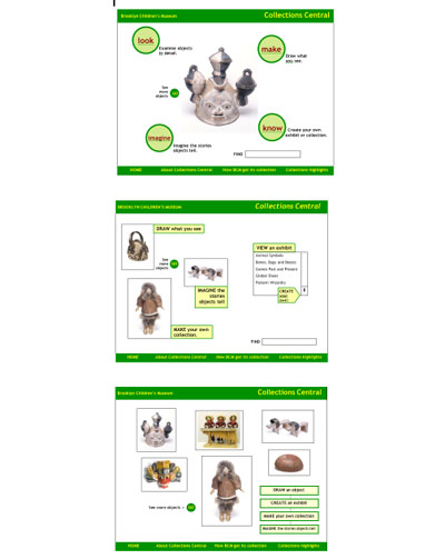
Fig 1: paper home page prototypes for round 1 testing
As it turned out in round 1 and in subsequent rounds, interest in any one of the three home page prototypes was directly tied to the child's curiosity about, and attraction to, a particular object on the page. The objects themselves, not the activity links from the home page, were most compelling.
As such, most children favored the home page with the most images. When asked what they would do next, they said they would want to find out more about a particular object, including "where it's from," "how long ago it was made," "what it was used for," "how we got the objects," and "how valuable it is."
Next, the kids were most interested in the possibility of a drawing program followed by the "make a collection" activity. Even with drawing already an activity in Collections Central (two permanent drawing horses are installed), kids liked the idea of an on-line drawing program that would give them more options in terms of colors, tools, stamps, paintbrush effects, etc. Adding a writing component to the activities also generated excitement when mentioned, although the term, "imagine stories" did not translate so well.
Round 2 Research: Getting on the Computer
Round 2 was a focus group with ten children ages seven to ten from BCM's after school program. We wanted to get kids looking at the database itself, and we wanted to dig further into some questions. What do children want to know about our collection objects? How do they want to interact with them in a digital environment? First, we asked kids to find a "favorite" object in the gallery. Then, while they sat together and looked at the TMS public access database projected onto a large screen, we looked up the objects they had chosen. Key Kidder "drove" while Jill Fruchter led the discussion.
The kids selected a variety of objects as favorites: a Navajo shoulder bag, an Indian harp, a mask from Papua New Guinea, a Ganesh statue, and a Hindu mask. When asked what they wanted to know about their objects, they said they always wanted to know "how it was made," "where it was made," "the history of it," and "what made them think of the idea." They sometimes wanted to know, "what it means," "what year it was made," "how long it took to make it," and "who wore (or used) it." However, while they were interested in learning the answers to these questions and the information was there in the object record, they were often unable to find the answers because of the lengthy and densely worded text.
Two built-in interactive elements of TMS (scrolling through "light box" views of dozens of images at a time and the zoom function) had obvious appeal to the kids. They got excited as Key zoomed in and out on the images. They asked questions, laughed and generally became more animated. They also enjoyed looking at object records that showed multiple views of the objects, allowing them to see an object in a new way (hence the final site's development of that feature).
As the closing activity, kids were asked to create their own collections of objects from the database. Children came up to the screen individually and pointed to one or two objects thatthey would like to include in their collection, as Key scrolled through dozens of "light box" views of random objects. The kids really enjoyed the momentum of the experience, seeing screen after screen of images, while still being able to focus on a few objects of personal interest. The objects chosen included dolls, a dollhouse, masks, jewelry, clothing, and a familiar cartoon figure.
Finally, when asked how a computer program could make the objects more interesting to them, they talked about "being able to color the object," "adding background images to objects," "drawing their own and adding details," and "writing about it."
Round 3 Research: Interactive Walkthroughs
The third round of research took place one weekend at the kiosk in Collections Central. Twelve children, ages seven to twelve, were asked to explore the interactive walkthrough while being observed and interviewed. While we tested a single set of interior pages with the same design and functionality, we rotated three different home pages through the interviews to continue to evaluate the appeal of various approaches. The last part of the interview had kids pick the home page they preferred.
No matter what home page was in rotation, most kids clicked on an object (vs. an activity link) to enter the site. When asked why they chose the object they did, they said: "If it's surprising;" "Stuff I never saw before;" "Color;" or, "Looks interesting." Ultimately, the majority of kids chose the home page that is most like our current one as their favorite. When asked why, they referred to the number of choices as well as the diversity of objects presented. They also liked the ability to plunge right in:
"Has the most stuff to see." (Kelly, age 10)
"Has all different things. Sums up the Web site." (Tyrik, age 11)
"Looks colorful." (Shantella, age 10)
"Can go to more stuff easily." (Jason, age 9)
One of the main observations from this round of testing was that kids enjoyed "surfing" the site and responded positively when the navigational elements made it "easy" for them to jump from object to object. While their first object selection is personal and specific, they were happy to surf the site in a more serendipitous way after that, taking advantage of the "related objects" links, perusing alternative objects on the ensuing search results pages, or simply using the forward and backward buttons on the page. Others would return to the home page to pick another object and "keep going." It was clear that kids were always looking for the next object to check out.
For the most part, kids did not seek out the search screen to find new objects. Even when asked to search for a category such as "musical instruments," they would look for a picture of an instrument first before they relied on the search screen. Once the search page was located for them, they liked the different types of searches available, particularly the drop-down menus. Similarly, only when the Exhibits page was pointed out did the kids explore it. They chose to check out exhibits depending on which ones were represented by attractive/colorful images and/or clever titles.
On the Object Record page, kids stopped to read the information and consistently explored the related objects group available from the sidebar. Most kids were drawn to the activities placed directly next to the image. They lit up when it was explained to them what they would be able to do once the site was fully implemented (i.e. draw, zoom, publish, collect). The Zoom tool was consistently praised as "cool." Seeing kids' drawings almost always prompted a click and the drawing applet proved easy to use.
Round 4 Research: Beta Testing and Observation
Fourteen testers reviewed the site remotely when it was close to finished. They used a protocol that guided them through open-exploration of the site and several usability tasks. Testers returned pre-formatted Web site test logs documenting their experience. We also conducted on-site observations of children (and their families) with the site installed in the Collections Central gallery.
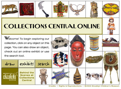
Fig 2: CC On-line Home page http://www.brooklynkids.org/emuseum
Testers were consistently positive about the site's appeal, ease of use and attractive Home page. The site was described as: "easy to navigate, clear and straightforward;" "clear and easy to understand;" "clear and attractive;" "easy to use, informative and fun." Almost all testers entered the site by clicking on an object from the Home page (vs. through "Exhibits," "Draw," or "Search" buttons).
On the Object Record page, reached by clicking any object image on the Home page or elsewhere in the site, testers enjoyed the Zoom function, Other Views, and More by the Same Maker links, which were a favored means of browsing. As one user said, "Fun just to sort through all the different objects. I liked how you were prompted to see more by the same maker, from this exhibit, etc."
Some testers found the site geared toward a higher age level than the site is intended for because of the amount and "sophistication" of the text. Others found the writing to be "easy to understand," "well written," and suitable for a variety of audiences.
The Zoom function was consistently enjoyed: "Zoom works well and is a very nice feature. My favorite!"
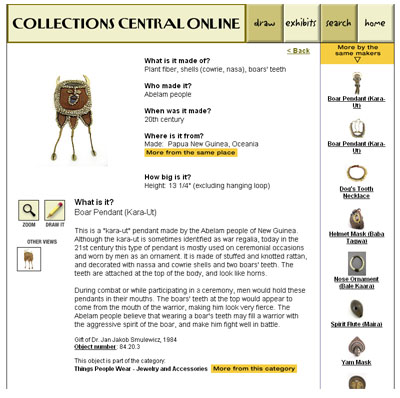
Fig 3: CC Online Object Record page
The Drawing page was consistently praised as a favorite part of the site. However, while its appeal was broad, so were the technical difficulties associated with the program itself, a java applet that is highly volatile due to varying desktop configurations for supporting java (http://www.anfyteam.com/panjava.html).
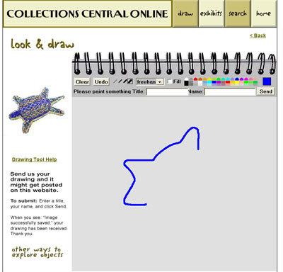
Fig 4: CC Online Drawing page
The search function was often found to be less than precise, and users wanted greater access to ‘advanced' searches.
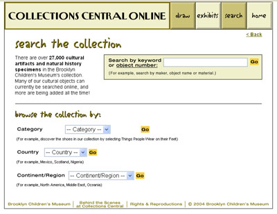
Fig 5: CC Online Search page
A couple of users who spent time on the Exhibits page said it felt "limiting." Another tester said, "I liked the on-line exhibits. Will they be adding new ones, and changing them every once in a while? Because you can go through them pretty quickly."
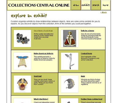
Fig 6: CC Online Exhibits page
The on-site observations with kids and families reinforced the above findings and offered new ones. The site is appealing to parents and children alike. Parents use it while their children are exploring the gallery; parents and children use it together, with the parent helping out with reading or suggesting where to go on the site; and/or, children come to it on their own – browse object to object, zoom and draw.
People quickly click on an object of interest from the Home page and then just dive in. The "See more by the same maker" column is a favorite way to browse the site, one object at a time. Some users return to the Home page to "see more stuff."
Some of the site's features could use additional explanation. For example, kids and parents aren't using the Zoom tool to its maximum potential,l and the drawing program's tools aren't always self-explanatory.
Below is a representative observation that reflects our original goals for the desired user experience:
Two boys, ages 10 and 11:
They come up to the kiosk after looking at a case of objects. They're clearly friends. They immediately click on the Carranca figurehead from the Home page and begin to read the page – often reading out loud to each other. They click to zoom: "Wow." They talk to each other about what they see as they use the buttons to zoom in, out, and across the object. "Let's look at something else," one says and clicks on the Home page to choose a new object. They decide to look at the Prestige Knife. They read the questions and answers at the top out loud to each other along with some of the label text below. For each of the Prestige Knife related objects, they quickly go to the Zoom tool. They slide the Zoom window across the page as they alternate between reading and zooming. "What's that up there?" "Looks like a boomerang." They refer to the text to answer the questions they have about what they're seeing.
When asked what else they would like the site to have, they said: to be able to "write what you think about it and to see what other kids wrote." When asked what they want to read about on the object page, they said they "want to know about the people who made it, what it means to them" and to read "stories about it."
Research Findings and Conclusions
Each round of research served meaningfully to inform the next stage of development. By taking an iterative approach, we felt we were moving forward, gaining the clarity and confidence necessary as we continued to make tough decisions on behalf of the end-user. What follows is a collection of findings and implications synthesized from all rounds of research.These will continue to guide development of the site.
Finding: Interest in our collection happens one object at a time. Which object will grab a child's attention, however, is based on individual interests, a desire to find "kid stuff," or just something that generally sparks their imagination and makes them want to know more ("How was that made?" "Who wore that?" "I want to make that."). In order to increase the odds that a child's first encounter with the Web site will lead to exploration, we need to create a home page that maximizes the possibility for a child to find an object of interest from the start.
Conclusion: The Home page should include a dense concentration of pre-selected objects to capture attention and draw kids into the database. These "gateway" objects need to be selected to reflect kids' interests, and be visually intriguing on their own, while also reflecting the scope of the collection as a whole. We also need to minimize barriers that could come between a user and an object – no extra pages or editorial interference.
Finding: The Object page is the key to the site. It is both destination and launch pad for activities and exploration of related objects. More than the search page, objects are being used to find other objects.
Conclusion: Making all aspects of the Object page as accessible and engaging as possible is critical to sustained and meaningful exploration of the site. Building out records at the back-end to have multiple relationships with other records and record groups on the front-end will pull users into the information and help guide them through the collection.
Finding: Enabling kids to create and participate is key. Kids want to make an object their own by doing something to it: drawing it, writing about it, adding a background, coloring, zooming, etc. In one way or another, they want to know "What can I do with this object?" They want to be able to say: "That's mine," or "I did that."
Conclusion: The tone, design and functionality of the interface should invite participation and interaction. Adding a drawing program to eMuseum proved critical in making this connection for kids. It validated kids' ability to interpret the objects for themselves and to participate on the site. We included kids' drawings of objects in the "Other Views" section of the Object page in order to affirm that a child's interpretation of an object is an important and legitimate view. Eventually, we hope to have a "grand gallery" of children's drawings that will be linked to the Object and Drawing pages.
Finding: Kids become more inquisitive as they see multiple perspectives of an object. Zooming and seeing multiple views of an object is exciting and fun for kids. As they see more, they ask more questions.
Conclusion: Previously considered Phase Two, the zoom feature was moved up to Phase One because of its inherent promotion of the inquiry process. The zoom feature is now considered an activity, not merely a "tool."
Finding: Kids approach objects with questions, and there is consistency to what kids want to know about our objects. Kids always want to know how it was made; where it was made; the object's history; and what made the objects' creators think of the idea. Kids sometimes want to know what it means; what year it was made; how long it took to make; and who wore or used it.
Conclusion: The decision was made to transform the traditionally passive presentation of tombstone data on each Object page into a question and answer format that reflects the inquiry process while prioritizing the types of questions kids ask. The identification of what kids want to know was also used to define the minimum data field requirements that determine whether an object record is ready to be released on-line. Finally, recognizing kids' information interests will continue to provide editorial direction for new copy.
Finding: The language and length of text being used in the object records during initial testing was not always kid-friendly, thus inhibiting access to the information kids want to know.
Conclusion: All TMS records made available to eMuseum need to be edited to be more accessible to the target age range. Previous records written from a "curatorial" perspective have to be edited to intrigue a nine-year-old! Longer text passages need to be broken up into shorter "chunks" to encourage reading.
Finding: Kids are instantly drawn to things by, for, and about kids. They are wary of anything that looks "adult." Kid stuff is more than subject matter (e.g. cartoon figures, dolls, etc.). Visual cues such as color and graphics provide kid appeal as well.
Conclusion: The interface and its components should POP with kid-centered appeal while maintaining the overall identity developed for Collections Central.
Finding: The "Look, Imagine, Make, Know" conceptual framework that is so closely tied to Collections Central's identity in its gallery setting does not have a direct function on-line. It failed to capture attention during testing either as a navigational device or as part of any general design.
Conclusion: In order to incorporate these important concepts into Collections Central Online, it was decided that they would be the centerpiece of an attract loop, or screen saver, that stayed on the computer between uses in the gallery and would eventually be reformatted into a downloadable screensaver for remote users (http://www.brooklynkids.org/cconline.)
Looking Ahead: Phase Two
Our current status is that we have a launched site that is capable of development, we have identified near-term fixes, and we have created a wish list of additions to make during a second phase.
The back-end work of completing and grooming records, rewriting text, adding records, adding kids' work, creating "exhibits" and handling the numerous tasks associated with this work has been completed for the 1500+ cultural artifacts on the site. We are moving forward relentlessly to publish the entire 12,000-total cultural collection while preparing the first of 18,000+ natural science specimen records. The near-term fixes and a modified object page for natural science specimens will be completed this spring.
Phase two, pending funding, includes
- the development of an enhanced and more broadly compatible drawing program
- enhancements to existing pages; e.g. an interactive map for geographic origin on the object page; an "on exhibit now" flag; a hyperlinked glossary; a visual way to communicate the scale of an object; links to donor/collector information
- the capability to combine search criteria
- a short animation explaining the meaning of the object number
- making pages print-friendly.
The wish list for new activities includes "Make your own exhibit" with opportunities for kids to write labels and interpretive text. Other write-in options are a guest book, a query-to-the curator page, or a journal similar to the Drawing page. Providing visitors with a way to lightbox two or more selections would facilitate comparing and contrasting. The capability to email images to others might be a popular feature. We would like to develop an activity that explores the impact of context on object meaning. A "behind-the-scenes" video tour of collections storerooms could be associated with a virtual "Rearrange and Store these Objects" activity in which visitors manipulate the compact storage and open cabinets and drawers.
We also envision ways of using the site to support teachers' work, coordinating thematic guides with pre-selected groups of objects, and correlating school visits with pre- and post-visit activities and information on-line.
An important addition will be an on-line audience survey. The front- end research has been so fruitful that we are committed to continuing to evaluate as part of development. We will soon begin evaluating Collections Central exhibits and programs in preparation for enlarging and reshaping the gallery for the new expanded building in 2006. Collections Central Online will be a part of that process. Learning from our end users – the children, families, teachers, and staff who are our primary audience – will help us to shape the site and to prioritize its growth.
Acknowledgements
Jill Fruchter, former BCM staff member, served as Project Manager. Beth Alberty, BCM Director of Collections, was Project Director. Others on the BCM team consisted of Key Kidder, Collections Information Technology Manager; Leon Waller, Senior Project Development and Manager of Collections Central; Melissa Husby, writer, anthropologist; and Hazel Lee Chee, BCM Manager of Technology. We worked with Priscilla Greene, Kevin Arista, Brian Jennings, and Dmitri Vessensky at Gallery Systems. Owen Electric Pictures, Inc. (since renamed Media Combo) helped develop, design, and program the site. Their team consisted of Robin White, producer; Randy Silver, project manager; Phil Wilhelm and Samantha Orme, designers; and David Gochfeld, programmer. We thank you all!
Cite as:
Fruchter, J. and B. Alberty, Bringing Collections On-line for Children: Using Front-End Research to Develop an Interface, in J. Trant and D. Bearman (eds.). Museums and the Web 2005: Proceedings, Toronto: Archives & Museum Informatics, published March 31, 2005 at http://www.archimuse.com/mw2005/papers/fruchter/fruchter.html
April 2005
analytic scripts updated:
October 2010
Telephone: +1 416 691 2516 | Fax: +1 416 352 6025 | E-mail: