
Allegra Burnette and Lyde Spann, Museum of Modern Art, USA
http://www.moma.org http://www.momastore.orgAbstract
In the summer of 2005, The Museum of Modern Art launched a redesign of MoMAstore.org. Among the goals for the redesign was the creation of stronger visual ties between the Museum's main site, MoMA.org, and the on-line store. This paper will explore the development of the two sites, starting with a brief history and then looking at the current implementations. Topics to be covered include the relationship between the identity of the on-line retail environment and the Museum's overall identity, links and crossover between the two sites, and the impact one site has on the other. We will also discuss common functions, such as e-news, search, and traffic reporting.
Keywords: MoMA, store, redesign, traffic, design, retail
Introduction
The Museum of Modern Art reopened in midtown Manhattan in November 2004 with new and expanded gallery and retail space. Part of the project involved establishing a visual language between the Museum and the Design Store, with the Design Store having its own space and voice but clearly established as part of The Museum of Modern Art. Since the reopening, a similar dialogue has been taking place between MoMA.org and MoMAstore.org, resulting in the August 2005 redesign of MoMAstore.org. Following the redesign, which strengthened the visual relationship between the two sites, our efforts have been focused on enhancing the cross-promotions between the sites and establishing more efficient tracking and communication with our visitors.
Background

Fig 1: Screenshot of MoMA.org, 1997
The Museum of Modern Art’s Web site, MoMA.org, is celebrating its tenth anniversary this year. Launched in 1996 through the Graphic Design Department by Greg Van Alstyne, with later contributions by Oven Digital, the site contained basic information about the Museum, as well as some Web-specific projects. The site design was updated in 1999/2000, and for a brief time it was partially managed through RunTime, a dynamic content-management system by SohoNet. In 2002, the Museum was preparing to close temporarily in Manhattan and move to Queens for the remainder of the construction project. With all the changes occurring in the Museum, it was time for the Web site to receive the same rethinking, restructuring, and new look. In the spring of 2002, the Digital Media Department embarked on a complete redesign of MoMA.org, to be designed, developed, and hosted in-house.

Fig 2: Screenshot of MoMA.org, 2001
MoMAstore.org
MoMA’s On-line Store was originally launched in the summer of 1998, on Intershop 4, a WinNT platform. The initial Web site was created by Pixel Park, a design firm based out of Berlin, Germany, and the site was hosted externally by GPI in Virginia.
The site’s first significant retail contribution came shortly thereafter, during the Jackson Pollock retrospective (November 1, 1998-February 2, 1999), with the Web site supporting the sales of exhibition-related merchandise such as catalogues and posters.
In an effort to alleviate overbearing performance and reliability issues, as well as to scale MoMA’s on-line retail growth in accordance with the potential of the emerging e-commerce marketplace, MoMA partnered with the design firm Icon Medialab, (based out of San Francisco). In February 2001, MoMA migrated to the Intershop Enfinity platform, which supported commerce transactions via a network of affiliated Web sites, contained simpler administration features, and most importantly, was aligned with emerging JAVA technologies. This solution was viewed as the optimal choice for strategically growing MoMAstore.org without having to reinvent the wheel. At this juncture, MoMA also migrated systems out of GPI to a fully managed hosting solution by Quest Communications.
At the time of this initial 2001 redesign, the On-line Store had an opportunity to distinguish its Web presence by strengthening and reinforcing its connection to the Museum and reinforcing the strong diversity and high quality of its distinctive product line. In the collaboration with Icon Medialab, this was accomplished by focusing on negative empty space and clean, functional design. Although color was initially intended to consist of spare, subtle, and muted hues, the end product resulted in a bolder flat-blue color that reflected both the minimalism illustrated on MoMA.org and the brand color utilized in MoMA’s physical store locations at the time.
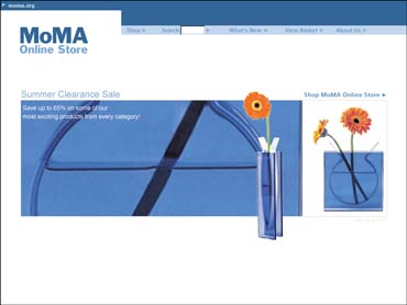


Fig 3-5: Screenshots of MoMAstore.org, 2001
In the fall of 2002, in an effort to improve site-performance, MoMA’s internal IT resources opted to leverage in-house expertise of the iSeries platform by migrating to the robust, retail-oriented IBM Websphere 5.4 platform, utilizing the iSeries, an IBM application server. In maintaining the complexity of IBM Websphere 5.4, MoMA began to shift towards an internal hosting environment, and allocated a full-time dedicated IT staff member towards supporting the On-line Store retail effort. In the fall of 2004, the site was migrated from the iSeries server to a Microsoft Wintel platform (Windows 2000 and Intel processor based servers). This allowed for scaling to the projected performance needs required with the upcoming Museum reopening in November 2004 by moving to a multi-tier environment (six servers vs. one).
Redesign of MoMA.org
In 2002, the Digital Media Department embarked on a major structural overhaul and redesign of MoMA.org, with the launching of a “relook” to coincide with the temporary move to MoMA QNS in Queens. The relook, which focused on changes to the home page and information about visiting the Museum, offered an opportunity to dip into the redesign process before launching a more complete redesign initiative. At the same time, focus groups from the various departments around the Museum were assembled so the team could learn more about their wishes and priorities. The outcome of those meetings formed the basis for the revised site architecture. A review group was formed to advise on the design itself, and the complete site redesign was launched in November 2002.
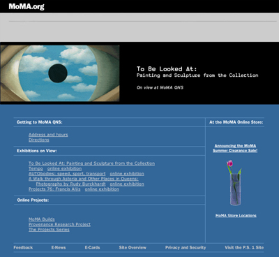
Fig 6: Screenshot of MoMA.org’s “relook”, 2002
Some of the conversations around the redesign focused on the relationship of the Web site to the Museum itself. Did we label the site MoMA.org or The Museum of Modern Art? Was the graphic identity the same as the Museum’s? Should we consider the Web site an additional location for the Museum? All of these questions went into establishing an updated on-line presence for the Museum that is considered a separate location with an identity that falls within the Museum’s overall identity umbrella, but with variations that provide a distinct voice. The home page, for example, is labeled MoMA The Museum of Modern Art, but from there on the site is identified as MoMA.org The Museum of Modern Art: a subtle distinction, perhaps, but one that reinforces the name of the site to those who may have come through a link or search engine. The Museum’s color palette - from the green of the Vermont slate floors to a digital equivalent of the custom Pantone red that was created for the logo to the soft blue that made reference to the blue of MoMA’s past - was used and expanded upon, with different colors demarcating the different sections of the site. The Museum’s signature font - a digital version of Franklin Gothic created by Matthew Carter for the reopening - was used, but it is supported on-line with the secondary font Din, which has a larger family of variations and holds up better on-line than the secondary font used throughout the Museum (a tweaked version of Trade Gothic).
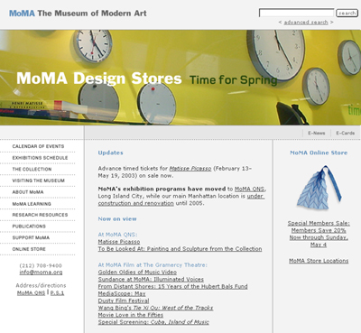
Fig 7: Screenshot following MoMA.org’s complete redesign, 2003
In addition to a new look and structure, the redesign project included adding several services to MoMA.org: Atomz for the site’s search engine, Hitbox for site tracking, and Silverpop for E-News.
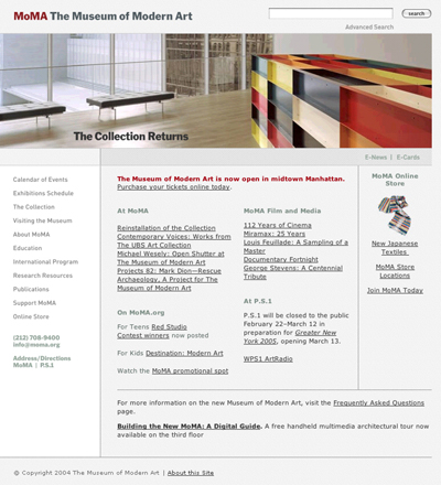
Fig 8: Screenshot of MoMA.org, early 2005
Museum Reopening
In November 2004, the Museum of Modern Art reopened its doors in the heart of Manhattan, complete with a stunning new building designed by Japanese architect Yoshio Taniguchi. Simultaneously, the MoMA Design and Book Store, designed by Richard Gluckman, opened with an entrance directly off of the Museum’s lobby, similar in relationship to that of the right-hand store presence on the home page of MoMA.org. The previous locations of the Design Store remained across Fifty-third Street and in Soho.

Fig 9: The Museum of Modern Art. Fifty-third Street entrance. Photo © 2005 Timothy Hursley
The successful integration of these related yet separate functions of the Museum visitor experience - visiting the Museum versus shopping at the Museum Design and Book Store - was immediately evident in the unforeseen traffic now entering the Design and Book store on a daily basis, averaging approximately 68% of daily visitor traffic to the Museum. That business was beyond initial projections and redefined the potential of the Museum Design and Book Store as a source of revenue for the Museum. Similarly, in the weeks preceding the Museum’s opening and through the initial Museum reopening period (defined as November 11-December 31, 2004), MoMAstore.org’s traffic increased approximately 58% versus the same period in the year prior, also surpassing initial projections. In a parallel comparison, MoMAstore.org’s unique visitors were approximately 46% of those of MoMA.org’s during this Museum reopening period. These results indicated a real opportunity to explore the user experience between MoMA.org and MoMAstore.org.
Redesigning MoMAstore.org
With the resounding success of the Museum’s Design and Book Store, and in an effort to emulate this seamless yet distinct identity in the virtual world, MoMAstore.org began to contemplate an on-line redesign. The focus was centered on the implementation of both updated commerce features and functionality, and an updated graphic identity more closely aligned with the redesigned MoMA.org interface.
The first steps taken were to understand what features and functionality were available in the e-commerce marketplace that MoMAstore.org had not been taking advantage of since the last functional and UI iteration of the site in 2001. The consultant company the e-tailing group, out of Chicago, Illinois, was commissioned in February 2005 to perform a site audit of MoMAstore.org. The e-tailing group process is defined as a series of steps, including preparing a strategic questionnaire, which was completed by the MoMA Retail team; completing a site audit of the MoMA Retail site, which benchmarked the MoMA’s shopping and merchandising experience against a customized “e-tailing” index of both leading multi-channel retailing companies (such as Crate & Barrel, Red Envelope, and Williams-Sonoma), as well as museum retailing sites, furniture sites, department store sites, etc.; and suggesting industry best practices and specific tactics aimed to drive best-in-class e-commerce practices.
Based on a presentation that led the MoMAstore.org user experience from the entry point on the MoMA.org site through the checkout process, the MoMA retail team decided to focus on the following site initiatives to drive the maximum return by focusing on improving the user experience.
Improvements
- an improved global navigation that brought merchandising categories to the home page, making the breadth of categories clear from the outset.
- a revised home page template that integrated greater product visibility and “seasonality” into the home page design (rather than showcasing just a single product).
- a “view all” button on all sub-category pages, allowing for quick browsing of products within a given sub-category.
- an improved product information page, with a restructured layout that included more legible text, multiple products on a given page, and most importantly, multiple images that could now be viewed in a pop-up window.
All of these initiatives attempted to improve conversion once a user entered the site by making the shopping experience at MoMA as quick and convenient as at other leading ‘e-tailers,’ in line with the expectations of a modern on-line operation.

Figure 10. Screenshot of redesigned MoMAstore.org, 2006
The Process
Whereas previous designs to MoMAstore.org had been by outside consultants, this redesign was done in-house through collaboration between the Retail, Graphic Design, and Digital Media departments. Digital Media, which had completed the redesign project of MoMA.org, was able to bring that experience to bear on this project. The design process began by extracting the grid from MoMA.org and seeing how it could be translated to MoMAstore.org. The goal was to have two distinct yet compatible sites, and the approach was to maintain the grid structure between the two, while changing the elements within those grids. Ideally, visitors moving from one site to the other would not go to radically shifting pages, but from one set of visual references to another within a similar structure.
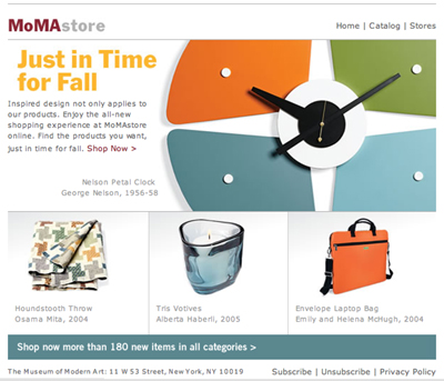
Once the overall layout was established, efforts turned to color and image treatment. MoMAstore.org had never incorporated the MoMA red prior to this stage, and so that was one of the first elements to be brought over, establishing a closer visual connection to the Museum. After looking closely at several possibilities, the primary accent color used in the site became the new, softer blue. Due to the strong presence of blue in the previous site design, using this new blue maintained a connection with the past while bringing the site into a current, up-to-date palette. Additionally, there was a font overhaul that focused on consistency with established MoMA fonts. The MoMA Gothic font was used for the new MoMAstore.org logo. MoMA Gothic was also used in certain constant elements, such as bolded footer text throughout the user experience and within product flags that referenced either “MoMA exclusive” (exclusive to MoMA for a specific time) or “MoMA collection” (featured in the Museum’s Design Collection) products. TradeGothic was used for other image text, while Verdana was used for all HTML and dynamic text, creating a clean, minimalist approach in line with that of MoMA.org. MoMAstore.org also took this time to make font size consistent (font sizes had varied in previous site iterations), make buttons appear more ‘clickable,’ and enlarge images to accommodate now standard monitor resolutions. Finally, as a result of the increase in international visitors to the reopened Museum, the incorporation of icons on key pages (a shopping cart on the home page, arrows, and a specific icon for “add to basket” in a distinctive red) now made the site ‘foreign-friendly,’ to guide the foreign-user shopping experience.
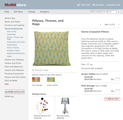
Fig 11: Screenshot of redesigned MoMAstore.org, 2006
MoMA produces a catalog showcasing its retail products each fall and spring; with the redesigned home page template, there was an opportunity to incorporate strong cover branding images within the home page “hero” space, creating a consistent story for MoMA shoppers who receive the catalogue and also visit the Web site - a fast growing population. Images of products featured in the catalogue are silhouetted against a white background, adding shape variety to the page and drawing the focus to the products themselves, while the rest of the page recedes. On the home page, rectangular areas designate feature sections, but here the images break out of the box, creating not only visual interest but also an identity that is distinct to the on-line store.
The entire process of establishing a design language took three weeks, with an additional three weeks for the application of that language throughout the site (work that was done by an outside freelancer), and ongoing tweaking throughout the development and post-production phases.
Fig 12: Screenshot of redesigned MoMAstore.org, 2006
Part of redesigning the on-line store included a naming dialogue similar to the one that took place during the redesign of MoMA.org. Formerly known as the MoMA Online Store, the Web site is now referred to as MoMAstore.org. This creates a clear relationship between the Museum, the Museum’s primary Web site, and the Museum’s on-line store. And, because all sales at the store support the Museum’s exhibitions and programs, it was important to us to reinforce both the connection to MoMA and the connection to the .org part of MoMA, also a parallel to the MoMA Design Store catalogue. Part of what distinguishes museum stores in general from other on-line shopping experiences is that purchases support the efforts of the non-profit cultural institutions, and this is definitely an important distinction to make the visitor aware of throughout the user experience.
E-News
E-News has been a feature on MoMA.org since 1998/99. Presently it is run through a service provided by Silverpop. Nine different e-newsletters are offered, and the lists, layouts, and mailings are managed within the service. Since November 2004, the number of E-News subscribers across all newsletters has increased 350%.
MoMA’s retail group approached the redesign of their e-newsletter in line with processes outlined above. There was a two-pronged process focused on streamlining our marketing message to increase clickthroughs to the site once a visitor opened the MoMAstore E-News, while also adhering to the new clean space and user-friendly fonts and graphics of the site design. There was a competitive analysis conducted comparing the MoMAstore E-News to an array of other leading versions, including multi-channel retailers, other museums, department stores, etc. A few key discoveries were made through this process. Most sites had several templates embedded within a consistent framework, allowing for greater creative flexibility in delivering the key marketing and merchandising message of the e-mail. Visuals appeared to be the key driver in the majority of E-News campaigns, creating a clear message that can be quickly grasped and stand out among a barrage of other e-mails.
Whereas MoMA had initially used a single template for the monthly E-News, which began as more of an e-newsletter, over the years it had evolved into a combination of product images with explanatory copy. In balancing the key factors discovered through our competitive analysis, we first approached the establishment of conversations that could be conveyed through different templates. The creation of multiple templates was intended to drive our subscribers’ interests (and, hopefully, click-through rates) while allowing the Retail team to leverage existing formats without having to reinvent the wheel each time. The next focus was the frame; specifically, the creation of the most minimal framework possible, to allow for more dramatic image placement within the E-News. Using the style guides produced by the MoMAstore.org redesign, we incorporated the new MoMAstore logo in MoMA red and gray. Red was also to be used for attention-grabbing headers that frame the content within the e-mail. Also, bearing leading e-mail carriers in mind, we streamlined the top navigation and footer text to remain in the grays used on both MoMAstore.org and MoMA.org. To simplify the shopping experience, links outside the content area were reduced to eight from an initial fifteen, and a modified version of the Web site navigation was implemented, abandoning the previous format’s literal representation of the site’s navigation.

Figures 13 and 14. MoMA Online Store E-News, early and late 2005
A key change was creating a ’multi-channel’ shopping experience and reinforcing this capability with our subscriber by having only three shopping links: Home, Catalog (where a user could either request a catalog or shop via our catalog quick-order service), and Stores. Through our design phase, we discovered the context and purpose of our final four templates. Template one would mirror the new home page template design and leverage these existing assets, while producing a consistent message with our Web site. This template would be utilized for seasonal launches (Fall, Holiday, Spring, and Summer). A second template was devised to leverage catalogue photographic assets that often use clean materials (wood, acrylic, metals) as backgrounds to contrast with difficult-to-see silhouette product images. This template would be utilized for product stories such as ‘holiday entertaining’ or other catalogue spreads. The third template featured two distinct stories: one that could be product-focused, the other event-focused (such as our Members Shopping Days or a book signing at the Museum). This template was used when multiple messages needed to be communicated to our subscriber. Finally, there was a template that would typically feature only one graphic message, created by our Retail Graphics Department, for events such as End of Season Sales and Members Shopping Days.
Our first redesigned E-News was delivered shortly after the redesign went live in August of 2004. Since this date, the number of subscribers in the MoMA retail subscriber database has doubled. This amazing feat is the result both of Web site, store, and call center efforts to find out if people are interested in receiving information via e-mail, and of the new format, which has kept our unsubscribe rates in check and allowed this list to continue to grow. As our e-mail list grows in the future, our next steps will be in determining frequency of E-News deliveries - currently Retail averages one E-News every three weeks during peak periods and every four weeks during non-peak periods. As our subscriber database grows to a certain threshold, we will also begin exploring segmentation and driving ‘store specific’ messages to those customers within the tri-state NYC region. At the same time, the process for the store E-News redesign is now being applied to the rest of the Museum’s E-News offerings, with an eye towards consolidating, clarifying, and increasing the effectiveness of this form of communication with MoMA’s visitors.
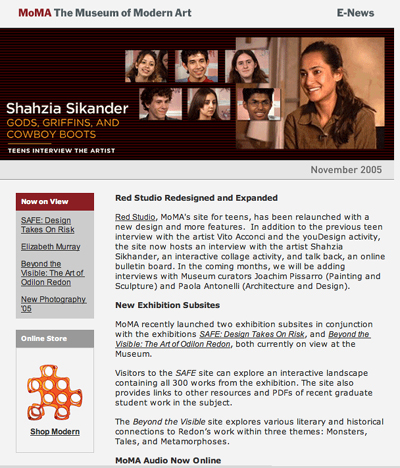
Fig 15: Screenshot MoMA Web Site E-News, 2005
Traffic
Using our Hitbox on-line reporting tool, MoMA began to track referral traffic more diligently between MoMA.org and MoMAstore.org during the holiday season of 2005. We discovered that MoMAstore.org’s total traffic is approximately one-quarter that of MoMA.org, with one-quarter of that traffic coming from MoMA.org (meaning one out of every sixteen visitors goes from MoMA.org to MoMAstore.org). The MoMA.org referral traffic is far and away MoMAstore.org’s greatest source of traffic outside of ‘direct load’ traffic, which is between 55 and 70% of total site traffic in a given month versus referral traffic, which tends to be between 30-45% of total site traffic.
Links to MoMAstore.org are featured throughout MoMA.org via banners, images, and text links on the home page; consistent placement on the left navigational menu; and links on exhibition, collection, and e-card pages. The majority of traffic comes from the MoMA.org home page, through the links on the right-hand side of the page, which hosts several options for entering the MoMAstore.org site. There is a graphic image of a silhouetted product or graphic image (such as “Winter Sale”) with a complementary actionable phrase, such as “Shop Modern,” or “Save up to 60%.” There is also a “Support MoMA” section, where users can “Join MoMA.” Some people link through the animated banner at the top of the page, but the primary purpose of the banner is to direct people to the store through the other links below.
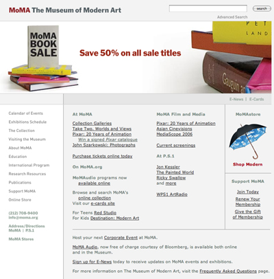
Fig 16: Screenshot of MoMA.org Home Page, 2006
Links on the exhibition pages take visitors directly to a page of products related to that exhibition, and links from the on-line collection section perform a search for that artist in the store.
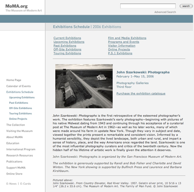
Fig 17: Screenshot of MoMA.org, 2006
E-Cards, historically an outside service, was brought in-house in conjunction with the launch of the new on-line collection in May 2005. Since its launch, E-Cards has consistently been the third most-visited section of MoMA.org (behind the collection section and the home page, respectively). Cards featured include works from the collection, exhibition posters, and special-occasion cards. Over the holidays, holiday cards from the Design and Bookstore were offered, with links to purchase those and other cards from MoMAstore.org.
MoMA also undertook a three-month Google grant to test Google paid keyword search marketing as another potential driver to both MoMA.org and MoMAstore.org. The grant is still underway at the time of this writing.
Conclusion
Both MoMA.org and MoMAstore.org are constantly being reevaluated, enlarged, and improved. With the opening of the new Museum and retail spaces in late 2004 and the redesign of MoMAstore.org in the summer of 2005, all of the virtual and physical spaces have been brought up to date. Now we look forward to further interdepartmental collaborations that reinforce the presence of the Design and Book Stores not only as showcases of design products and modern and contemporary art publications, but also as an increasing means of supporting the educational and exhibition programming at The Museum of Modern Art. What differentiates MoMAstore.org - and all museum stores - from other on-line retail environments is this connection to supporting the museum’s mission of education and exhibition. Strengthening that connection in an on-line environment reinforces physical manifestations of that support.
Cite as:
Burnette and Spann, MoMA.org and MoMAstore.org: The Crossover, in J. Trant and D. Bearman (eds.). Museums and the Web 2006: Proceedings, Toronto: Archives & Museum Informatics, published March 1, 2006 at http://www.archimuse.com/mw2006/papers/burnette/burnette.html