Matthew MacArthur, National Museum of American History, USA
Abstract
The Web Program at the Smithsonian’s National Museum of American History began with one overworked part-time staffer and a shoestring budget. Ten years later, the New Media office is an integral part of the museum, partnering with staff across the organization to produce award-winning content for the Web and other forms of electronic outreach. While some aspects of this change were surely inevitable due to the rise of the Internet, it is also partly the result of a focused effort to understand and advocate the role of the Web and related technologies within the museum. This paper will examine the history of the program, the strategies employed in a recent Web redesign, and ways the museum has been able to accomplish more with limited resources. The museum Web site has grown from a few crude HTML pages to a resource with thousands of pages and millions of visits per year. Each iteration of the site has grown more sophisticated, while becoming more responsive to the needs and habits of users. At the same time, the way that the Web site is staffed and managed has also become more sophisticated. By promoting the site internally, planning wisely, and distributing the effort, the museum has been able to boost its on-line productivity and to think more creatively about the role of the Web in accomplishing the museum’s mission.
Keywords: Web site administration, staffing, redesign, marketing
Introduction
Like a surfer who catches a heavy wave by being at just the right spot at the right time, so many careers, including my own, have been propelled by the tidal surge of the Internet. And it has been one wild ride for those of us who work in the field and for institutions that have struggled to keep up with the current of ever-changing technology and the array of possibilities and challenges that it brings. While much of our energy is spent trying to predict the future, it seems worthwhile to pause and reflect for a moment on where we’ve been.
Personally, it was only a little more than ten years ago — dog years, it seems — that I was discovering the World Wide Web using the Mosaic browser (Netscape and IE were just coming on the scene); a short time later I built my first Web site using a primitive editor offered by AOL (Dreamweaver was still a thing of the future). I was interested in museums but could not have found the job that I now perform at the National Museum of American History in any career guide. If I had visited the NMAH Web site back then, I would have seen a series of basic informational text pages and perhaps one or two more adventurous features that began to explore the possibilities for on-line “experiences.”
Today, NMAH has recently completed a major Web site redesign — the museum’s third on-line iteration — and we find on-line outreach more thoroughly integrated into the workings of the museum than could be thought possible just a few years ago. This paper describes that journey with particular emphasis on our recent redesign process, and identifies a few of our key strategies for making the site more useful to staff and visitors alike.
As with any case study, my hope is that the reader will find some nuggets in the particulars described here that will be useful to his or her own situation. I don’t pretend that our way of doing things is the only way, or the best. Each of us labors in the context of a particular institutional history that shapes its present-day approach to the Web and other new media. Indeed, presumably because the field is still so new, it is characterized by a remarkable lack of consistency when compared to other museum professions with better-defined standards and methods of practice.
Building a Program
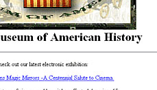
As with many organizations, the National Museum of American History’s Web site began as what would come to be known as “brochureware” — fundamentally, a series of text documents that had been converted to HTML and linked together.
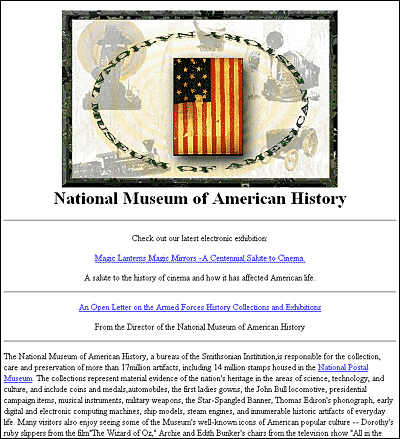
Fig 1: Home Page of the National Museum of American History, 1997
In 1998, the museum released its first professionally-designed site, which kept much of the structure and content of the previous site, but added a stronger design concept to tie it together. In addition, a few Web-only features were added, such as an “Objects A to Z” activity for kids.
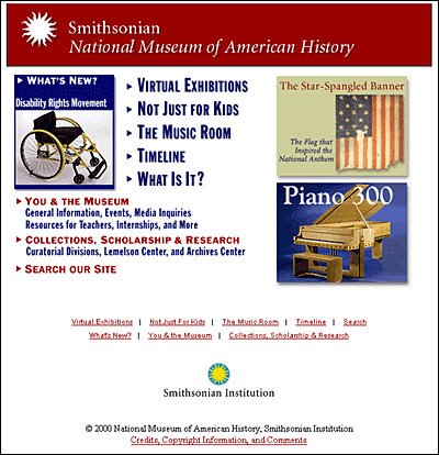
Fig 2: Home Page of the National Museum of American History, 2000
The new site, while a visual improvement, embodied some shortcomings that were common to many Web sites of the period. Among these were:
- Poor information design. Main site sections were given “cute” names that ultimately obscured their meaning. For example, crucial information such as exhibitions and visiting information was put under the heading “You & the Museum.” A page for kids was titled “Not Just For Kids,” a perennial head-scratcher.
- Mimicking the museum’s org chart. If users wanted to find out about the work of the museum or the collections, first they would have to negotiate a departmental list and try to distinguish between monikers like the Division of the History of Technology and the Division of Information Technology & Society.
- Lack of support for changing or additive features. Two egregious examples — both linked prominently from the home page — included a timeline that never grew beyond ten or so entries and a “What Is It?” mystery object that featured the same object (an early typewriter) for seven years.
- Poor extensibility and updatability. As a series of flat pages with hard-wired navigation links, the site became difficult to manage as new content was added over time.
Looking back, it’s extraordinary how quickly early Web sites were rendered obsolete by advances in technology and design techniques, the proliferation of on-line tools and services, and the application of user-centered design to the Web. A book or video produced in 1998 would not likely seem as dated today as a Web site from the same period. At NMAH, we recognized the need for improvements early on, but did not have the resources to redesign for another seven years. During that time, sites such as the Discovery Channel changed three or four times (for a good sense of this, try the Internet Archive’s “Wayback Machine,” http://www.archive.org).
All the more reason to turn our attention to the dedicated staff who must not only add and maintain content on rapidly-growing Web sites, but also try to keep up with the shifting medium itself — often on a shoe-string budget. Managing a Web site requires a broad complement of skills, technical aptitude, and an eye for design; the ability to think creatively about the big picture as well as iron out the smallest detail; comfort working either with large teams of people or hunkered down over a solitary computer; and above all, the ability to mediate between content providers, developers, and the audience. To assemble a team with the requisite skills is a tall order: to do it alone, or worse, alone and part-time as many museum Webmasters must, is nothing short of a miracle. Like many institutions, NMAH tries to capitalize on our strengths, and solicit outside help to compensate for our limitations.
Shortly after the 1998 redesign the part-time Webmaster, who had also served as the head of the publications department, retired from the museum. Recognizing the need to devote more resources to the burgeoning on-line medium, the museum brought on a team of two — myself included — who had been laboring on Web projects elsewhere in the Smithsonian. Coming from a small, independent program to start a new office in a large, established bureaucracy proved to be an adjustment for all parties.
One of our first tasks was to figure out where the new Web Program should sit in the organization. The prior Webmaster had been part of the Public Programs department, which would shortly be disbanded. For the first few years we bounced around from the Office of Curatorial Affairs, where we struggled to gain attention amidst a large number of staff and competing priorities, to the Office of Administration, which generally supported our efforts and took a hands-off approach. Though we were in the same division as the IT staff, and certainly collaborated with them on technical issues, we did not regard Web administration as a primarily technical function. Eventually my colleague was promoted to lead a reorganized Office of Public Programs, and the New Media Program, as we were now called, followed. In a sense we were right back where we started, though much had changed in the interim.
Reviewing this arcane bit of history is instructive insofar as it reinforces the fact that a museum Web site is a many-headed beast that defies easy categorization -equal parts content, technology, marketing, and education. Good sites can be administered any number of ways — and where the program sits may make a statement about the philosophy behind it — but we have found that the most important factors are the attitude brought to the task by Web staff, and the degree of support given by those in the chain of command. NMAH was fortunate to get a new Web manager who brought years of curatorial and education experience to the job. Under her leadership, our philosophy was that the Web was a new medium, distinct from the exhibition format and other familiar museum products, and as such it had its own set of rules. Some of these rules were technical in origin (remember Web-safe colors?), but more importantly, it was user behavior and the culture of the Web that set the new standard.
Understanding this brave new world and explaining it to others in the organization occupied much of our time initially. Curators and exhibit designers who were used to a high degree of control over the learning process were exposed to the reality that on-line users with short attention spans and powerful search engines tend to zip in and out of sites at random points rather than enter through the front door and proceed through in an orderly fashion. The questions we posed when beginning a project were,
- What can the Web site provide that can’t be done in any other format?
- Who is the audience and how do we expect the site to be used?
- What constitutes a successful visit?
Using this approach led to some early successes such as the Star-Spangled Banner on-line exhibit (http://americanhistory.si.edu/ssb) which featured content and design that were different from, yet complementary to, the corresponding museum display.

Fig 3: Home Page of the “Star-Spangled Banner” virtual exhibit, National Museum of American History, http://americanhistory.si.edu/ssb
Soon, other exhibition projects adopted this model until it became de rigueur for any new exhibit to budget and plan for a Web site. As we began to enjoy the fruits of our lobbying efforts (and struggle to meet the demand), another important event occurred: in 2002, on-line visits exceeded the number of physical visitors for the first time; the next year, thanks largely to a drop in tourism after the events of September 11, 2001, there were twice as many on-line visits, and by 2004 three times as many people visited the site as walked through the doors of the museum.
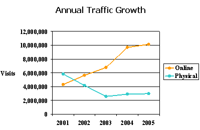
Fig 4: On-line vs. physical visits to the National Museum of American History
This, as much as anything, caught the attention of the museum administration. Meanwhile, the aging home page and core site was straining under the load of all the content that had been added in the intervening years, and the staff were struggling to maintain the clunky site and keep up with the demand for new material. Everyone agreed something had to be done.
Redesign
In 2003, the National Museum of American History was entering a period of change. Not only did we have a new director, but the museum was contemplating significant updates to its physical structure as well. Now was the time, we argued, to first remake the virtual museum, and reward the on-line visitors who were now coming in the millions with an up-to-date site that reflected our stature as a national institution. The director agreed, and provided the funds for a thorough site redesign. Faced with the prospect of actually accomplishing what we had advocated for so long, we rolled up our sleeves and set to work.
Laying the Foundation
Fortunately we did not have to start from scratch. Over the years we had accumulated a wish list of improvements and features that we would like to see added to the site. We had sketched out possible changes to the site architecture and kept abreast of technical solutions for helping us manage the site. Now, as the project formally got underway, we got other staff involved through open-invitation brainstorm sessions, an anonymous staff survey, and targeted meetings with key departments. To help generate ideas, we looked at many model Web sites from museums around the world and other organizations with similar missions and content-rich offerings.
Another important aspect of our research was user surveys. In a bit of fortunate timing, we had recently completed a yearlong effort to survey visitors to our Web site. The survey questioned users about who they were, why they were visiting the site, and what sorts of features they were interested in. We learned that about three-quarters of users were goal-oriented and had a specific purpose in mind, with the rest just browsing. About a quarter of users were planning a visit to the museum; nearly a third identified themselves as teachers, students, or researchers.
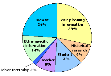
Fig 5: Results from a 2003 survey about users’ purpose for visiting the National Museum of American History Web site
Further, we broke down teachers and students by grade level. A little more than half the students were in the grade 6-12 range, generally thought of as our target education audience; a whopping 34 percent identified themselves as college-level, a group we had never seriously courted. Among teachers, the surprise statistic was 38 percent in the K-5 range, clearly looking for resources they could adapt to their students’ level. In terms of interests, high scores were given to some topics that were sorely neglected on our site, such as music and popular culture. Visitors also expressed interest in timelines and access to collections.
Some of this information confirmed our suspicions, some was unexpected, and it all fed into the decisions we made about how to redesign our site and which features to focus on. Later, as part of the design contract, additional user studies were done to observe and document a variety of interactions with the existing site and collect user feedback; also, interviews were conducted of target audiences to determine what their experiences and expectations of the Web site were, and how the site might best fulfill their needs.
The ultimate result of our research was a refined, prioritized list of goals that would guide the project and serve as the basis of an RFP. Outlined below are a few of these goals:
- Bring objects to the forefront. It had long been our aim when designing a virtual exhibition to try to minimize the number of clicks a user had to make before actually seeing museum objects. Objects, after all, are our fundamental raison d’être. We wanted to apply this same reasoning to our core site by providing frequent opportunities to interact with our collections.
- Market the museum as a destination. Strange as it may seem for a museum with a fabulous setting like ours, the old NMAH site did not portray any images of the museum or its setting on the National Mall, and users looking for basic visiting information had to click two not-very-well-labeled links down from the home page. Our goal was to better promote the physical museum and make information easier to find.
- Put people in the museum. NMAH receives millions of visitors a year, but you would have been hard pressed to know that by looking at the Web site. We felt it was important to convey that the museum is a lively, interesting place to visit by actually showing people enjoying our many exhibitions and programs.
- Target various audience segments. By the time we undertook this project, it was a well-known axiom in the Web world that rather than design your site around your organizational structure, as we and so many others had done, the better approach was to design the site around the various needs of your audience. We sought to follow this advice by providing targeted content to kids, educators, visit planners, and the press.
- Create a timeline feature. We knew from our research that timelines were popular with visitors. We conceived of an interactive feature that would not attempt to be a comprehensive timeline of American history, but would situate our many on-line offerings in a historical context using a timeline-style visual interface. This would prove to be one of our more challenging, but rewarding, endeavors.
- Situate the museum in its broader institutional context. While all Smithsonian museums enjoy a high degree of autonomy in terms of their Web offerings, we were also aware that the Smithsonian “brand” is a powerful attractor and that visitors to the Smithsonian — whether physical or virtual — are often surprised to find that it is comprised of several distinct entities. Through graphics and links we endeavored to strengthen the ties between the NMAH site and the parent Smithsonian organization.
- Make site management easier. One of our core goals was to modernize the way the site is built and managed, eliminating the need to touch scores of flat HTML pages and giving non-technical staff the ability to add or maintain content on the site via simple data-entry forms. In addition, functions such as the events calendar and exhibition list were converted to searchable databases.
As we dreamed up our new site, it was important to remind ourselves at every step that keeping the site up to date — even with new, friendlier tools — would require some degree of time and effort. We didn’t want to fall into the trap of our seven-year-old “What Is It?” feature that languished for lack of a sponsor who would freshen it periodically. Since the resources of the Web office were limited, it was important to make other staff in the museum feel invested in the site and involve them in its upkeep.
Reconstructing the Museum, Virtually
With the goal of staff involvement in mind, and to help bring order to the sprawling project, we formed 13 committees comprised of a wide cross-section of staff members, each group corresponding to a major functional area of the site. Committee members worked with Web staff and the contractor to develop requirements in more detail, review deliverables as they came in, and in some cases create new content. These committees tackled everything: from the development of the timeline feature, to creating a new collections area, to determining the functionality of the new calendar. In general this plan was highly successful, providing the necessary focus and labor that each feature required. It was also beneficial from a collegial perspective, as staff gained a better sense of what the Web office does and how the site operates, and we in turn benefited from their ideas and expertise.
The committees were important for another reason. Remaking ourselves in the on-line world meant taking the museum apart, boiling down the essentials of our mission and our relationship to our audience, and reconstructing ourselves in the virtual space. In doing this it was impossible to avoid controversy, thorny policy issues, and a closeted skeleton or two. Certain important issues were dealt with at the committee level; this policy not only distributed the responsibility for decisions that had broad impact on the museum, but also bestowed legitimacy on those decisions by virtue of the fact that the process was an inclusive one. Outlined below are a few of the issues that required an extra degree of deliberation:
Home page
Despite the fact that many visitors to our site bypass our home page altogether, it is nevertheless a critical, and contested, piece of real estate. The particular combination of imagery, colors, words, and layout on any home page conveys messages about the institution — its purpose, priorities, and intended audience — and introduces a certain tone, be it serious or playful, informational or exploratory. From these cues users begin to form a sense of what kinds of experiences are offered and what the nature of their relationship to the institution might be.
Consider a physical museum’s exterior. It also conveys messages to approaching visitors through architecture, signage, and other design elements. Now imagine that the façade also has to give hurried visitors a quick sense of what they can do inside the museum and help them get there as efficiently as possible, while branding the museum and conveying an overall sense of the organization — all before they set foot inside the museum proper. That provides some sense of what a home page is asked to do. The new NMAH home page was examined at the highest levels, with many design rounds and refinements. For better or worse, every element is the result of thorough deliberation.

Fig 6: Home Page of the National Museum of American History, 2006, http://americanhistory.si.edu
Collections
With this redesign, we knew that we had to do a better job of satisfying users’ interests in our collections. Indeed, as a national institution in the public trust, we felt a mandate to do so. The old site had pockets of searchable collection information relating to specific exhibitions or topics, but nothing that addressed the entire scope of our holdings. To remedy this was to expose the state of the museum’s collection documentation, unravel the complicated curatorial structure (which was in the process of being reorganized), and somehow emerge with a picture that made sense to users — not tasks for the faint of heart.
We decided to take a two-pronged approach. The first was to begin a process of exporting information directly from our main collections database and allowing users to search it on-line. Although certainly not a novel idea, it had not been tried at NMAH on a large scale. We started cautiously, only releasing records that had been thoroughly documented and fact-checked, with new labels written expressly for the purpose. While this resulted in a modest quantity of records to begin with — with the intention of adding more over time — it guaranteed a high-quality experience for users of the database. Other museums have chosen to be less constrictive about publishing their collection data, at the risk of presenting incomplete or inaccurate data. How we handle this in the future is sure to be an ongoing conversation.
Given that our nascent database search could hardly paint a comprehensive picture of our holdings, our second approach was to introduce visitors to our collections by way of a subject index. Each subject page offers a summary of the scope of collections in that area and features ten or so objects that serve as examples. Feeling that no pre-existing categorization schemes would fit the bill (such as curatorial structure), we went through the exercise of creating a new list of 28 subjects that focused on the nature of the objects themselves — e.g. clothing or food — and cut across the various collecting units. Creating a manageable list that makes sense to users but also covers the gamut of our collections was a challenge, but the result is an informative feature that can be used by the casual browser as well as the specialist who is looking for leads into further research.
Timeline
Though timelines are occasionally employed in the museum, they are not universally loved, as they are, by design, a somewhat reductive device. As mentioned above, we wanted our timeline feature to contain enough historical information to help contextualize content on the site without trying to be an encyclopedic reference tool. We determined that we wanted users to be able to sort information chronologically or by theme. For the chronology, we followed the periodization contained in the National History Standards for educators. Themes were more complicated. After discussing a number of possibilities, we were encouraged to adapt historical themes found in a pre-existing collections planning document. Though some doubted that concepts created for the use of professional historians would be useful to the general public, we re-wrote them to enhance their accessibility.
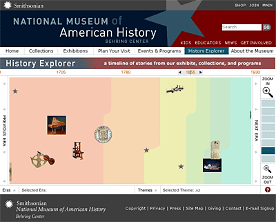
Fig 7: “History Explorer” timeline feature, National Museum of American History, http://americanhistory.si.edu/explorer
Events
Creating an improved on-line events calendar (and later, a monthly e-mail newsletter) began a process that led to the demise of a traditional print calendar and also revolutionized the way that program staff planned and documented events. To satisfy the demands of the database-driven calendar, and to streamline the administrative process, new procedures were put in place for collecting data and images about each event. Having the information in a database also opened new possibilities for archiving one-time events by attaching program information or media clips and making them a permanent part of the museum’s on-line record.
Staff information
Though less glamorous than other areas of the site, we also sought to rethink the way we present information about the staff and the museum organization. Here again, it was helpful to have a staff committee who could gather opinions, compare a variety of other sites, and come up with recommendations. When the committee recommended that bios and contact information be posted for curators, educators, and others whose job it is to interact with the public, staff members raised legitimate concerns about privacy and the effort it would take to keep personal information up to date. We tried to offset these concerns by creating opportunities for efficiency. For example, we created lists of frequently asked questions that users are encouraged to read before contacting the museum, in the hopes of reducing the volume of e-mail or telephone inquiries. Some information, such as staff publications, was typically reported on a regular basis anyway, and gathering the information on-line could serve both the public and the reporting requirement.
During the execution of our redesign, it must be said that our true saving grace was having in the New Media office a project manager who had been through the process before and was a model of organization and efficiency. Together with the contractor and the chairs of the staff committees, she labored diligently to keep track of the countless details related to the development of new pages and the migration of the old site. In particular, two planning documents guided our work: a functional specification, which listed each new page of the site and its features and functionality; and a corresponding content matrix, which was essentially an extensive outline that detailed all new content that would be required. A lot of effort was spent in keeping these documents up to date so that both the museum and contractor had a clear and mutually-understood picture of the tasks at hand.
Launch and Beyond
After 18 months of hard effort, the new site was ready to launch, and we were determined to roll it out with a splash. We hoped that the entire museum would take pride and a sense of ownership in the site, a task made easier by the fact that so many had been involved in its creation. This is not to say that everyone agreed with every aspect of the outcome, but at least all had been given the opportunity to contribute.
One may not expect that the Web site would require a great deal of marketing within the organization. At NMAH, certainly some Web-savvy employees are familiar with the site. Others would be hard-pressed to call it up on their computers. We had given periodic updates at staff meetings during the development process, and after launch, we formally presented the site and demonstrated a number of its features. We were also invited to present the site at a meeting of the museum’s board. Finally, the museum hosted a small celebration and cake-cutting for staff to mark the end of the project, as is often done for exhibit openings.
In the New Media office, we regarded the launch of the redesign not so much as an ending, but a new beginning. In order to prevent the Web site from being shelved for another seven years, it has been important to keep up the momentum. For one thing, we emerged with a wish list of further improvements that we have continued to work on, albeit at a less frenzied pace. Also, it was always part of our strategy to divest some of the work of updating the site to other departments once our content-entry tools were developed. Accordingly, we have begun training selected staff in this process.
The completion of the redesign also positioned us to be able to think about the NMAH Web site more strategically. The New Media office emerged with stronger ties to nearly every department of the museum, from curators and educators to public affairs and business activities. These ties reflect a greater degree of shared interest in the role and potential of the site, and demonstrate how integral the site has become to museum operations. While this was an important paradigm shift for the museum, in a sense we were only catching up to the shift that had already been made by much of our audience, who naturally turn to the Web as a first recourse for finding information about the museum.
As so often happens, one of the last tasks was to update a variety of planning documents and procedures at the museum to reflect the new reality. Though partially symbolic, the symbolism is nonetheless important and sets us on solid footing for moving forward. On-line outreach is now referenced in the strategic plan for the museum as a whole, and is thoroughly integrated into the goals and vision statement for the Office of Public Programs where we reside. The museum administration and board receive regular reports on Web activities. And the New Media office is represented on the museum’s Interpretive Planning Advisory Committee, which steers and develops future projects and initiatives.
Finally, one more promotional tool must be mentioned. An important follow-on project to redesigning the site was to create a subscriber-based monthly e-mail newsletter. Naturally, this is something of use and benefit to our patrons, and they are the primary audience. However, we have also been impressed by its utility as an internal marketing tool. Staff members have expressed appreciation for the regular news about the activities of the museum, and even the director is enthusiastic and has made efforts to ensure that the board and other friends of the museum receive the newsletter. Each receipt of the e-mail or click-through to the site is a reminder of the power and importance of electronic outreach.
Conclusion
This paper began with a personal perspective and broadened to tell the story of how the National Museum of American History gained not only a new Web site, but also a new appreciation for the power of Web sites and other electronic means to reach a wider audience and serve them more effectively. Since a Web Program was formed at the museum nearly eight years ago, the scope and ambition of the program have increased considerably while available resources have increased only modestly. Through the strategies outlined here, we have nevertheless been able to accomplish a great deal by spreading both our enthusiasm and our workload out to other parts of the museum.
Gone are the days when the only job descriptions to include Web activities belonged to our small team, and the only recourse for adding or changing content was to funnel through the Webmaster. Creating or updating content for the Web is now a distributed function, and like many organizations we are only beginning to explore the possibilities and efficiencies this will bring. Gone are the days, too, when the Web was seen as simply one more competitor for limited resources. Now, it is seen as a viable alternative, and sometimes the best alternative, for accomplishing our mission of the “increase and diffusion of knowledge.” The rapid rise of the Internet should be viewed as a boon to any museum or organization that is trying to do more with less — but it requires a shift in thinking and practice, and dedicated employees who will champion the cause.
Cite as:
MacArthur M., Building a Robust and Fully-Integrated Web Program, in J. Trant and D. Bearman (eds.). Museums and the Web 2006: Proceedings, Toronto: Archives & Museum Informatics, published March 1, 2006 at http://www.archimuse.com/mw2006/papers/macarthur/macarthur.html