
Christine Reich, Museum of Science, Boston, USA
http://www.mos.org/exhibitdevelopment/access/index.htmlAbstract
This paper presents results of a qualitative research study examining how 16 users of a broad range of abilities and disabilities use computer interactives in museum exhibitions that were created using universal design. The users chosen for the study include persons who are blind or have low vision, persons who are deaf or hard of hearing, persons with learning disabilities or other cognitive impairments, and persons with limited mobility. The interactives included in this study each use buttons as the primary user interface, and together, represent the variety of learning experiences that computers can provide in museum exhibitions. Study findings yield insights on how individuals with disabilities interact with computer interactives and the types of design features that are needed to provide access for an audience that includes visitors of a broad range of abilities and disabilities. In addition, findings demonstrate that certain design features support learning for a broad range of users and that features implemented to provide access for one audience can lead to improved experiences for another.
Keywords: universal design, accessibility, interactives, disability, usability
Introduction
Museums are places where visitors of all abilities and disabilities are invited to learn. This diversity offers a unique challenge - how can museums ensure that everyone can benefit from the learning experience? Universal design, which is the “design of products and environments to be usable by all people, to the greatest extent possible, without the need for adaptation or specialized design” (Center for Universal Design, 2002), puts forward a potential solution.
Information technology offers museums new possibilities for achieving universal design. With information technology, museums can simultaneously present information in multiple formats (including text, audio, and images) and also deliver information at a self-determined pace; these features are known to increase access to learning for persons with print-based disabilities (Rose and Meyer, 2002). Print-based disabilities is a term used to describe persons who struggle to construct meaning from printed text, including those who are blind/ have low vision and cannot see text, visitors who are deaf/hard-of-hearing, and visitors with reading-related learning disabilities such as dyslexia.
It is not surprising, therefore, that museums have begun to explore how information technology can be used to create learning environments that are inclusive of persons with disabilities. A number of studies that focus on the use of handheld devices to provide access to learning for persons with disabilities (Roth et al., 2005; Giusti & Landau, 2004; Kirk, 2001; Tate Modern, 2004) have recently been completed. While noteworthy, none of these studies has focused on the universal design of computer kiosks in museums, despite the fact that kiosks are a commonly used design element in museums of all sizes and content disciplines (Reich, 2002).
Museum guidelines such as those created by the Smithsonian Accessibility Program (Smithsonian Accessibility Program, 1996) and the American Association of Museums (American Association of Museums, 1998) provide information on the design of the kiosk that houses a computer interactive and limited information about the controls, but do not address the actual user interface or program design. Over the past five to seven years, a number of guidelines have been produced within the fields of Web site and software development that provide standards, techniques and strategies for providing universal access to information (Burgstahler, 2002; Chisholm, Vanderheiden, & Jacobs, 1999; Coyne & Nielsen, 2001; Foley & Regan, 2003; Freed, Rothberg, & Wlodkowski, 2003; “Rehabilitation Act,” 1998; Schmidt & Wlodkowski, 2003; Spry Foundation, 1999; Vanderheiden, 1994). However, this information is not directly applicable to the design of computer interactives or kiosks in exhibitions.
The Museum Of Science Sets An Example For Computer Interactives That Reflect Universal Design
The Museum of Science has created over 25 computer kiosks that feature universal design elements. Standards used across these interactives include audio, text, and images that deliver information, stools for resting, and easy to reach button controls (see Figure 1). This interface was developed by Robert Rayle, technical designer, and Betty Davidson, Ph.D., exhibit planner. They originally devised the system for visitors who are blind, hoping it would serve as an alternative to the touchscreen and trackball interfaces that are inaccessible for this audience. Later, they expanded the audience to include visitors with limited upper body mobility. This interface bears a striking similarity to the EZ Access© interface developed by the Trace Center at the University of Wisconsin-Madison (Vanderheiden, 1999). Surprisingly, these two systems were developed in parallel; Museum staff did not learn about the EZ Access interface until after the first implementation of their design.
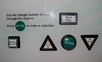
Figure 1: Example of the button controls that are a part of the Museum of Science interface
Through the years, the Museum of Science interface has been modified in response to user testing. Advice from visitors who are blind prompted a change in the shape of the scrolling buttons from rectangles to triangles that point in opposing directions. This new shape better reflects the intended purpose of the buttons as ‘arrow’ keys. Some of the newer designs also feature large, rectangular Go Back or Start Over buttons which were requested by visitors so that they could easily rectify accidental mistakes and errors.
Based on results of user-testing of each new design, Museum of Science staff began to develop a set of best practices guidelines for designing computer kiosks that are physically and cognitively accessible for visitors of a broad range of abilities and disabilities. While this list provided a solid starting framework, Museum staff were unsure whether the application of these guidelines would lead to the creation of computer interactives that reflected true universal design. For this reason, as a way to begin to formalize these guidelines the Museum decided to conduct a study that examined how persons with disabilities interacted with different versions of the Museum’s computer kiosks.
Study Methodology
The purpose of this study is to examine the effectiveness of the Museum of Science interface that was designed to be accessible for museum visitors of all ages, abilities and disabilities. It addresses the following questions:
- Which design features provide access to learning, and which present barriers for visitors with a broad range of abilities and disabilities?
- What other features, beyond the push buttons and the use of audio and text, are needed to provide visitors with disabilities with access to the learning experience?
The interactives chosen for this study each use buttons as the primary user interface, and together, represent the variety of learning experiences that computers can provide in museum exhibitions. One interactive titled Personal Computers provides object interpretation of historic computers. Another, Mammal Skull Mystery, guides visitors through an activity where they investigate the identity of a series of tactile skull models. The third, ‘Fish Farming,’ is a stand-alone simulation where visitors conduct virtual experiments and explore how they can stop the spread of disease through a fish farm by vaccinating the fish or controlling the population.
The research methodology employed reflects the practices of participatory design (Ringaert, 2001; Wright, 2003). Study participants are considered ‘experts’ and asked to share information about how they feel the design supports or hinders their learning, and to contribute ideas for possible redesigns. Their opinions and thoughts about the experience are viewed as accurate portrayals of their perceptions of their experiences and are considered a better reflection than the observer’s interpretation of their actions.
Sampling Method
To gather feedback on the universal accessibility of the Museum of Science button interface, participants were chosen so that a broad range of abilities and disabilities are represented. In total, the study includes the perspectives of 16 participants:
- Alice, age 53, frequent computer user, blind;
- Jerry, age 51, expert computer user, blind;
- Olivia, age 55, not a computer user, low vision;
- Mark, age 31, expert computer user, low vision;
- Carol, in her 30’s, frequent computer user, late-deafened;
- Leon, age 32, frequent computer user, deaf;
- Carolyn, age 52, frequent computer user, hard of hearing;
- Jerry P., age 77, non-expert but frequent computer user, wears a hearing aid, does not self-identify as having a disability;
- Kent, age 67, non-expert but frequent computer user, hard of hearing, has ADD;
- Gail, age 27, non-expert but frequent computer user, non-verbal learning disability;
- Yaacov, age 17, expert computer user, dyslexic;
- Linda, age 60, novice computer user, low vision, cognitive disabilities and limited mobility;
- Judy, 50’s, non-expert but frequent computer user, wheelchair user, limited dexterity;
- Stacy, 50’s, non-expert but frequent computer user, wheelchair user, limited strength;
- Jen, age 31, non-expert but frequent computer user, does not self-identify as having a disability; and
- Vicky, age 20, expert computer user, does not self-identify as having a disability.
Data Collection
Each participant is considered a separate case study. Each case study includes data collected during an introductory and a final interview, and interactive observations at each of the three interactive components. Both the interviews and the interactive observations were recorded using a digital audio recorder, and the conversations transcribed. In addition, the observer/ interviewer took notes to record observations that could not be captured through audio.
Limitations of the Methodology
The methodology has a number of limitations. First, participants use the interactives on their own, and are not accompanied by other family members or friends with whom they may normally attend museums. Some participants are accompanied by a personal care assistant (PCA), but the PCA’s are asked not to provide assistance. This decision was made in order to better examine the ability of the interface to facilitate an independent learning experience for persons with disabilities. However, this results in an experience that is not naturalistic and may not reflect a ‘typical’ museum experience.
Data Analysis Methods
The theoretical proposition guiding this study, and therefore the analysis of the data, is that it is the design of the experience, and not the abilities or disabilities of the individual, that defines whether an individual is able or “dis-able” to learn (Gill, 1999; Rose & Meyer, 2002). For this reason, the data were analyzed to identify areas where the design of the interactive influenced whether the participant was able to interact with the component and learn from this experience. In addition, a successful design was considered to be one that was inclusive of the needs of a broad range of users. Therefore, suggested design features were selected based on the ability for that feature to create an experience that would be accessible to users of a broad range of abilities and disabilities.
Data within each case were coded using ATLAS.ti software and code categories were developed following constant comparative analysis (Lincoln & Guba, 1985). To establish the ‘trustworthiness’ of the study’s findings, participants were asked to review the preliminary findings (Lincoln & Guba, 1985). Additionally, study findings underwent peer examination where the developers, designers, and evaluators of the interactives were asked to comment on the emerging findings and express how these findings match, or do not match, their experiences testing the interactives with a larger museum audience (Merriam, 1998).
Findings
Study findings reveal a series of design features that either support or detract from the participants’ experiences as they use the three interactives. Summarized below are the design elements that have a significant impact on the ways the different users interact with, and learned from, the different computer kiosks.
This list is not exhaustive and does not provide a definitive guide for the design of computer interactives for museum exhibitions. Given the small number of users, the results of this study may not be generalized to reflect all users. However, the design features that were chosen for inclusion in this section were selected based on their apparent benefit across users of a broad range of abilities and disabilities. Therefore, it is hypothesized that these design features would benefit a larger audience.
Present the activity’s goals clearly at the beginning of the activity.
For many of the participants, a clear goal and/or purpose greatly influences whether they enjoy an interactive and perceive it as easy to use. While providing visitors with a clear indication of the interactives goal is already cited as a ‘best practice’ in exhibition design, the importance of doing so increases, and the ways we communicate those goals changes, when considering the needs of an audience that includes persons with disabilities.
Kent tells us that visitors with decreased attention need a clear indication of the goal to help them remain focused on the activity. Leon and Carol (who are deaf) request that the goals be presented in a visual (and not just a text-based) way. Given this, developers should consider how to communicate this information through multiple media (visual images, audio and text) to be sure that the purpose of the activity is accessible and clear to all users.
Give clear and simple directions, and provide participants with a precise description of what to do and the exact ordering for doing it.
The need for clear directions is not a new concept and is frequently listed as a guideline for creating successful interactive exhibits (Kennedy, 1997; McLean, 1993; Serrell, 1996). When designing for an audience that includes a broad range of users, how we provide users with an indication of what to do, and why we provide directions, changes.
Clear directions are requested by multiple participants. Olivia (low vision) states that she needs clear directions because she cannot view the whole screen at once (she views the screen from a very close position out of the corner of her eye). Clear auditory directions, therefore, help her to focus her visual attention where it is needed most. Gail says that clear verbal directions would assist her with the activity as individuals with non-verbal learning disabilities need “directions that are specific and organized in steps.” Carol (deaf) wants visual indications of what to do. It is important, therefore, to present directions not just through text, but also through multiple media, including visual representations and audio.
Place monitors in upright positions close to the edge of the table.
A monitor that is upright and near the edge of the table seems to be the optimal placement when considering a broad range of users, and is the preferred placement for many of the study participants. Olivia and Mark (who have low vision) report that this placement makes it easy for them to get their eyes close to the screen and view the finer details of the display. Judy and Stacy (wheelchair users) also prefer this monitor position to the one where the screen is placed on a 45 degree slanted surface; when the monitor is upright, it is easier to approach and view from a seated position. Even Leon and Carol (deaf) state that an upright monitor is better than a slanted one, as angled monitors make it difficult to read the video captions that are placed at the bottom of the screen
Provide images that offer a visual indication of what to do, how to proceed and the content behind the activity.
Functional images are needed to facilitate learning amongst our visual learners, particularly those who are deaf or hard of hearing. Many of the existing guidelines and standards for creating accessible Web sites or other software focus on providing verbal access to visual images for users who are blind (Freed et al., 2003; Vanderheiden, 1994; Wheaton & Granello, 2003). While many guidelines mention the need for visual representations of information, they rarely go into deeper detail about the presentation of visual images and guidelines for presenting them.
Participant responses from this study provide us with an indication of what guidelines might be needed for adding images to computer interactives in museums. Leon advises that when adding images to the interactives, exhibit developers should consider the content, feelings, and direction these images portray, and not just add them for decorative purposes. However, Gail, who has a non-verbal learning disability, alerts us that adding too many images could over stimulate her as a user. For this reason, exhibit developers should be selective about the images that are included, and work to ensure that the screen provides visual clarity and gives the visitors guidance on what to do and where to focus their visual attention.
Provide clear mapping between the buttons and images on the screen.
One of the lessons learned by the Museum of Science staff after years of conducting formative evaluation of computer interactives is the need to present unambiguous mapping between the buttons and the information on the screen (Reich & Rayle, 2004). While this lesson has been applied to the development of numerous computer interactives, it is not always adhered to.
Some participants struggle when using both Personal Computers and Mammal Skull Mystery because of inadequate mapping between the buttons on the console and the information on the screen. One affordance of a touchscreen is that there is a direct connection between the users’ physical action and the selection they make on the screen. In comparison with the button interface, there is a physical disconnect between the users’ physical actions pressing the buttons on the console and the visual feedback delivered by the screen. When working with a button interface, therefore, clear and unambiguous mapping between the buttons and the screen is crucial to the interactive’s success.
Match screen text and audio closely, and provide opportunities for the user to switch back and forth easily between the two modes.
Observational data reveals that many participants, including Yaacov (dyslexic), Judy (wheelchair user), Mark (low vision), Olivia (low vision), Linda (low vision, limited mobility and cognitive impairments) and Jerry P. (no disabilities but wears a hearing aid), listen to the audio while simultaneously viewing the screen. These participants report in their interviews that the ability to simultaneously listen and read enhances their understanding of the interactives.
Leon and Carol (who are deaf) also suggest that all information read aloud should be presented on the screen, and that the user should be explicitly informed of this design feature. Both of these participants are deaf and the presence of the audio distracts them since they are concerned that they might be missing information. As an alternative to providing text that states “all audio appears as text on the screen,” Leon suggests that there could be a visual way to indicate this same information by using a set-up that is similar to a Karaoke machine where the words on the screen are highlighted in real time as the audio is played.
Give greater control over the pace of interaction to the participants to enhance the accessibility of the interactives.
User control over the pace of interaction is a frequently cited guideline for the development of accessible software (Chisholm et al., 1999; Freed et al., 2003; Vanderheiden, 1994). This idea is supported by the participants, who testify that persons with disabilities need more time to think, respond, and act when working with computers. Judy and Stacy assert that persons with limited mobility need more time to implement actions due to their reduced strength. Leon and Carol state that persons who are deaf need more time to read information as English is often not their first language (Schirmer & McGough, 2005). These participants desire more control over the pace at which the screens move backward and forward and the speed at which the activity takes place.
Lengthen timeouts and/ or allow time for user feedback before ending a session.
Many participants find the timeouts disruptive and feel it inhibits full access to the interactive. When the participants are using the interactives, the computer frequently times-out and returns to the starting page while they are still reading, listening, or responding. In addition, the timeout feature at two of the interactives does not provide an auditory indication that the computer has returned to the first ‘attract’ screen. Therefore, participants who are blind do not know when the computer times-out.
Participants should be provided with an option for preventing the computer from timing out, similar to the systems implemented in other Web applications such as on-line banking where the user is provided with a warning that the computer will timeout unless the user responds within a certain amount of time.
Label buttons clearly, and provide visitors with both a tactile and visual indication of how they should be used.
Participants request that the buttons should be well-labeled with small one-word phrases (such as Select or Enter) and with appropriate tactile cues for persons who are not sighted. It should be noted that most participants do not find the buttons difficult to use, but feel that improved labeling would provide them with more confidence as users.
The two participants who are blind (Alice and Jerry) experience the most difficulty with the button labeling. Some buttons do not have tactile cues, and others only used raised letters (and not Braille). Both Jerry and Alice request Braille identifiers for the buttons to help them identify the button’s purpose and function. Participants with sight indicate that well-defined button labels also improve their experience. For example, Olivia (who has low vision and is an inexperienced computer user) reports that the two interactives with well-labelled buttons are much easier for her to use than the one where the buttons are not labeled.
Increase contrast of visual images and decrease dependence on color-coding for visual cues.
Guidelines for creating accessible exhibitions rarely mention the need for high contrast visual information beyond that delivered through text. Yet study findings reveal that this is an important factor in the accessibility of computer interactives for certain users. Increased contrast for the visual images and other elements would greatly improve the accessibility of the interactives for the three participants who have low vision: Mark, Olivia and Linda. In addition, increased contrast would make the experience more comfortable for Stacy and Judy (wheelchair users) whose visual experience is altered by the light’s glare that only occurs when viewing the screen from a seated position. While the contrast and size of text-based information is for the most part accessible for these participants, greater visual contrast is needed for visual cues that are not based on text, such as menu highlighting and line drawings.
Use precise and descriptive language to support participants who are blind and aid learning for participants who are sighted.
Some participants suggest that the interactives should include more precise and descriptive language. Descriptive language appears to be critical for Alice and Jerry who are blind, but is also requested by Kent, Yaacove, and Gail who are all sighted and have learning disabilities. This suggests that providing audio descriptions, which are traditionally viewed as an access feature for persons who are blind, may in fact improve the experience for a broader range of users.
The absence of descriptive language is particularly noticeable at Mammal Skull Mystery, where the images are a necessary part of the interaction. In order to be effective, the descriptors do not need to be longer, just more precise. For example, the word “sharp” is used as a descriptor for canine teeth. Jerry, who is blind, interprets the word “sharp” to infer that the teeth should feel like a blade of a knife. This is a different interpretation of the term “sharp” than the one used by the exhibit developers who use it to refer to teeth that are shaped like the stakes one would drive through a Vampire’s heart. Given the variety of interpretations for the word “sharp,” the word “pointy” might have served as a better descriptor and decreased the confusion.
Keep background noise to a minimum.
The background noise in certain galleries interferes with the experience of multiple participants, and in some cases has a profoundly negative impact on the user. A repetitive sound emanating from one of the components distracts Linda (who has cognitive impairments) and may be partially responsible for the seizure she suffered later that evening. Loud background noises are also problematic for users such as Yaacov (dyslexic) and Alice (blind) who rely on audio to receive information. When the background noise is high, both of these users cannot use the interactives since they are relying on the computer’s audio as the primary source of information and feedback.
Decreasing background noise would improve the experience for the participants who are hard of hearing, as well as those participants who relied on audio to receive information, such as Yaacov and Alice. However, this design feature is difficult to put into practice - one of the sources of background noise is the increased number of interactives that provide auditory options for learning. It is interesting that in this case, the design feature that is critical for access for certain user groups (such as visitors who are blind or dyslexic) can also decrease their access to the experience.
Ensure that Images move slowly on the screen (including images presented on attract screens) to reduce the risk of inducing seizures.
Guidelines for creating accessible computer software suggest that quick-moving and flashing images should be avoided. These guidelines define a range that should be avoided (4 to 59 flashes per second (Hertz) with a “peak sensitivity at 20 flashes per second”), and the types of flickering that qualify, such as quick changes from light to dark (Chisholm et al., 1999).
The quick-moving attract screens and other images present in the Museum’s interactives cause Linda (cognitive impairments) to have seizures. Linda does not advocate the exclusion of all interactives that include fast moving images, but requests that the Museum should place a warning sign at certain exhibits so that persons who experience seizures are alerted before they use them.
Given the severity of the consequences of not following this guideline, exhibit developers should review interactives to examine the refresh or flash-rate of the images, and avoid quick-moving images if at all possible.
Conclusion
There are ways museums can design learning experiences so visitors of a broad range of abilities and disabilities are provided the opportunity to learn. Previous lessons learned in the fields of software and Web site development, along with the findings from this study, provide suggestions for design features that support learning for users of a broad range of abilities and disabilities. Table 1 combines this information with what has been learned during the formative evaluation of over 20 computer kiosks at the Museum of Science, creating suggestions for design features that should be considered when designing interactives for a diverse audience. As the design features presented have not been tested with a large number of users, this list should not be considered as a definitive guide, but as a starting point.
The most significant finding from this study is that museums can play a considerable role in defining who in our society is able, and who is unable, to learn. By changing the way they design exhibitions, museums can enable learners of a range of abilities and disabilities to engage in independent learning experiences that do not force them to depend upon others for assistance. If employed with thought and care, new technologies can offer museums the ability to provide a broader segment of the public with the opportunity to engage in independent learning experiences that foster curiosity and inspire life-long learning.
| Feature | Audience members who benefit |
|---|---|
| Screen text that is read aloud and makes sense when heard and not viewed | Visitors who are blind or have low vision Visitors who are learning to read Visitors with cognitive or learning disabilities English as a foreign language learners |
| Open captions for videos and non-text based audio | Visitors who are deaf and hard of hearing Older adults |
| Audio descriptions for videos, images, and other visually-based information | Visitors who are blind and have low vision Visitors who have cognitive or learning disabilities affecting image reading |
| Text with a large font, clear typeface, capital and lower case letters and ample space between lettering and text lines | Visitors with low vision (including older
adults) Visitors who are dyslexic Visitors at extreme heights (low and high) who may be subjected to glare |
| Alternatives to color-coded cues | Visitors with low vision (including older adults and persons who are color blind) |
| High contrast images and text | Visitors with low vision Older adults |
| Minimized use of flickering and quick-moving images | Visitors who are subject to seizures |
| Images that offer a visual indication of what to do, how to proceed and the activity’s content | Visitors learning to read Visitors with learning disabilities Visitors who do not speak English (including American Sign Language users) |
| A short description of activity’s goal presented through images, audio and text | Visitors who have ADD Inexperienced computer users |
| Use of the clearest, simplest text that is free of jargon | Visitors learning to read Visitors with cognitive or learning disabilities Visitors whose first language is not English (including those who use ASL) |
| Clear, simple directions that provide a literal and precise indication of what to do and the exact order for doing it | Visitors who are blind or have low vision Visitors with learning disabilities Infrequent computer users |
| A clear, consistent and repetitive layout for presenting information | Visitors with cognitive disabilities Visitors who are blind or have low vision (and rely on their auditory memory) Older adults Infrequent computer users |
| A limited number of choices presented at one time (5-7) | Visitors who are blind or have low vision
(and rely on auditory working memory) Visitors with cognitive or learning disabilities (including ADD) |
| Minimized screen scrolling | Visitors with low vision Visitors who have learning disabilities |
| A tactile interface, such as buttons, for navigating choices and making selections | Visitors who are blind or have low vision Visitors with limited upper body mobility |
| Control over the pace of interaction, including when a computer “times-out” | Visitors who are deaf Visitors who have low vision Visitors with limited mobility Visitors who are dyslexic |
| Clear mapping between the buttons and screen images | All sighted visitors, especially visual learners |
| Stools | Visitors with lower back pain Visitors with low vision Young children Older adults |
| Monitors placed in an upright position close to the edge of the table | Visitors who use wheelchairs Visitors with low vision |
| Buttons placed on a slanted surface near the edge of the table | Visitors with limited upper body mobility |
| Buttons that are clearly labeled with both a tactile and visual indication of their use | Visitors who are blind or have low vision Inexperienced computer users |
| Minimized background noise | Visitors who are hard of hearing Visitors who rely on audio to receive information such as visitors who are blind or dyslexic |
| 27-29 inches of clearance beneath the kiosk, with a depth of at least 19 inches | Visitors who are wheelchair users Young children |
Table 1: Interactive Design Features that Support Universal Design
Acknowledgements
Universal design of computer interactives for museum exhibitions is based upon work supported by the National Science Foundation under ESI-0423802. Any opinions, findings, and conclusions or recommendations expressed in this material are those of the author(s) and do not necessarily reflect those of the National Science Foundation.
This study would not have been possible without the backing of the Museum of Science and its staff (including Christine Cunningham, Ph.D., Betty Davidson, Ph.D., Andrea Durham, Anna Lindgren-Streicher, Robert “Boob” Rayle, Emily Robertson and Susan Sunbury, Ph.D.); the feedback and guidance provided by the Lesley University advisory team (including William Barowy, Ph.D., George Hein, Ph.D., and Nancy Waring, Ph.D.); and the generosity of the participants who graciously donated their time, energy and expertise.
References
American Association of Museums. (1998). Everyone's welcome. Washington D.C.: American Association of Museums.
Burgstahler, S. (2002). Real connections: Making distance learning accessible to everyone. Retrieved October 8, 2004, from http://www.washington.edu/doit/Brochures/Technology/distance.learn.html
Center for Universal Design (2002). Definition of universal design. Retrieved November, 2002, from http://www.design.ncsu.edu/cud
Chisholm, W., G. Vanderheiden, , & I. Jacobs (1999). Web content accessibility guidelines 1.0. Retrieved August, 2003, from http://www.w3.org/TR/WAI-WEBCONTENT/
Coyne, K. P., & J. Nielsen (2001). Beyond ALT Text: Making the web easy to use for users with disabilities. Fremont, CA: Nielsen Norman Group.
Foley, A., & B. Regan (2003). Best practices for web accessibility design and implementation. San Francisco, CA: Macromedia, Inc.
Freed, G., M. Rothberg & T. Wlodkowski (2003). Making educational software and web sites accessible: design guidelines including math and science solutions. Retrieved August, 2003, from http://ncam.wgbh.org/cdrom/guideline/
Gill, C. J. (1999). Invisible ubiquity: The surprising relevance of disability issues in evaluation. American Journal of Evaluation, 20(2), 279-289.
Giusti, E., & S. Landau (2004). Accessible science museums with user-activated audio beacons (Ping!). Visitor Studies Today, 7(3), 16-23.
Kennedy, J. (1997). User friendly: hands-on exhibits that work. Washington DC: Association of Science-Technology Centers, Inc.
Kirk, J. (2001, March 15-17). Accessibility and new technology in the museum. Paper presented at the Museums and the Web, Seattle, WA.
Lincoln, Y. S., & E.G. Guba (1985). Naturalistic inquiry. Newbury Park, CA: Sage Publications, Inc.
McLean, K. (1993). Planning for people in museum exhibitions. Washington D.C.: Association of Science and Technology Centers.
Merriam, S. B. (1998). Qualitative research and case study applications in education (2nd ed.). San Francisco, CA: Jossey-Bass.
Rehabilitation Act, 508 (1998).
Reich, C. (2002). A survey of museums: Information technologies as tools for museum learning: Unpublished work.
Reich, C., & R. Rayle (2004, December 7-12). Creating interactive learning experiences for all. Paper presented at the Designing for the 21st Century III: An International Conference on Universal Design, Rio de Janeiro.
Ringaert, L. (2001). User/ expert involvement in universal design. In W. F. E. Preiser & E. Ostroff (Eds.), Universal design handbook (pp. 6.1-6.14). New York, NY: McGraw-Hill.
Rose, D. H., & A. Meyer (2002). Teaching every student in the digital age: Universal design for learning. Alexandria, VA: Association for Supervision and Curriculum Development.
Roth, A., Mogerman, J., & Oakley, T. (2005). Every student is a scientist: Using technology to foster inclusion learning. Paper presented at the A Defining Moment: Museums at the Crossroads, AAM Annual Meeting, May 1-5, 2005, Indianapolis, IN.
Schirmer, B. R., &S.M. McGough (2005). Teaching reading to children who are deaf: Do the conclusions of the National Reading Panel apply? Review of Educational Research, 75(1), 83-117.
Schmidt, C., & T. Wlodkowski (2003). A developer's guide to creating talking menus for set-top boxes and DVDs. Retrieved August, 2004, from http://ncam.wgbh.org/resources/talkingmenus/
Serrell, B. (1996). Exhibit labels: An interpretive approach. Walnut Creek, CA: Alta Mira Press.
Smithsonian Accessibility Program. (1996). Smithsonian guide for accessible exhibition design. Washington, D.C.: Smithsonian Institution Press.
Spry Foundation. (1999). Older adults and the world wide web: a guide for web site creators (Conference results). Washington DC: The Spry Foundation.
Tate Modern. (2004). Tate Modern Multimedia Tour. Retrieved October 8, 2004, from http://www.tate.org.uk/modern/multimediatour/reseval.htm
Vanderheiden, G. C. (1994). Application software design guidelines: Increasing the accessibility of application software to people with disabilities and older users. Madison, WI: Trace Research and Development Center.
Vanderheiden, G. C. (1999). Use of audio-haptic interface techniques to allow nonvisual access to touchscreen appliances. Madison, WI: Trace Research & Development Center.
Wheaton, J. E., & P.F. Granello (2003). Designing web pages that are usable and accessible to all. In Cybercounseling and Cyberlearning: An Encore (pp. 17).
Wright, E. (2003). Designing for an ageing population: an inclusive design methodology. Art, Design and Communication in Higher Education, 2(3), 155-165.
Cite as:
Reich C., Universal Design of Computer Interactives for Museum Exhibitions, in J. Trant and D. Bearman (eds.). Museums and the Web 2006: Proceedings, Toronto: Archives & Museum Informatics, published March 1, 2006 at http://www.archimuse.com/mw2006/papers/reich/reich.html