
Introduction
Many research papers have been written addressing faceted browse and search in the context of museum collections, but they generally seem to be of the "here's what we did" variety, with very little retrospective "is it working?" reporting. This paper seeks to determine if there are any objective advantages of a browse interface using category filters over a fairly simple text query box. The analysis is made potentially even more valid by the fact that the data comes from the same site in two consecutive years with the primary difference between versions being the search and browse interface. By comparing usage trends between the two versions of the site, I hope to finally start to answer the big question: does it work?
The site in question is ArtsConnectEd.org, or ACE, a joint venture of the Walker Art Center and the Minneapolis Institute of Arts.
The first version (ACE1) launched in the mid 90's and was at the time a groundbreaking resource for educators; it provided access to the collections of both institutions, and allowed users to collect and annotate sets of artwork. The search interface was very plain, a simple keyword field, with options to limit the search to only one institution or to only find objects with images on-line. In May of 2009, a complete rewrite of the site (ACE2) went live, including a fully combined search and browse interface providing filters on aspects such as Medium, Culture, and more. Due to this launch time, all comparisons of the sites will be made in the window of May 1 through December 31, 2008 for ACE1 to May 1 through December 31, 2009 for ACE2.
I've opted to use log analysis vs. more traditional usability studies with live users for a few reasons:
- The old site we're comparing to is no longer live, but the logs live on.
- As Christina Wodtke writes, "search is so fast, that if the user is forced to think [e.g., in a usability test], they slow down too much and behave unnaturally" (Morville, 2008). It is hoped that log analysis will reveal more natural usage patterns than would a test environment.
- I had no budget for usability testing on a scale that would give meaningful results.
This paper will first summarize the current state of collection interfaces on-line, and then delve briefly into the structure of the site we're using for testing. I'll summarize and make recommendations on the cleanup needed on the log files, and finally compare the two sites in depth along with analysis and conclusions. This investigation will help illuminate some of the shared issues of findability on our collection sites, as well as common approaches and best practices. I'll also touch on the role of Google in all of this - as Mike Ellis points out in both his blog and his recent paper on hoard.it (Ellis, 2009), our collections may as well not exist if they're not in Google's index. Users do not begin their search on our sites; they begin on Google.
Definitions
Throughout this paper I refer to facets, which may be considered simply as descriptive categories of metadata about an object. For example, when describing a work of art, possible facets are the creator (Picasso, Jasper Johns), the medium (oil painting, bronze), or the creation date. I also make a distinction between "term facets" (facet words occurring within a search string) and "browse facets" (facets chosen from pulldowns in the site interface).
A Brief Survey of Collection Interfaces: Trends and Anomalies
A survey of 12 collection interfaces was made the week of January 17, 2010, and these results reflect the sites at that time. The sites chosen were primarily art institutions, but included several others as well. Within these 12 sites there was a great deal of variety in the interfaces and functionality, as well as several aspects that were nearly ubiquitous. These groupings are notable for their clear trends, but also for their outliers. The sites surveyed are in Table 1, and the results in Table 2.
| Institution | URL | Reference name |
|---|---|---|
| ArtsConnectEd.org | http://www.artsconnected.org/resource/list | ACE2 |
| Brooklyn Museum | http://www.brooklynmuseum.org /opencollection/collections/ |
Brooklyn |
| Indianapolis Museum of Art | http://www.imamuseum.org/search/mercury | IMA |
| Museum of Fine Arts, Boston | http://www.mfa.org/collections/index.asp | MFA |
| Museum of Modern Art, NY | http://www.moma.org/explore/collection/ | MOMA |
| Phoebe A. Hearst Museum of Anthropology | http://pahma.berkeley.edu/delphi/ | PAHMA |
| Powerhouse Museum | http://www.powerhousemuseum.com /collection/database/ |
Powerhouse |
| San Francisco Museum of Modern Art | http://www.sfmoma.org/pages/collection | SFMOMA |
| Seattle Art Museum | http://www.seattleartmuseum.org/emuseum/ code/emuseum.asp |
SAM |
| Smithsonian Institution | http://collections.si.edu/search/ | SI |
| Victoria and Albert Museum | http://collections.vam.ac.uk/ | V&A |
| Walker Art Center | http://collections.walkerart.org/ | Walker |
Table 1: Institutions surveyed.
| Institution | Results with no images | Multi-word query operator | Stemming | Spelling suggestions | Browse option |
|---|---|---|---|---|---|
| ACE2 | no | AND | yes | yes | same interface |
| Brooklyn | n/a* | OR | no | no | backdoor |
| IMA | included | OR | no | no | none |
| MFA | included | AND | no | no | none |
| MOMA | included | AND | yes | yes | separate interface |
| PAHMA | no | AND | no | no | same interface |
| Powerhouse | included | AND | no | yes, several | backdoor |
| SFMOMA | included (at end?) | AND | no | yes | by artist* |
| SAM | included | AND | no | no | backdoor |
| SI | included | AND | yes | no | same interface |
| V&A | sorted to end | AND | yes | no | backdoor* |
| Walker | included | AND | no | no | none |
Table 2: Collection interface survey results. *See text for full description.
One question facing institutions as they bring their collections on-line is how to display objects without an image (due to rights issues, or simply not photographed yet). Here the trend is clear: just 2 sites opt for image-only returns by default. One institution, Brooklyn, has largely solved the problem for their collection by always showing at least a thumbnail under fair use. The V&A includes results without images, but the default behavior has them being sorted last, effectively hiding them for most queries. Of the two sites that limit results to those with images, their collections are very heavily weighted towards objects without images: PAHMA has approximately 10 to 20 times as many, ACE2 about 4. Sites that include results without images by default seem to have a much lower ratio: Powerhouse and MOMA both appear to have equal or better representation of objects with images. It therefore seems clear this decision was made to "clean up" the results in collections with a disproportionate number of objects without images, even it means hiding a majority of the collection.
Another example of interfaces trending the same way is the decision on how to treat multiple-word queries. This was tested by comparing results of a search for a single keyword, "blue", and a pair of words, "blue mummies". If the size of the second result set was the same or larger, the search engine appears to be using an implicit Boolean "OR" to join words. Only two sites use "OR"; the other 10 use "AND". It is hard to infer meaning from this other than to say that "OR" is more likely to return at least some results, which can be considered positive. But it also means that adding more words doesn't serve to refine the query, and instead broadens it.
In another test of the underlying mechanics, a search was made for "blue" and another for "blues". If a site returned an identical result set, it means the search engine was using stemming, or reducing words to their roots for broader results. The implementation trend was a bit less clear-cut, but in the end only 4 sites are stemming their vocabularies. Again, this seems to come down to an effort to provide more results for more queries, rather than providing a rigid search framework.
One final aspect of search is the ability to suggest spelling corrections. Only 4 of the sites were able to correctly suggest spelling fixes; for example, suggesting "picasso" when given the incorrect "picaso".
The sites were also examined for a way to browse the collection or a “backdoor” browse technique; such as links on object detail pages, or choosing only one aspect of an advanced search. These secondary browse experiences are often quite complete, and sometimes (V&A) even mentioned in the documentation, but are not given primary consideration on the interface. SFMOMA provides browsing by one facet, artist name, and a separate "virtual wall" interface for browsing visually using a keyword to filter.
Of the sites with browse, they all use some form of linked breadcrumb to both indicate current position and provide a means to remove filters. Three sites, PAHMA, SI, and V&A, allow parallel selections from within the same category, and two, ACE and MOMA, offer a drilldown mechanism where there can be only one choice per category. Of these, only MOMA does not show counts next to the category filters to show how many results will appear with this selection. Two sites, ACE and MOMA, show all category filters at all times, while the others only show filters that will impact the current result set. This seems clearly related to the number and depth of the categories available for filtering: PAHMA, SI, and V&A have an incredibly rich set of filters across many categories. ACE and MOMA have limited both the categories and the number of filters within them, so this information is less overwhelming to show all the time.
Of final note, it's worth considering how Google handles some of this. Multiple words are combined with ”AND” by default, and while generic stemming is not performed, there is an extremely advanced synonym resolving system in place (Google, 2010). If you entered "blue" but the algorithm thinks it understands the query, you may very well get back some results for "blues". It does not seem reasonable for museums to replicate this level of analysis, so the jury is out on the "right" answer regarding stemming collection searches. The final thing Google does extremely well, again thanks to analyzing its incredible volume of searches, is suggest spelling fixes. Google is actually spelling agnostic: it simply corrects towards known good searches, so if a misspelling is endemic it can suggest it even though it's "wrong". This is something for museums to consider as they begin to index user-entered tags and comments.
The state of collection search spans a very broad spectrum, from sites like the Walker and MFA with their collections on-line but primarily only keyword (and sometimes advanced) search to access them, to the new Smithsonian interface giving access to everything at once plus an incredible variety of filters and information about the collection. I don't think this paper can prove that one is fundamentally better than the other, but it is safe to say that how institutions put their collections on-line is changing all the time, and the trend seems to be towards richer interfaces showing more aspects of the underlying data.
A Description of the New Interface
The new ArtsConnectEd was built with the goal of both exposing the breadth of the collection and encouraging deeper exploration. (See ”Some Real Questions Get Answers” below for an analysis of our success in this area.)
User studies (Lee et al., 2003; English et al., 2003) have recently been carried out to show that if the user does not know precisely what objects s/he is looking for, then the multi-facet search method with its browsing the shelves sensation is clearly preferred over keyword search or using only a single facet. ... However, if the user is capable of expressing an information need straightforwardly in terms of keywords, then a Google-like keyword search interface is usually faster and preferable.
(Hyvonen et al., 2004)
Early discussions considered building two interfaces: one for search, and one for browse, but this was quickly scrapped as the two designs began to have more similarities than differences. We eventually decided to focus exclusively on a browse interface, with keyword just another filter to narrow down the results. Including our object metadata as facets with counts gives users two immediate benefits:
- it exposes the collection since they can see at a glance how many paintings, sculptures, etc., there are
- it gives a key way to differentiate between words and meaning. That is, instead of searching for the word "painting", users can select "Painting" from the Medium pulldown.
The difference may seem subtle, but the results are quite different, and allow further keywords to be used to refine their selection of paintings. For more details on the Art Finder in ArtsConnectEd, please see my blog post from after the launch: http://blogs.walkerart.org/ newmedia/2009/09/22/behind-the-scenes-of-artsconnected-art-finder/.
While our object records provide a rich base to build a faceted search on, the weak link in our implementation was the upstream collection databases, which were sometimes extremely sparse in their metadata and not tied to a controlled vocabulary. Lacking even full descriptions of some objects, a few experiments with the Delphi natural language processing system didn't provide much that we didn't already know. The one thing we perhaps could have gained with further tinkering is more hierarchy in our data, but it was decided to skip this for now.
The filters
On the top level, we have a pulldown for Institution, and two checkboxes for "On View" and "Has Image". A "Reset All" button clears all the filters to bring the user back to the default state.
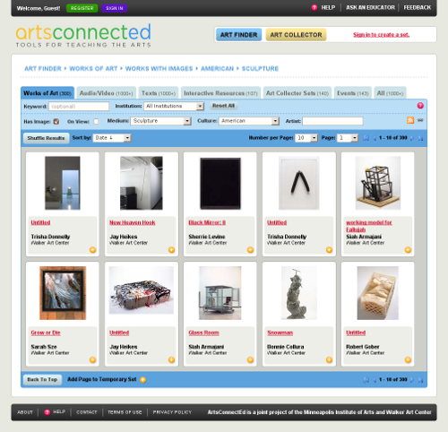
Fig 1: The search interface of the new ArtsConnected.org. http://www.artsconnected.org/resource/list
We chose to facet on the "big three" of the art world: Artist Name, Culture, and Medium. The first, Artist Name, is a text field that autocompletes user input using the full text of our artist names, and the other two are pulldown menus that allow only one selection each. That is, they only allow users to drill down towards a narrower result set; they don't allow parallel selections. Each pulldown has an "Any" selection that clears its filter, and this is the default.
Term reduction and data cleanup
The lists of unique terms for fields like Culture and Medium were daunting, with each containing many hundred entries. Unfortunately, as our data sources were not normalized to vocabularies such as the Union List of Artist Names (ULAN) or Thesaurus of Geographic Names (TGN) for places / culture, the lists were sprawling and confusing. Early on we intended to clean our data programmatically, but this proved to be out of scope for the project. For artists, this means the site does not know "El Greco" and "Doménikos Theotokópoulos" are the same person -- we can only autocomplete to artist names from our existing vocabulary.
Because we lacked organizing hierarchies, and because we wanted a vocabulary accessible to non-professionals (Amuzinskaya et al., 2007), it was decided to reduce the terms into broadly similar types. Administrators from each institution are able to sort and group the 1200 unique Mediums into a very digestible 15 items. A similar approach was taken for Culture, but a manual interface was ruled out due to the size of the list: almost 5,000 unique entries. A naive Bayesian filter was built and quickly trained by starting with the most common words, and now automatically sorts any culture string into one of 27 groups. Administrators can manually override the Culture (and re-train the filter) if something ends up in the wrong group. After some initial work, this system seems to be extremely reliable.
Because the lists were small enough to scan visually and we had no hierarchy, it was decided it didn't make sense to remove those with zero results. It was determined that it was more important to always show all the options rather than whittle the list down to nothing after the first selection. It is unclear if this decision translates to an intuitive user experience (see “Evidence-Based Recommendations”), since it can result in zero result sets.
We also had to clean our data for dates and sizes. Each field has a fairly complex parsing routine that can understand a wide variety of formats for each data type. Internally every dimension measurement is normalized to inches, and a representative size value is calculated from the largest two dimensions.
Under the hood
ArtsConnectEd harvests collection data using the Open Archives Initiative Protocol for Metadata Harvesting (OAI-PMH) to transport object metadata in the lite version of the Categories for the Description of Works of Art format (CDWAlite).
We're using Solr as our search engine. It's fast and has a nice interface to provide facet counts. All searches are handled as AJAX calls to avoid loading the entire page -- this is especially important since we decided that every change of every facet will immediately retrieve results. There is no need to hit "go" except on the open text fields. Each query is logged in our database along with the session information and a unique browse id. Any actions taken with this result set are tied back to this browse id and can be investigated further.
Log Files and Analysis
Recovering session data
The log files for the first version of ArtsConnectEd leave much to be desired. I will briefly document the cleanup effort made on this data, as I believe there are a number of institutions sitting on similar log files and these techniques appear to be useful. The log file stored a unique id for each search, the term used, the timestamp, the number of results of the search, and the User Agent string from the browser. No attempt was made to add a session to the logs, so at a glance there is no way to tell if a set of consecutive searches really came from the same person. Further examination of the data, however, allowed me to extract very good approximations of session data using the User Agent and the timestamp.
First, I defined a "session window" of 180 seconds, or three minutes. A script then iterates through the search log and looks for a new User Agent. When found, a unique session identifier is generated from the User Agent (UA) and the timestamp of the search. If the same UA is seen within the session window, the script adds that line to the session and moves on. This continues until we leave the session window without seeing another occurrence of the UA.
This approach is supported by a recent study from the Electronic Frontier Foundation showing a User Agent string on average contains enough info to uniquely identify a user out of 1,500 other users (Eckersley, 2010). "On its own that isn't enough information to ... track people perfectly," but combined with our small session window we can be fairly confident our sessions are accurate.
Several additional measures were taken to try to account for the potential overlap of UAs between actually unique users in special cases. For example, the script watches for "bursts" of search activity that occur in sequences faster than a real user can type; this sort of behavior seems to come up often in school labs where all of the machines are using the same browser and OS, resulting in identical UAs. Another algorithm watches for "bouncing", where a search term is used several times in a row, as if for paging, and then is replaced by a new term, and then we continue to see both of these terms on and off in the session. This usually indicates two users with the same UA doing different things with the system at the same time. In all cases we delete the entire session, since there is no way to accurately pull apart these overlapping actions.
Finding term facets
In addition to the obvious things like number of words per search, I also tried to analyze terms with meaning. Using the object metadata from ACE2 I exported full lists of our artist names, unreduced culture words, and all the medium terms. Each query in the logs was examined against these lists to see if a user was searching for artists, cultures, or medium. This is easy for words like "sculpture", but a bit trickier for artist names with multiple words. The algorithm we ended up using checks first for the complete artist name in the query, e.g. "Chuck Close"; this was marked as a full match. In the case of a query like "close portrait" it would be marked as a half match since algorithmically it seems likely that the word "close" means the artist, but we can't be sure. As a further refinement I gave the half matches a bit more weight if the word was capitalized, as in "Close portrait", since many users capitalize proper names. A final bit of cleanup for names involved copying and reducing diacritics (umlauts, etc) to their base character, so we could match both "durer" and "dürer".
A similar matching approach was taken for medium, where our master list contained several multi-word entries (e.g. "mixed media"). For the culture list it was easier to split multi-word entries into single words, do some manual cleanup, and use this list of single words.
Paging
The last bit of inference from the old ACE1 data was paging, since we did not explicitly record paging information from the search interface. However, by marking consecutive searches in a session that have the same term and the same number of results, we can fairly confidently say these are page changes. It's possible the user simply reloaded the page and generated another line in the logs, but for the sake of analysis we decided they were all page changes.
Log file recommendations
Based on the amount of data cleanup and recovery I had to do on these logs, it seems wise to suggest not waiting to start analyzing your data. The sooner you try to get the data out, the sooner you realize what's missing, not recorded in a way that's useful, or maybe entirely unnecessary. Fortunately there are a few aspects of data that can be recovered or inferred after the fact, but these are limited and extremely resource-intensive to discover.
Another reason to recommend performing log analysis sooner is to encourage more publishing of this data. Exposing our successes and failures in hard numbers would be a great step in the journey towards findability, especially if we can begin iterating design changes and track result. if
What Our Logs Tell Us
Are people trying to browse the old site?
Is there any evidence we can get from ACE1 that people were trying to browse the site using the search interface? I started by examining what terms were being used as people searched beyond page 10, and the results in table 3 are clear: most of the top keywords are Medium facets such as "photographs," "painting," "paintings," "sculpture," and "ceramics." Also, note the near-duplicate "painting" and "paintings"; "photo," "photograph," and "photography." This is an argument to make browse facets available on screen so users don't have to guess what words your institution uses.
| Term | Frequency |
|---|---|
| photographs | 734 |
| paintings | 413 |
| sculpture | 275 |
| arts | 263 |
| ceramics | 169 |
| pattern | 156 |
| photograph | 150 |
| landscape | 123 |
| masks | 121 |
| children | 112 |
Table 3: Keywords used in ArtsConnectEd 1
when users searched beyond page 10.
Using facet words in a query seems to strongly indicate a deeper engagement with the site, and a general willingness to search further and longer. Users including facets in their search terms, on average:
- went almost a full page deeper in their results,
- were 10% less likely to have only empty results in their session, and
- performed 2.7 times as many searches, including page changes.
When people paged extensively in ACE1, they were significantly more likely to be using facet words (particularly medium) in their query, as Fig 2 shows.
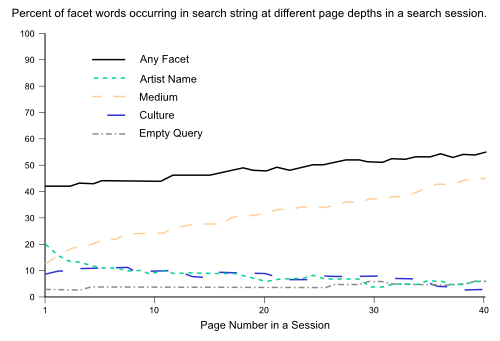
Fig 2: Percent of facet words occurring in search string at different page depths in a search session
While looking for browsing behaviors, I also did a significant amount of investigation regarding words added and removed, spelling changes, etc. That is, if a word is added, is it a name or a culture word? How many words were changed, and by how much? Was it just a respelling? There is a slight trend in ACE2 to add words to a query instead of leaving the length the same, perhaps indicating more attempts to refine the query. Overall, the numbers give us very little we can be sure of: see Table 4 for more.
| ACE1 | ACE2 | |
|---|---|---|
| Average words per query | 1.56 | 1.42 |
| Average words added or removed | -.02 | .27 |
| Percent queries with respelled word(s) | 4.1% | 6.7% |
| Percent queries with advanced search | 2.4% | 1.4% |
Table 4: Query string comparison between ACE1 and ACE2.
See text for in-depth analysis
I examined the case in both systems where one or more words were added to an existing query string, and at least one of the original words remains the same. If we assume that adding a word to an existing query means they're trying to refine their results, and removing one means they're seeking to expand them, are there trends as to what kind of words they're adding or removing? Apparently not. There was no appreciable difference in the distribution of respelled words from general usage, except there were slightly fewer artist names added. Of those added, 70% were non-facet words. The same trend is seen in word removals, with a slightly higher number of non-facet words removed at 75%.
How Does the New Site Compare?
Number of searches per session
The first number to look at is how many times the users searched per session. This is interesting because of the clear spike in the ACE2 line showing that more people did two searches than did just one. This is in contrast to ACE1 where the number of searches per session immediately begins to decline: many more people did a single search and stopped than in ACE2. Overall, the "long tail" of searches is thicker in ACE2, indicating more search activity in the new interface.

Fig 3: Number of sessions Y that did X number of searches
Success and Failure
I was unable to come up with a log-based metric to show a successful search, so I decided to try the opposite. If we define a "failed session" as one that saw a user try more than one search and never get any results at all for the session, we can determine the percentage of failures out of all sessions that had at least 2 searches. In ACE1, this figure is a depressing 8.8%. ACE2 is much better, with only 0.5% of all users who did more than one search quitting without ever getting results.
In terms of getting at least some results to users before they leave (and ignoring the question of "is it what they wanted?"), ACE2 is a vast improvement over ACE1.
Advanced Search
I defined an "advanced search" as one that includes a Boolean operator, a quoted phrase, or a wildcard '*'. (Note, the word "and" is particularly difficult to interpret, since it occurs so often in titles of works. For these figures, its use was estimated as about half Boolean, half phrase.) From Table 4, we see that ACE2 has nearly 2 times fewer advanced searches, perhaps because the browse facets allow intuitive ways to combine ideas instead of using the query string.
Facet usage
The usage of facets in search terms dropped markedly in ACE2 (about 70% of what was seen in ACE1), except for the Culture category. Investigation of the actual queries seems to indicate users are trying to refine the rather broad Culture categories we've provided in the pulldown.

Fig 4: Percent term facet usage in ACE2 compared to ACE1
Overall, this drop in keyword facets can be considered a good thing since it is made up for by usage of the browse facets. In ACE2, 3.5% of all searches included an artist name in the query, and 7.1% included a name in the artist browse field. This change in usage is also seen in Medium, with 5.1% of searches having a term facet and 14% using a selection from the pulldown. Culture moved from 4.5% as a term to 9% as a browse facet. See "Browse vs. keyword facets" below for more on term facet versus browse facet usage.
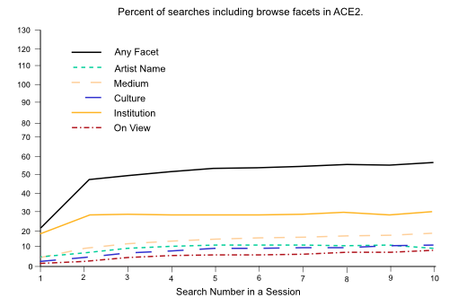
Fig 5: Percent of searches including browse facets in ACE2

Fig 6: Proportional use and overlap of browse facets in ACE2
One final graph (Fig 7, compare to Fig 2) of term usage by page number shows that in sessions that page extensively, the deeper they went, the more likely they were to have an empty query string. This strongly indicates that the browse features were being used for more extensive exploration.
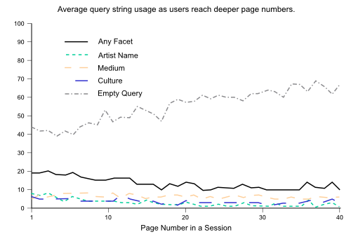
Fig 7: Average query string usage as users reach deeper page numbers
Some Real Questions Get Answers
Collection coverage
How many different objects were viewed in each of the two sites? As with most of these questions, it's not as straightforward as I'd hoped. Using Google Analytics to extract pageviews and unique URL counts of object detail pages, ACE1 saw 11,756 objects viewed 66,887 times. I expected, and got, an increase in the new site: ACE2 saw 14,105 objects viewed 135,563 times, for an increase in coverage by almost 20%, and views by 100%.
As it turns out, a good portion of these object views do not come from clicks in the search results: instead, users are "paging" at the object detail level, or flipping through their improved results like a deck of cards. Another segment of object views comes from search engines due to the new interface allowing deep crawling of our entire collection, instead of relying on links to discover the objects. These are both directly related to the search interface changes, so the increased coverage seems attributable to this change as well.
Time on site
Turning again to Google Analytics for this information reveals a clear increase: the average time spent on search and detail pages went from 28 seconds to 40 seconds, with most of the difference being on the object details themselves.
The most significant downside of doing data-only analysis is being unable to declare with confidence why numbers like this changed the way they did. Is it because the interface was able to lead them to objects they were actually interested in, or simply because the page was complicated and they were struggling to make sense of it? I'd like to believe the former, but this cannot be asserted without actual user tests.
Browse vs. keyword facets
When given facets for Medium, do users take advantage of them? Or do they continue to type things like "Sculpture" into the keyword field? The answer overall shows positive uptake for browse facets, although it does seem to vary significantly by medium. For example, the word "painting" occurs as a browse facet about 6 times more frequently than it appears as a keyword facet. The word "sculpture" is closer; it is used as a browse facet only 2.5 times more than as a keyword. The total trend is encouraging, averaging 4 times more use of the browse facets than of equivalent keywords.
Evidence-Based Recommendations
Prevent dead-ends
Facets need a count in order to prevent dead-ends. In our pulldown lists we are able to tell users how many results each selection will give them, but we don't provide any clues for several other fields ("on view" and "has image" checkbox, etc.). The difference in dead-ends is striking: with the warning, people are only a third as likely to browse into a "zero results" set as when we don't warn them. However, this is still almost a full percent of our searches, so it seems clear that some people either don't believe those numbers or don't notice them. Of these "unwarned" zero results, the majority (70%) were autocompleted artist names.
Recommendation
Every facet needs a count to indicate the results of adding it to the current search, especially if the result is zero returns. It may be argued that facets should be removed if they will not refine a result set, but with short category lists, removing facets will quickly obscure the variety of the collection. Counts are mandatory; whether or not to remove empty facets is rather collection-specific.
Clean up the "no results" page
It's easy for users to type their way to a dead-end by adding or changing a keyword, and here we have no facet counts to help. We also see some users get "stuck" on a facet, and seemingly forget that it's on. This leads to some fairly significant bouts of thrashing as they try various search terms and never find the expected results.
Example:
- User has applied a browse facet, and has some results.
- User adds or changes the search string in a non-trivial way (not just a spelling change), and gets no results.
- 25% of these users change the query again and still get no results
Recommendation
Make the breadcrumb a prominent part of the "no results" message, and give options (with counts!) to remove various pieces of the query (Nudelman, 2009). This eliminates confusion as to why a result set is empty by showing that the keyword is good, just not with that facet in place.
Suggest spelling
When a word is respelled (determined by computing the Levenshtein distance between the two query strings), there are some clear trends in what kind of word it is. From table 4: for ACE1, 4% of the total searches contained a respelling of a word, and of these 14% were artist names; culture and medium words were about 5% each. For ACE2, we saw 5.7% of all searches contain a respelled word, and the percent of facets was much lower: only 8% were names, 2% medium, and 4% culture. The slightly higher rate of respelling and the fact it is more of these "non-facet" words seems to indicate the "did you mean" function of ACE2 was able to successfully correct more general vocabulary that people otherwise missed.
Recommendation
Suggest spelling or use autocomplete wherever appropriate, but especially for artist names. These are clearly difficult for users to spell.
Don't hide results if they have no images (by default)
I can't be quite as definitive as I'd like on this, but there is a minority of users who seem to realize their filters should produce results and then uncheck the box limiting them to results with images only. If I look only at cases where users go from 0 results and "has image" on to some results and "has image" off, it is a fraction of a percent of total searches: 0.4%. Still, as we saw above, we're not providing count information on this filter to indicate the results of clicking it, so many users probably never realized their valid query was blocked by a parameter they'd never set. About a quarter of all searches show the user turning off the "has image" checkbox, so clearly some users realize its impact and want full results.
Recommendation
By default, all results should be returned, allowing users to select images only if they so choose. The ideal in this regard is the collections site at the Victoria and Albert Museum which sorts results by "richness" so all results always show up, but those with images are first.
Traffic from search engines
Perhaps the biggest difference in the two sites is also the aspect that's really at the heart of the concept of "findability": what sort of traffic did our collection get from search engines? Using Google Analytics to create a segment of visitors that landed on an object detail page, we see only 1,756 visitors from search engines in ACE1. The number of visitors landing on object pages from search engines in ACE2 is a stunning 71,276!
Recommendation
Follow standard Search Engine Optimization (SEO) procedures for your object detail pages; i.e., object title and description properly marked up and high on the page, flat images (with title and credit lines nearby) served in addition to fancy zoomable ones that aren't accessible to search engine spiders, and most important: make sure your entire collection is visible to the bots! This means you either need a full and automatically updating sitemap, or simply must stop hiding it behind a search interface. Google actually has some incredible algorithms it uses to poke forms on the Web to crawl deep pages, but they will never discover our entire collections this way (Google, 2008).
Conclusion
The concept of findability is fluid, changing as our ideas and expectations of the Web grow. What worked when we first brought our collections on-line may no longer provide a complete experience today, especially if we are limiting users to a keyword search. As Peter Morville, the author of Ambient Findability, said, "As long as humans use words to communicate, findability will remain imperfect" (Danzico, 2005). Most museums have what Google would kill for: semantic knowledge of their collection. We know who made the object, when, and where, and what it is made of. Limiting users to a simple keyword search denies these organizational concepts that can reveal our collections in their fullness.
The exciting aspect for me is that the journey toward a perfect collection interface is ongoing. In this paper I make only one recommendation that should be written in stone. It was already mentioned, but deserves a special call-out: our entire collections must be accessible to search engine spiders. A sitemap is one answer in the meantime, but a potentially more user-friendly idea would be to put the entire collection in a big set of pages that can be browsed, and hey - might as well put some filters on there while you're at it!
References
Amuzinskaya, O., A. Hilgert, J. Lesser, P. Schmitz, and G.Yu (2007). Delphi - An on-line museum collection browser. Retrieved January 22, 2010, from http://www.ischool.berkeley.edu/files/DelphiFinalReportLinked.pdf
Center for Democracy and Technology (2007). Hiding in Plain Sight: Why Important Government Information Cannot Be Found Through Commercial Search Engines. Retrieved January 31, 2010, from http://www.ombwatch.org/files/info/searchability.pdf
Danzico, L. (2005). Ambient Findability: Talking with Peter Morville. Retrieved Jan. 20, 2010, from http://www.boxesandarrows.com/view/ambient_findability_talking_with_peter_morville
Eckersley, P. (2010). Browser Versions Carry 10.5 Bits of Identifying Information on Average. Published January 27, 2010. Retrieved January 29, 2010 from https://www.eff.org/deeplinks/2010/01/tracking-by-user-agent
Ellis, M., and D. Zambonini. “Hoard.it: Aggregating, Displaying and Mining Object-Data Without Consent (or: Big, Hairy, Audacious Goals for Museum Collections On-line)”. In J. Trant and D. Bearman (eds). Museums and the Web 2009: Proceedings. Toronto: Archives & Museum Informatics. Published March 31, 2009. Consulted January 29, 2010. http://www.archimuse.com/mw2009/papers/ellis/ellis.html
Ellis, M. (2009). "Can I find it on Google?" Published October 16, 2009. Retrieved Jan. 30, 2010, from http://electronicmuseum.org.uk/2009/10/16/can-i-find-it-on-google/
Google.com (2008). Crawling through HTML forms. Retrieved Jan. 30, 2010, from http://googlewebmastercentral.blogspot.com/2008/04/crawling-through-html-forms.html
Google.com (2010). http://www.google.com/analytics
Google.com (2010). Helping computers understand language. Retrieved Jan. 30, 2010, from http://googleblog.blogspot.com/2010/01/helping-computers-understand-language.html
Hyvonen et al. (2004). “Finnish Museums On The Semantic Web: The User’s Perspective On MuseumFinland”. David Bearman and Jennifer Trant (eds). Museums and the Web 2004: Proceedings. Toronto: Archives & Museum Informatics, 2004. Consulted January 29, 2010. http://www.archimuse.com/mw2004/papers/hyvonen/hyvonen.html
Nudelman, G. (2009). Starting from Zero: Winning Strategies for No Search Results Pages. Published February 9, 2009. Retrieved January 12, 2010, from http://www.uxmatters.com/mt/archives/2009/02/starting-from-zero-winning-strategies-for-no-search-results-pages.php
Morville, P. (2008). Christina Wodtke: A Quick Word. Retrieved Jan. 20, 2010, from http://findability.org/archives/000212.php
Wikipedia.org (2010). Faceted Search. Retrieved Jan 30, 2010 from http://en.wikipedia.org/wiki/Faceted_search
Wikipedia.org (2010). Naive Bayes classifier. Retrieved Jan 30, 2010 from http://en.wikipedia.org/wiki/Naive_Bayes_classifier
Yee, K-P., K. Swearingen, K. Li, M. Hearst (2003). “Faceted Metadata for Image Search and Browsing”. In Proceedings of the ACM Conference on Computer-Human Interaction, 2003. http://bailando.sims.berkeley.edu/papers/flamenco-chi03.pdf