Introduction
When users go on-line in search of cultural heritage information, more likely than not their first stop is a major search engine. When they search this way, they have some expectation that the scope of their search is anything on the Internet. They may not be specifically looking for your collection, but something you have may attract their attention. If you are lucky, users might be familiar with your museum and its collections, but in many cases it is as if they have been dropped from the sky into the middle of your galleries. They will not know what your collecting strengths are. They may not even know how big a museum they are in, or how to get from where they are to where they want to be. Navigational aids might help them move from one space to another, but even in physical spaces, a visitor may not know what to expect around the next corner.
This work began with a simple question. How could we make the shape and contours of cultural heritage collections (as whole entities) more visible to users, especially in environments where users may be unfamiliar with the collection or where it may be one among many similar kinds? The Indianapolis Museum of Art’s Museum Dashboard and its goal to make certain processes at the IMA “radically transparent” inspired us (Stein, 2009). However, we noted that the IMA Dashboard provides little information about the collections themselves -- information that proved difficult to find in any one convenient place on the IMA Web site. The collection dashboards explored here seek to make the features of library, archive and museum collections more transparent to end users in a way that is quickly and easily understandable.
Because information dashboards are a relatively new development within the cultural heritage domain, we wanted to engage the problem in a way that was user-centered and would also allow us to quickly explore the problem space. For initial concept development, we recruited digital humanities scholars, librarians, archivists and museum professionals in conference-like settings. Their ideas were translated into initial prototypes that used readily available metadata, free on-line visualization services, and open-source software. This paper discusses two examples of cultural heritage information dashboards – one drawn from the IMLS Digital Collections and Content Project’s Opening History aggregation, and the other grounded in the collections of The Metropolitan Museum of Art.
Background
Information Dashboards
Information dashboards emerged in the 1980s from the needs of financial and business managers tasked with overseeing large, complex and often quickly changing information environments. Management strategies that emphasized key performance indicators encouraged the instrumentation and visualization of a wide variety of business processes – from sales transactions and inventory levels to employee productivity. Dashboards are:
A visual display of the most important information needed to achieve one or more objectives, which fits entirely on a single computer screen so it can be monitored at a glance.
(Few, 2006)
Dashboards are not intended to be a replacement for richer, more detailed kinds of information, but rather, are a way of presenting data that can be easily and quickly perceived. Dashboards are intended to provide a quick at-a-glance overview of a situation. This helps an observer gain a rich contextual overview in which to situate particular details. It can also facilitate giving attention to outliers or anomalies – things that are potentially interesting or worrying and so merit more detailed scrutiny. A dashboard cannot tell you everything, but it can help you to decide what to investigate further.
Although much of the dashboard literature is geared towards business applications, the scholarly researcher faces similar challenges. Currently available information in digital cultural heritage collections represents only the tip of the iceberg of what will potentially be available in the next decade. While traditional search and retrieval interfaces may be sufficient for certain kinds of known-item searching, dashboards offer an alternative approach that allow scholars to “identify trends, patterns, anomalies, and reason about what they see and help guide them towards effective decisions” (Few, 2006).
Cultural Heritage Precedents
The Indianapolis Museum of Art’s Museum Dashboard (http://dashboard.imamuseum.org) is the best example of the types of dashboards described by Few. Its focus is on a few key metrics selected by the IMA’s staff that describe operational information, such as the number of visitors to the museum (and where they came from), how much power the museum has used, and what’s blooming in the gardens. The information is not very different from what is normally shared through the museum’s Annual Reports to visitors and stakeholders.
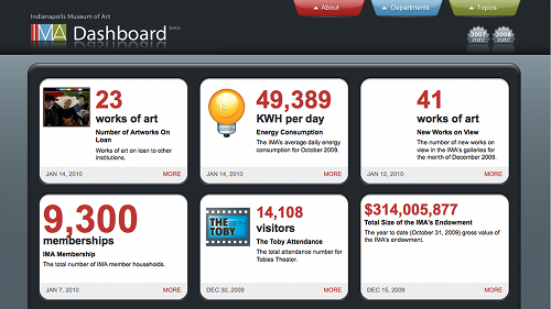
Fig 1: The Indianapolis Museum of Art Museum Dashboard
But this information tells us little about the museum’s collections themselves. It does tell us a little about new acquisitions and about works on loan, but what about the rest of the collection? This information, if available, is scattered throughout the IMA’s Web site. At a cursory glance visitors unfamiliar with the IMA:
- Cannot find the total number of works owned by the IMA
- Can find some information about the number of works on view, but this is often missing or vague (“more than 200” appears frequently)
- Can learn that the IMA has works in many different styles, periods and types, and from many different places – but not what the museum’s strengths in these different areas are
- Cannot reliably learn how much of the collection is available on-line, on- view, or in storage
- Can discover some of this information in the Collections Backgrounder memo provided for the media, but this is also missing key pieces of information that would allow comparison of the IMA’s core collecting areas.
[Please note that by singling out the IMA here, we do not intend to criticize the groundbreaking work they have done regarding transparency. Rather, they serve as a convenient example for what is typical for most museum Web sites.]
Some might object that core audiences are not interested in this kind of trivia – but Stein (2009) argues that it is making this kind of operational trivia available that has resulted in important changes at the IMA.
It should also be noted that the goals of a collections dashboard differ from other examples of novel visual browsing interfaces, such as SFMOMA’s ArtScope (http://www.sfmoma.org/projects/artscope), the National Museum of American History’s HistoryWired (http:/historywired.si.edu) or The Metropolitan Museum of Art’s Heilbrunn Timeline of Art History (http://www.metmuseum.org/toah/). While these may offer alternative ways to access a collection, it is not their goal to represent an overall summary of collection features. Derthick’s Bungee View (http://cityscape.inf.cs.cmu.edu/bungee/) interface for the Library of Congress’ American Memory Collection comes closer by offering a dynamic faceted browsing interface that highlights the relative size of each facet as users drill down into the collection. But even simple visualizations across collections can prove compelling, as demonstrated by Ellis and Zambonini’s hoard.it (http://www.hoard.it) project (Ellis & Zambonini, 2009). After scraping 70,000 object records from hundreds of different Web sites, visualizations of the types and locations of objects paint immediately recognizable patterns.
Earlier work by Greene et al. included timelines, topical browsers and geospatial views of the American Memory Collections. This “collection browser” was guided by Marchionini’s view that:
information seeking is a dynamic and iterative decision-making process in which users engage to change their knowledge state (Marchionini, 1995). This view holds that except for known-item searches, information seekers initiate search through a query or by browsing in a subset of the digital library. Users scan objects rapidly to determine whether to examine them more closely, or move on in the digital library. This process continues until the information need is satisfied or satisficed or the search is abandoned.
(Greene et al., 2000)
Dashboards, as a kind of preview/overview, need to provide sufficient information about a collection to help users judge its relevance to their information needs. The challenge is to provide this information at the right time and also “at the level and scope…so that comprehension is maximized and disorientation is minimized” (Greene et al., 2000). Ideally dashboards facilitate exploration by providing users with mechanisms to easily navigate a collection. Importantly, Greene found that in order to create useful previews/overviews, it was necessary to create metadata with consistent attributes at both the item-level and collection-level.
Fig 2: The Visible Archive Project
Collections dashboards need not be limited to collections with item-level descriptions as is demonstrated by the ArchivesZ project (http://www.archivesz.com). As with other kinds of cultural heritage collections, users of archival collections are also challenged with understanding the extent and scope of available materials. Because traditional catalogues describe single items, providing users a sense of scale for archival collections is particularly difficult. ArchivesZ provides histograms that show not only what the subject areas of collection are, but also what portion of them matches provided queries. Likewise Mitchell Whitelaw created the Visible Archives project (http://visiblearchive.blogspot.com) to address the problem of gaining a “wider sense of these cultural datasets” despite increasingly large scale.
Conventional text-based displays are unable to offer us any overall impressions of the millions of items contained in modern collections….Searching the collections is something like wandering through narrow paths in a forest: what we need is a map. [Emphasis added]
(Whitelaw, 2008; 2009)
Case Studies
Opening History
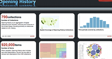
The IMLS Digital Collections and Content Project (http://imlsdcc.grainger.uiuc.edu) began in 2002 with the goal of aggregating collection-level and item-level metadata from digital projects funded by the Institute of Museum and Library Services (IMLS) National Leadership Grants. In 2007, the project expanded its scope to include not only IMLS NLG projects, but also state-level projects funded through the Library Services and Technology Act (LSTA) and recognized collections related to U.S. History. Known as Opening History (http://imlsdcc.grainger.uiuc.edu/history) this expanded aggregation provides access to 770 collection-level records that are associated with more than 950,000 item-level descriptions. Earlier usability studies found that users struggled to gain a clear sense of “collections understanding” and were often confused by what they could – or could not – find (Lee, 2005; Twidale & Urban, 2005; Palmer, 2006). User logs from the project show that visitors are more likely to arrive at a collection or item description via an on-line search rather than beginning at our home page, which includes contextual information about what is included in the aggregation. These lengthy metadata descriptions often proved as much of a hindrance as a help as users engaged in “dynamic and iterative decision-making process[es]” because they lacked clear paths to related materials or collections (Greene et al., 2000). In addition, these records often failed to provide users with information they needed to evaluate whether continuing their search was worthwhile. Users sought ready access to information such as the size, scope and strengths of a collection. Our initial sketches for a IMLS DCC collection dashboard drew on these experiences and forced us to ask: how could we provide better contextual information in more visual ways?
Patchwork Prototyping
Previous work on IMLS DCC involved many months developing full-featured prototypes (occasionally informed by paper prototyping) followed by user testing to identify areas for improvement. Unfortunately, the development framework made anything more than minor tweaks extremely difficult. Because the concept of a collections dashboard was untested, we felt it was important to break with this practice to develop proof-of-concept prototypes outside the existing development cycle. We also knew from previous experience that building services on heterogeneous Dublin Core metadata of varying quality could be difficult (Foulonneau & Cole, 2005). An alternate approach might allow us to probe the possibilities before implementing a dashboard across the whole aggregation.
In order to explore the collections dashboard landscape, we adapted a method that combines user-centered design and rapid-prototyping known as patchwork prototyping (Jones, et al., 2007). Like any user-centered approaches, finding users to inform the design process can be difficult. Rather than have users come to us, we decided to go to where the users are by enrolling participation during sessions at professional and academic conferences. Demonstration sessions proved to be an excellent environment to do initial concept development using paper prototyping techniques that informed an evolving digital prototype. Unlike traditional user-centered design approaches that require a small group to focus closely on the problem, these demonstration sessions encouraged short, brief interactions with many participants. This kind of interaction is similar to on-line “crowdsourcing” activities that helped build Wikipedia, or tagging services. Over the course of 2009, we were able to engage more than 130 digital humanities scholars, librarians, archivists and museum professionals.
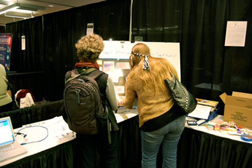
Fig 3: Participants engaged in patchwork prototyping at MW2009
During each session, participants were provided with a selection of different visualization patterns gathered from various Web sites and interface pattern libraries. Although these patterns might have represented other kinds of information/data, participants engaged in “ego-centric” design to add annotations that suggested how they, or their audiences, might use visualizations to answer questions about a collection. This feedback allowed us to develop a growing list of desirable features, functions and approaches to collection dashboards.
Desirable features (what should be visualized)
Much of the exciting work being done in information visualization and dashboards begins with information that is already quantitative – whether it is financial information drawn from changing markets, scientific data, quantitative survey data, or census data. Gross statistical summaries of a collection were a core need for most participants. However, much of this information is not currently available in already tabulated “collection census” formats, but had to be generated from a variety of metadata fields. More often than not, this information was represented by textual datatypes that needed to be counted and parsed into quantitative representations. Beyond simple “how many items are in this collection?” kinds of information, participants’ responses gravitated towards the traditional who, what, when and where questions:
| Who | What |
|---|---|
Proper names referenced
Number/percentage of items from different institutions
|
Total number of resources in the digital collection
Types/genres of materials in the digital/physical collection Formats of materials in the digital/physical collection Subjects of items in the collection |
| When | Where |
Number of items created during a particular period Timelines Relationship between the collection and major events
|
Specific map locations for items Summary distribution of collections/items by state/region/country Maps with historical political boundaries, and/or cultural group boundaries. |
Table 1: Desirable Features
Participants also suggested a number of visual clues that were not based on quantification or existing metadata, but could be used to make collection descriptions stand out and be distinct at a glance. Including a logo from the contributing institution would allow users to easily distinguish items from different collections when viewed in a multi-institution aggregation like IMLS DCC. Adding a small thumbnail “badge” that included “iconic” or “representative” images from the collection also allows users to very quickly see if the types of materials in the collection are of interest. One participant likened the challenge of creating such thumbnails to the art of creating successful movie trailers. How can you condense an hour or more of film, which may contain a complex plot, into two or three minutes? Will that trailer entice potential audiences to attend the movie?
Desirable visualizations: how should features be represented?
Simple, easily recognized visualizations that are familiar to participants are preferred over more complex and/or novel visualization types. Some of our early prototypes intentionally left off legends and labels to encourage participants to define what it meant for their collections. However, many found this frustrating as it left them unable to interpret what the pie charts, bar graphs or other visualizations meant. In order for the dashboard to succeed at providing information at a glance, clearly understood labels are necessary. An unanswered question from our brief interactions with participants is whether more complex visualization types (such as interactive stacked graphs, bubble maps, etc.) would be useful after longer interactions. In addition, some of these kinds of digital representations are really more useful as dynamic, playful ways of showing data.
Desirable functions
Personalization was one of the most important functions that participants suggested would be useful for dashboards to include. For example, the iGoogle dashboard was suggested as a possible inspiration, one that allows users to select not only which “widgets” are being displayed, but also where they appear on the screen.
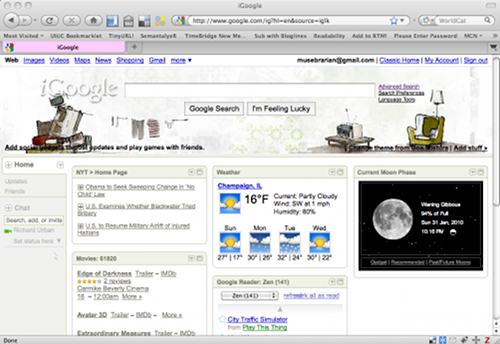
Fig 4: iGoogle Dashboard
Participants noted that different kinds of tasks would require different kinds of features or visualization types. Furthermore, different kinds of collections (be they archival, print or object-based) inherently possess different kinds of features. For any particular collection, its most prominent features could be displayed by default, but allow for customization by the user.
Although participants believed that simple summary information would be useful, ultimately they wanted those visualizations to offer navigational features as well. If a visualization showed that a collection contained a particular kind of material, users wanted to be able to select the visual area to see which items or collections matched. In addition, participants wanted the dashboard to respond to queries or selections made in nearby visualizations. If I limited my view to the 19th century, numbers, types, subjects, etc. should immediately refresh to show a new summary.
Lastly, participants also desired the kind of recommendation services found in Amazon or Netflix. When viewing a summary of a collection, seeing “related” collections might validate that this collection would be useful or could be a pathway to related materials. In a similar vein, participants also wanted to be able to “compare” two or more collections with each other in order to make decisions about which might better meet their information needs.
Draft prototype
The input from live demonstration sessions informed the development and refinement of a working prototype of the Opening History dashboard (http://www.richardjurban.net/dashboard). In addition to drawing on user-centered design, we also had an interest in seeing how far we could get using resources ready at hand and by playing with available tools. Since the dashboard was a new idea, we wanted to be able to use the emerging design to stimulate discussions. Since we’d only be risking the time invested in the project, it was cheap enough to say, “I bet if they saw it, they might like it.”
In order to do this, we relied heavily on free Web services and readily available open-source software. MIT’s SIMILE project provided the method to gather XML (http://simile.mit.edu/wiki/OAI-PMH_RDFizer) and to characterize its features (http://simile.mit.edu/wiki/Gadget). The frequency counts that Gadget provides can be easily translated into CSV formats that work with available visualization services – thanks to the work of Viégas , Wattenberg, and others (2005) interested in “democratizing” visualization, services like ManyEyes (http://manyeyes.alphaworks.ibm.com) and the Google Visualization API (http://code.google.com/apis/visualization/). Finally the IMA’s Museum Dashboard Drupal-module (http://code.google.com/p/museum-dashboard/) was used to “stitch” these individual components together. Because the dashboard does not rely on any one technology, it is easy to swap out a particular visualization for another. It also makes asking, “is this little hack good enough to actually be useful to someone?” possible. This bricolage approach means that as new tools pop up, they can be adopted. This isn't a systematic exploration of the design space in the same way a from-scratch project might approach it, but it allows us to very rapidly hop around to different tools as needed. As such, it exploits the relatively recent phenomenon of certain kinds of software abundance – existing programs and Web services that can be used and, most importantly, combined to assemble working prototypes and even deliverable applications.
Building the framework for our dashboard proved to be easier than building the content. Ideally we would like to offer a dashboard for each of the collections aggregated by Opening History. While this might have been possible for any one collection, variations in metadata quality proved to be disparate enough to make this difficult. Minor encoding differences meant that the number of “unique” values expressed in the metadata ballooned to the point of making the visualizations complex and unreadable. Metadata quality hurdles are issues that we can overcome in a more intensive development process. However, varying metadata quality makes iterative and rapid prototyping difficult.
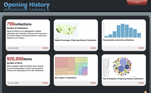
Fig 5: Opening History Collection Dashboard Prototype
In order to develop a complete prototype, we turned to the collection-level metadata directly managed by IMLS DCC. Because input forms control data entry, this metadata offered a more regular set of values that could be easily visualized. We selected six metrics (shown in figure 5) to fit on a single screen in the IMA dashboard template (though more could be added “below the fold” in the future). One drawback to relying on modules created by others is that it can be difficult to add in customized features that participants suggest would be useful. Certain kinds of functionality are not currently available in our existing prototype, although there are clear opportunities to reintroduce them as a more full-fledged design emerges.
Dashboards at The Metropolitan Museum of Art
The Metropolitan Museum of Art collections include more than two million works of art from all over the globe, spanning five thousand years of history. Information about the collection is presented on-line in a straightforward manner – faceted by department, searchable by keyword, and sortable by individual fields. The only aggregate collection level information presented is the number of objects in a department. Individual object pages provide an image of the object along with the object description and attendant metadata, but no efforts have been made to further contextualize the object within the collection.
Using the same patchwork prototyping approach as with Opening History, a series of dashboard visualizations have been developed for The Metropolitan Museumof Art's collection information (http://museumpipes.wordpress.com). Using Many Eyes, Yahoo! Pipes (http://pipes.yahoo.com), and Google Charts (http://code.google.com/apis/chart/), these dashboards are made up of focused visualizations using aggregate metadata, each tailored to answer a particular question about the collection.
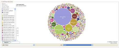
Fig 6: What Media are represented in American Paintings and Sculpture from The Met?
Prototype analytic dashboard – Visualizar
In addition to the largely static snapshots of The Metropolitan Museum of Art's data, we were interested in whether our design methodologies could be applied to more analytic dashboards that allow more direct manipulation of the data.
As part of the Visualizar’09 workshop at the MediaLab-Prado, Adamczyk (2009) used data from The Metropolitan Museum of Art, Brooklyn Museum, and Powerhouse Museum for another prototype iteration. A common metadata format was established and records were collected through a combination of API access, page scraping, and direct download. All records were translated, but ultimately the records available through the Brooklyn Museum API (http://www.brooklynmuseum.org/opencollection/api/) proved the most complete and internally consistent, and the visualizations below reflect portions of only the Brooklyn Museum collection.
The main dashboard window consists of a control interface and a timeline viewer. The timeline viewer is a 3D volume where the x-axis represents time, individual Museum departments are slices along the z-axis, and the y-axis is a stack of all of the objects within a department. Individual results are represented by a string of points, one for each year of their associated date range. The control interface includes sliders to manipulate the 3D camera position and distance, toggles that determine the display of each department, date range sliders, and search boxes linked to full text filters for common metadata fields: maker, title, description, and medium. Navigation of the 3D timeline view is also possible directly through the mouse when the control panel is closed.
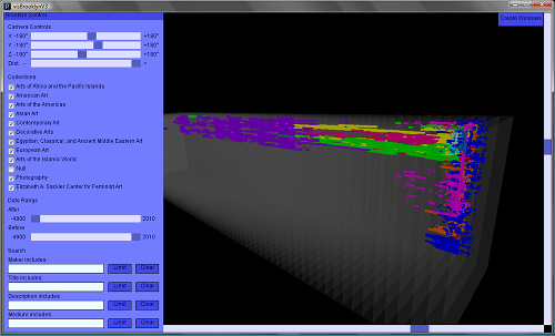
Fig 7: Dashboard control panel and 3D timeline viewer
Along with the 3D timeline viewer in the main window, the dashboard includes 4 additional views on the data:
- An Artscope-style gallery viewer where each of the objects matching the control interface criteria are displayed in a grid. The size of images in the presentation is determined by the amount of available screen space. Hovering over any of the objects brings up a larger image and a full description of the object.
- A histogram showing the distribution of the results on a timeline.
- A tag cloud of the terms in the descriptions of all of the objects.
- A 2D stacked timeline viewer, similar to the 3D presentation, but where the departmental layers are stacked.
All of the visualizations are controlled through the control panel in the main window; any adjustment in the main panel updates all of the spawned visualizations. The single control interface, combined with visualizations that focus on both overview and detail presentations, allows for quick contextualization of individual records and an at-a-glance view of the entire result set.
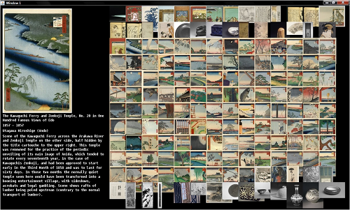
Fig 8: Artscope-style presentation of a selection from the Brooklyn Museum Asian Art department
Each of these visualizations is still a very early result of our design process. Future iterations will include combined visualizations; e.g. the histogram of results will be available as a layer alongside the 2D or 3D timeline views. Though the entire dashboard framework was built in Java using custom visualization code, it was built on existing open libraries. So while its development required more familiarity with Java, the dashboard was still very much a rapid prototype. Similar to the Opening History dashboard, this approach isn’t meant to be a systematic exploration of the possible visualization space, but rather a rapid prototyping approach to better understand the challenges when providing interactive access to very large cultural heritage datasets.
For example, representing time arose as a significant design issue. A visual ambiguity develops when a record labeled as 18th century is represented by a string of 100 points, while an object from 1734 is a single point in the visualization. While less precise, the long string is more visually salient and can skew interpretation of the visualization. More speculative or abstract visualizations of aggregate data may resolve these kinds of issues, but may make it hard to navigate from the overview presentation to individual records. Available screen space will be a problem for any visualization with this many individual data points and views on the data, though some visualization techniques from large display research may scale down to desktop visualizations (Manovich, 2008).
Design Implications
As digital cultural heritage collections continue to grow larger, we may need to broaden our concept of what metadata is for and what services it supports. Current practice privileges descriptions that are as unique and special as the things they describe. Humans have an incredible ability to recognize patterns and make inferences based on limited information, if provided the right contexts. Human readable metadata meets our needs on the small scale, but in the future it will be necessary to consider how visualizations can help us to see the big picture. While improved approaches to metadata encoding and adherence to content standards can help, finding consensus across the LAM sector will continue to be a challenge. While the problem may be daunting, it also calls for shared solutions. One approach that could move forward our ability to construct dashboard visualizations is an end-to-end service that accepts cultural heritage metadata in various formats (DC, VRA, CDWALite, etc.), aggressively normalizes key metrics, and provides output that is readily available for visualization. A number of tools and services are already available, but as of yet they have not been knit together in this way.
Even with such services it may not be possible to build a complete – or useful – dashboard for any arbitrary set of metadata. In fact, a dashboard visualization may prove more useful as a diagnostic tool for metadata creators, publishers and service providers. Metadata quality work at the National Science Digital Library (NSDL) relied on off-line tools like Spotfire to identify anomalies (Dushay & Hillmann, 2003). Nichols et al. have also demonstrated the usefulness of clear but simple visualizations in a lightweight metadata quality tool (Nichols et al., 2008). Like earlier business intelligence dashboards, a metadata quality dashboard could help identify anomalies in new records, or help make decisions about where and how to share metadata in other environments (especially if aggregators had profiles of their own).
Conclusion
Scientific and financial information visualizations are well established mechanisms to enable people to derive insights from data. Information dashboards are a special category of visualization particularly aimed at enabling people to gain rapid contextual overview and to spot certain anomalies, discrepancies or unexpected variations in a pattern that might merit further scrutiny. Traditionally, visualizations have been developed by a laborious and consequently expensive process. The recent growth in the provision of freely available software, APIs and Web services means that it is now possible to develop certain kinds of visualizations at much lower costs of time and effort. This allows the exploration of new applications of visualization techniques, including areas that lack the significant resources of big science and business. This paper has noted some work undertaken to explore the potential of dashboard visualizations in the context of supporting the understanding of museum collections. The low cost and high speed of development enabled by selecting, repurposing and combining different visualization options allow for an exploratory approach which has only recently been possible. This enables the consideration of new kinds of visualization, and visualizations new to the cultural heritage setting. Not all will turn out to be useful or usable. But the approach allows us to rapidly explore the design space and to involve people in this exploration and testing. This preliminary work notes the recurrent difficulties arising around metadata quality, coverage, and consistency. This is only to be expected, as visualization typically entails the repurposing of museum metadata and can involve translations from a rich, qualitative, diverse and idiosyncratic description, entirely suitable to exploring the uniqueness of individual artifacts (which is often the reason why they were collected in the first place). Drawing on its scientific and financial origins, most visualization resources are better suited to metadata that is amenable to quantification and standardization. This tension is likely to become the key bottleneck as more visualization resources proliferate.
Acknowledgements
This research was supported in part by a 2007 IMLS National Leadership Research and Demonstration grant LG- 06-07-0020-07.
Creation of Brooklyn Museum API visualizations was supported through the “Visualizar’09: Public Data, Data in Public” workshop hosted by the Medialab-Prado in Madrid. Medialab-Prado is a program of the Department of Arts of the City Council of Madrid, aimed at the production, research, and dissemination of digital culture and of the area where art, science, technology, and society intersect.
References
Adamczyk, P. (2009). What do they have? Alternate Visualizations of Museum Collections. Updated January 27, 2010. Consulted January 31, 2010. Available http://medialab-prado.es/article/muestra_de_proyectos_visualizar09_datos_publicos_datos_en_publico
Dushay, N, and D.I. Hillmann (2003).” Analyzing metadata for effective use and re-use”. Proceedings of the International Conference on Dublin Core and Metadata Applications, Seattle, WA.
Ellis, M., and D. Zambonini (2009). “Hoard.it: Aggregating, Displaying and Mining Object-Data Without Consent (or: Big, Hairy, Audacious Goals for Museum Collections On-line)”. In J. Trant and D. Bearman (eds). Museums and the Web 2009: Proceedings. Toronto: Archives & Museum Informatics. Published March 31, 2009. Consulted January 31, 2010. http://www.archimuse.com/mw2009/papers/ellis/ellis.html
Greene, S., G, Marchionini, C. Plaisant & B. Shneiderman (2000). “Previews and overviews in digital libraries: Designing surrogates to support visual information seeking”. Journal of the American Society for Information Science, 51(4), 380–393.
Few, S. (2006). Information dashboard design: The effective visual communication of data. Beijing: O'Reilly.
Foulonneau, M. and T.W.Cole (2005). “Strategies for reprocessing aggregated metadata”. In Andreas Rauber, Stavros Christodoulakis, and A Min Tjoa (Ed.) 9th European Conference on Digital Libraries. ECDL 2005, September 18-23, 2005, Vienna, Austria., 290 – 301. Available: http://imlsdcc.grainger.uiuc.edu/docs/metadatareprocessing.pdf
Jones, M.C., I.R.Floyd & M.B. Twidale (2007). “Patchworks of Open-Source Software: High Fidelity, Low Cost Prototypes”. In K. St. Amant and B. Still. The Handbook of Research on Open Source Software. Hersey, PA: ISR. 126-140.
Lee, H.L. (2005). “The Concept of the Collection from the User’s Perspective”. Library Quarterly. 75(1), 67-85.
Manovich, L. (2008). Cultural Analytics: Analysis and Visualization of Large Cultural Data Sets. Updated 2008. Accessed January 31, 2010. Available http://softwarestudies.com/cultural_analytics/cultural_analytics_2008.doc
Marchionini, G. (1995). Information seeking in electronic environments. Cambridge, MA: Cambridge University Press.
Nichols, D. M., C. H. Chan, D. Bainbridge, D. McKay & M.B. Twidale (2008). “A lightweight metadata quality tool”. In Proceedings of the 8th ACM/IEEE-CS Joint Conference on Digital Libraries, 385–388.
Palmer, C.L., E.M. Knutson, M.B. Twidale, Z. Zavalina (2006). “Collection Definition in Federated Digital Resource Development.” In Proceedings of the 69th Annual Meeting of the American Society for Information Science and Technology. Vol. 43. Austin, TX.
Stein, R. (2009). Museums and Transparency – Walking the Talk (Part I) Updated November 3, 2009. Consulted January 30, 2010 Available http://www.imamuseum.org/blog/2009/11/03/transparency-and-museums/
Twidale, M.B. and R.J. Urban (2005). Usability Analysis of the IMLS Digital Collection Registry. Consulted January 31, 2010 Available http://imlsdcc.grainger.uiuc.edu/3YearReport/docs/UsabilityReport1.pdf
Viégas, F.B., M. Wattenberg, F. Van Ham, J. Kriss and M. McKeon (2005). “ManyEyes: A Site for Visualization at Internet Scale”. IEEE Transactions on Visualization and Computer Graphics 13(6), 1121.
Whitelaw, M. (2008). Project Outline. Updated July 2008. Consulted January 30, 2010. Available http://visiblearchive.blogspot.com/2008/07/project-precis.html
Whitelaw, M. (2009). “Visualizing Archival Collections: The Visible Archives Project”. Archives & Manuscripts 37(2), 22-41.