
![]()
![]()
![]()
![]()
![]()
![]()
![]()
![]()
![]()
![]()
![]()
When is the next
Museums and the Web?
![]()
Archives &
Museum Informatics
158 Lee Avenue
Toronto, Ontario
M4E 2P3 Canada
info@ archimuse.com
www.archimuse.com
| |
Search
A&MI |
Join
our Mailing List.
Privacy.
Copyright
Archives & Museum Informatics
2000

Virtual Museums Made Easy with New Techniques and Tools
Abstract
Currently, there is often a division of labor involved in virtual museum maintenance. The curator or administrator updates text, graphic, or multimedia content, and submits it to the webmaster, who then fits the page into the overall site design and uploads it to the web server. However, there are an increasing number of ways that they can both save time and hassle by enabling the curator or administrator to update the site herself. Museums whose goals include public education should consider the use of tools that allow non-technical staff to update the virtual museum without having to learn complicated software, style sheets, HTML, FTP, DHTML, and the myriad of other acronyms involved in site maintenance. Using a content management system, an easy-to-use interface allows an administrator to create new pages or update the content area on an existing page. The webmaster concentrates on the more complicated parts of the page, including the navigation bars, frames, popup menus, sounds, etc. There are also an increasing number of easy-to-use tools for creating pages. A webmaster can create the standard site template, and teach the curators the few things they'll need to know to get the job done. The webmaster can then focus on the design and template, instead of having to create each page himself. This paper explores the beginnings of a shift from web sites as technical challenges to web sites as tools for presentation and communication.
Overview
I�m going to talk about ways that you can set up a system that will allow administrators, volunteers, and non-technical people to maintain and enhance your web site.
Like most technological endeavors, it should be borne in mind that the crucial part of the system is not the hardware or software or middleware, but the liveware. First and foremost in your mind should be the end users. First and foremost in your planning, design, development, deployment, and maintenance. There is a person in your organization who you expect to use the system. Get a photo of that person and tape it to the edge of your monitor. Remember that person in everything you do. "Will that person understand this?" "Does that person know how to do X?" Does that person think in such a way that this will make sense? How do I communicate this concept to that person? Remember that this person is your friend, and will do their best to help you make the system a success. You are solving a problem for this person (and yourself at the same time) This person is the most important component in the system, in the same way that the customer is the most important person to any business. The most important link between you two is the written instructions that, with their help, you will create and they will use.
I don�t want to go into all the politics that are involved with system design, except to ensure that you start off by articulating the problem to be solved in writing, designing a system, and getting buy-in from all the stakeholders. The "in writing" part is important, because you can have a verbal conversation with someone and yet come away with completely different ideas about what was decided. If the decisions and reasons are put in writing, misunderstanding is less likely and effective communication is more likely. If you think putting it in writing is a waste of time, wait until you've wasted a lot of time building something that's "Not quite what I wanted". Like most technology issues, you have to get the people on board before you can solve the problem.
Overall Considerations
Don�t forget the need for backups! If someone accidentally changes a piece that shouldn�t be changed, be sure there�s a recent backup somewhere.
"Cheat Sheets"
For many of the procedures users will need to do, a simple, precise description will help users remember what you�ve taught them, answer their questions when you�re not around, and in general be happier and more effective.
Here's a sample "Cheat sheet" for resizing a photo in PhotoShop 5.02:
- Before you start, you'll need to know
- the name of the existing file,
- the size you want it to be on the web page (in pixels),
- the filename for the resized image.
- Open PhotoShop (Start / Programs / Adobe / PhotoShop 5.0 / PhotoShop 5.02)
- Open the photo file (File / Open; Drop down the "Look In" box, go to C:\Website\Images)
- From the top menu, select Help / Resize Image.
- In the "Resize Image Wizard" toolbox, click the Online option, then "Next".
- In the Width box, type the width you want in pixels. If it's a landscape picture (i.e., wider than it is tall) you probably want the width to be 400 pixels. If it's a "Portrait" picture (i.e., taller than it is wide), you probably want the width to be 300 pixels. Notice that the Height changes as you type.
- Click Next.
- Click Finish
- Select File / Save As, and enter the new file name in the File Name box. Do not enter a suffix.
- If the "JPEG Options" dialog box comes up, click OK.
- You're done!
Note in particular the "Before You Start" section. It's important that your "cheat sheets" include as many potential problems as possible. With PhotoShop, for example, there are many modes and options that must be set just so in order for even a simple cropping command to work correctly. Be sure to explain all the modes and settings that you know about, because you will never know what settings an inexperienced user might inadvertently set! You should go over this with the user at least once, and possibly several times depending on how quickly the user catches on and how comfortable they are with computers. If you write the "cheat sheet" in HTML, and teach the user to put a bookmark into their web browser, then they can print it any time they need it and/or refer to it online, depending on their taste.
Development Site
If at all possible, you should always have a copy of the web site on one of your own computers. You use this one to make and test changes. Because you always use relative URL�s (you do always use relative URL�s, don�t you?), the links will work even if you don�t have a web server. Whenever a page is changed, you can go to this site and verify that the page loads correctly, is formatted correctly, the graphics files are present and sized properly, the navigation links work, etc. Note that this isn�t possible with all the techniques I�ll show here.
Templates
With this strategy you find out what editor the user is comfortable with, and tailor the system to that editor. If it�s MS-word, you can provide a Word template that can be saved and edited as HTML. Explain to the person which parts of the page they can muck with, and which should be left alone, and put notes in HTML comments to reinforce and explain it. If you choose to use an HTML editor like HoTMetaL, explain the basic buttons and options, show them which ones are best left alone, and � most importantly � write it all down! Have a 1-page "cheat sheet" available for them to refer to.
It is important to be aware of Word�s characteristics in saving HTML documents, and the way in which it may modify the document without your say-so. One unfortunate characteristic of Word 2000 is that when you save some documents as HTML, they can only be read by Internet Exploder 5.0. If another browser tries to view the page, a GIF of the page is displayed, and none of the links work.
I only use Word as an example because many people are familiar with its use.
Notepad or any other HTML editor can be used with templates. If you put notes inside the text in HTML comments, you can easily teach people what to change where. For example, the template:
<html><head><title>
<!-- Ed, put the title here. The title is what appears in the very top blue bar. -->
</title></head>
<body bgcolor=ffffff>
<!--#include virtual="navbar.htm" -->
<h1>Volunteers</h1>
<!-- Ed, substitute the correct photo file name in the SRC= part. Don't forget the quotes! -->
<img src="photo_file_name.jpg"><br>
<!-- Ed, put the list of volunteers who helped out at this particular workday here. Put a <br> tag between each person's name like this:
George Washington<br>
Susan Anthony<br>. -->
<!--#include virtual="pagefooter.htm" -->
Could be correctly implemented thusly:
<html><head><title>
Volunteers at the Great Painting Party, April 16
</title></head>
<body bgcolor=ffffff>
<!--#include virtual="navbar.htm" -->
<h1> Volunteers at the Great Painting Party, April 16</h1>
<img src="volunteer_photo_Apr_16_2000.jpg"><br>
George Washington<br>
Susan Anthony<br>
Benedict Arnold<br>
Betsy Ross<br>
Winston Churchill<br>
<!--#include virtual="pagefooter.htm" -->
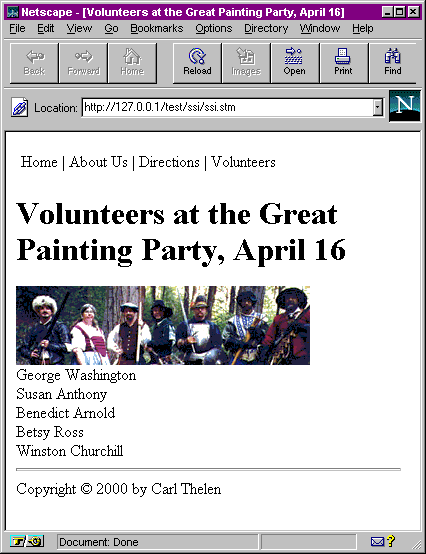
Figure 1, The Completed Template
Notice my use of a simple server-side include here, to take care of the navigation bar and page footer, which often includes copyright, disclaimer, and other information, in addition to the </body></html> tags.
Simple parse pages
The user enters basic page information in a text file. A Perl or ASP script reads the page, parses out the page elements, and generates the HTML. This has the virtue that changes in the overall look and feel can be made in just one place, the script.
For example,
TITLE: Slow Match
PHOTO: Slow_Match.gif
TEXT: Slow match is made by soaking rope in a nitrate solution, then letting it dry. It burns slowly and evenly despite wind and rain. Well, wind, anyway. The match is lit, and put into a small clamp on a pivot on the side of a gun. When the trigger is pulled, the clamp moves to push the match into the priming powder, which sets off the priming powder and the main charge.
Your Perl script reads the page from the disk, parses the fields, and adds the appropriate HTML, including any CSS and style information, to the page. These might be accessed via URL's like
http://mymuseumsite.org/cgibin/pagedisplay.pl?page=Georges_Teeth.txt
This technique requires knowledge of Perl programming, or at least where to download such a script, and imposes additional load on the server to parse each page. Still, it might be an appropriate solution for your needs.
Web sites to create web sites
You may or may not be aware that there are a variety of sites that allow you to create your own web site on their servers for free. Ask Jeeves alone lists 11, and www.thefreesite.com lists 46 more. Some of them have their own "site builder" pages, and are the ones that would be more interesting to you because you can teach your administrator how to use them, while you focus on more complicated things. They each have their own characteristics: AngelFire only allows one page, though it can be as long as you want. HomePage is pretty cool, but its navigation leaves something to be desired. They all have the disadvantage that they either have advertising on the site or will soon, or will go away as someone eventually figures out that they do not effectively monetize the traffic they get. MetaMuseum.com has the advantage of being optimized for museums, but is not free.
The general strategy is for you, the webmaster, to create and maintain the relatively static pages such as the home page and the "hours" page. Then create a HomePage site for each area that you want the volunteer to maintain, and a link from your home page to there. You could set up a "site" for each area of your museum, and display it in a frame. Again, a cheat sheet could be useful depending on the intellectual agility of the administrator, but most systems are sufficiently easy to use that it�s not necessary.
I want to direct you to www.thefreesite.com, where it list dozens of places you can get free hosting. Some, but not all, include do-it-yourself page creation sections you can use to create your virtual museum.
Angelfire
Angelfire, for example, has an easy-to-use. "Basic Editor". Here's' the page I created to investigate it. http://www.angelfire.com/ca4/cthelen. Note the irritating popup advertisements. Note also that there are no links to the other pages I created on Angelfire. When I chose the "Personal Information" page type, for my main page, it did not allow for any links on the page. If I didn't just happen to know HTML pretty well, I'd have been stuck. Actually, I did put a link on the page, and now I'll show you how, and show you a bunch of other stuff about Angelfire's system.
Once you've logged in, there are a lot of options for you, though how to complete a given task is not always intuitive. For example, when you want to create a new page, you enter the filename into the Input box and click create/edit. It would be nicer to have a button saying something to the effect of create new page. They give you a pretty easy-to-use interface into your directory structure. However, it assumes that you're already familiar with directory structures and relative paths.
When you create a new page, you are presented with a number of layout and color scheme options. For the man on the street, these canned styles are OK, but any museum that has already picked out a color scheme for its logo and print media will have to pick colors from another page. Select a Standard page type, a color scheme, and click submit to go to the next step (here's another peeve of mine: "submit" is a pretty nondescript description of what will happen when you click the button! How about "Next step" or "Finish"?).
Here's where you can choose your colors, enter a background image, enter the title, main logo, alignment, font size, headline and title, a list, a set of links, and a text block. The coolest thing about this is that you can use the radio buttons at the bottom to rearrange the order in which these page elements appear. Also, if you leave one blank, it simply doesn't appear. You can come back later and put it in if you want. Then you can create another page, link to it from the "Links" section of your page, and go on from there. You just have to get used to all the darn advertisements!
You can switch to "Advanced mode" for a page, and make a one-time transition to straight HTML. You just can't go back to using their basic editor. There is a lot of HTML help available online if you choose this option.
HomePage
Homepage is another free hosting service with a do-it-yourself web builder. It can be really slow at peak usage times, and is only passable during off-peak. It doesn't work very well with Netscape 3, but doesn�t' tell you which features and links won't work. For that matter, it doesn't work very well with Netscape 4, either; I got a large number of page errors, and even crashed Netscape 4 (so ugly that even Netscape's automatic "talkback" feature crashed, too!).
Their color selection scheme is pretty cool, if you have a browser that fully supports Javascript. Their basic page editor lets you change many page elements, though you can't rearrange them as you can with AngelFire. They break tasks down into logical, simple steps so almost anyone can use it. They don't have as good a selection of photos and clipart as Angelfire, but the selection process is easier because it brings up a separate window in which to do the selection.
Overall, the online help is passable, and the flexibility is impressive. Again, they don't help you with navigation too much, as there are no automatic links between pages.
MetaMuseum
Disclaimer: MetaMuseum is my company.
MetaMuseum is museum-specific, and provides cool features like newsletters and sounds, it automatically takes care of navigation and layout, and has no irritating advertising, and it's still small enough to be highly responsive to customer needs. However, it costs a hundred dollars a year, and for many organizations that's a deal-breaker.
I've set up a MuseWeb site on MetaMuseum to demonstrate its features. MetaMuseum is designed to work with as many browsers as possible, including older browsers like Netscape 3 and Explorer 3. (In this regard I could point out that HealthCentral.com gets 7% of its hits from version 3 browsers; HealthyWay gets 10% of its hits from Netscape 3 alone!)
There is a beginner mode and advanced mode. In beginner mode, the help text is right there with each data entry field; in advanced the help is at the very bottom of the page with links back and forth.
The way the main table is laid out reflects the hierarchical nature of the navigation. You've got the main page linking to Exhibit pages, which in turn link to Item pages. On the one hand, this constrains the way you can set up your site, but it means that no page is more than two clicks away from the home page and so is easy to get to. From the main menu page you can quickly edit any element on any page or go the upload page for that element. The linkage between filenames and uploaded files is automatic.
You'll notice that the Item pages don't have a "Colors" link. This is because I feel it's good design to keep some consistency between pages on a site, and you shouldn't change everything on every page.
The Edit page allows you to change the text, image filename, fonts, etc. Here you can see the help text right there to explain what each field is, and how the "submit" button has a little better description of what it does. This also allows you to change the sound file associated with a page. There is a library of MIDI music available, and I often record my own speech to add a little interest to the pages. Sounds on web pages are not common now, but will become more common in the future.
MetaMuseum also has a Newsletters feature that lets you send periodic newsletters to subscribers. It an "opt-in" system that requires a confirmation e-mail from the subscriber to activate a subscription. This prevents spammers from using MetaMuseum. You can have up to 1000 people subscribed to your newsletter.
While this site is designed to be an all-in-one museum web hosting product, it can easily be linked into a frameset that is more your style or color scheme.
Microsoft FrontPage
Microsoft FrontPage, as most of you probably know, is a development system intended to address the very issue we are discussing here, namely, making web site development easier. FrontPage has the advantages of
- Includes Javascript rollovers
- Includes templates, graphics, and "canned" styles and templates
- Relatively easy database access
It has the disadvantages of
- Costs $100
- Is relatively complicated to use
- Only runs on Windows
- Needs FrontPage extensions on the web server for many features to work
FrontPage comes with a number of templates to choose from that create simple yet effective pages that are logically linked together. While I hesitate to call the interface "intuitive", I found it easy to use and learn. I think a person of average intelligence and computer experience would be able to work with it effectively if they had a little tutoring in the basics.
FrontPage thinks of its directory structures as "Webs", the idea being that one web equals one web site, including all the pages and graphics. There are views into Folders, Files, Navigation (which is the most useful view), Hyperlinks, Link Status, Themes, and Tasks. FrontPage is essentially two parts: the FrontPage Explorer (personally, I'm getting a little tired of Microsoft calling everything "Explorer", aren't you?), and the FrontPage Editor. From the Navigation view, you can double-click on a page to edit it.
The FrontPage Editor is a pretty good editor, with pretty good WYSIWYG editing capabilities. You can specify paragraph properties, add "hover buttons" that change color when the mouse is over them, marquees, hit counters, and multimedia elements.
If your system doesn't already have a web server installed, I would recommend installing the Personal web server that comes with FrontPage. That way you can have all the files on both your local machine and your ISP's web server.
Again, the point here is to either use this tool to make your job easier, or teach others the basics of using it to add and edit pages. They don't need to know every bell and whistle (and there are a lot!), just enough to get their job done.
Vignette StoryServer
I cannot demonstrate this high-end product here because it is very expensive, around $5,000 for the generic cheap version. However, I can mention a number of successful web sites that use it, including Ziff-Davis (http://www.zdnet.com), and Preview Travel. You can tell a StoryServer site by its characteristic URL: http://www.zdnet.com/yil/stories/features/0,9539,2434426-1,00.html. All the numbers and commas after the last slash imply a StoryServer site. StoryServer has many features, one of which is a powerful content management tool.
Conclusion
I hope I've got you thinking about ways that the overworked and underpaid museum web master or mistress can empower others, utilize volunteers, and generally get more web bang for their buck. While it is unlikely to get you more free time (because, of course, your workload will increase accordingly), it will make the web site more of a team effort and give more people a hand and a stake in it.