
![]()
![]()
![]()
![]()
![]()
![]()
![]()
![]()
![]()
![]()
![]()
![]()
![]()
|
158 Lee Avenue ph: +1 416-691-2516 info @ archimuse.com Join
our Mailing
List.
published: March 2004
|

To Flash or Not To Flash? Usability and User Engagement of HTML vs. Flash
David T. Schaller and Steven Allison-Bunnell, Educational Web Adventures, Anthony Chow, Paul Marty, and Misook Heo, Florida State University, USA
Abstract
Of the many challenges facing developers of museum Web sites, usability and engagement rank high. Many developers have adopted Macromedia Flash as a useful tool that allows greater interactivity and multimedia compared to HTML pages. This paper reports on a comparative evaluation of Flash and HTML versions of a single site, focusing on user information-seeking goals, behavior, and responses to each version of the site. We then compare the two versions based on holding power, time on task, user satisfaction, and qualitative interviews.
Testing found notable differences between the two versions of the site, and between youth and adult tester groups. The results provide valuable insights into the relative strengths and weaknesses of Flash and HTML. While we cannot draw broad conclusions from a single case study, these data can help us begin the discussion around developing preliminary standards and basic frameworks for suggesting rationales for choosing Flash or HTML in a number of typical situations facing museum Web developers.
Keywords: Web media, Flash, HTML, usability, engagement, user testing
Introduction
Web developers have many tools at their disposal for the creation of dynamic, interactive Web sites. Many of these tools, however, come with tradeoffs, and none more so than Macromedia Flash. Flash allows developers to go far beyond the text and image foundations of the Web to create sophisticated applications, full-fledged games, rich multimedia, and complex interactivity. But the tradeoffs are significant: Flash content is invisible to search engine spiders and inaccessible to many disabled users and to users who do not have and cannot get the Flash plug-in. Development costs are often notably higher for Flash as well.
Are these tradeoffs worth it? Do Flash sites overcome these liabilities by creating more engaging and effective experiences for users? These are questions that Web developers often debate, with little or no concrete evidence to base their decisions upon. This paper provides such concrete evidence - a case study of an educational Web site about Renaissance art and history fully developed in both Flash and HTML - and represents an initial effort toward a proper understanding of the many factors that should determine whether "To Flash or not to Flash."
Flash Usability On The Web
According to Jakob Nielsen (2000a), usability can be defined as how much utility a product or system has and how easy it is to use. Utility can be defined as how well a product or system meets the needs or goals of the intended users. So evaluating the usability of some product, service, or system means answering two essential questions: Does anyone want to use the product or system for its intended purposes? And, if so, how easy it is to use?
After many years of trial and error, experience has taught us that interacting with a Web site depends largely on two factors: how well a site meets the user's self-defined needs and, if it does, how easy it is for the user to locate what they are looking for. As Nielsen advocates, sites should be engineered to support user interaction and whatever they are trying to find or do by using the site in the first place.
The first generations of Web content produced with Macromedia Flash (versions 3 and 4) were heavily criticized for poor usability (Nielsen 2000b, MacGregor 2001a, Kennedy 2000). The manifold design "sins" of Flash on the Web included gratuitous animation and sound, linear non-interactivity, buggy functionality, and artsy, nonstandard interface elements (Nielsen 2000b, Kennedy 2000). Other concerns centered on the way that Flash as a plug-in based technology "broke" basic Web functionality, like use of the browser back button, user-selected text sizing, lack of exposure to search engines, and lack of support for Section 508 assistive technologies (Nielsen 2000b, MacGregor 2001a). Most of these critiques were based on the premise that Flash was being used frivolously and that it should not be used as a replacement for basic HTML-based access to information on the Web. Owing to both its early limitations and its widespread misuse, there was little recognition that Flash might allow a type of interactive user experience unavailable with convention HTML.
With the maturation of the Flash authoring environment in Flash 5 and MX (v 6), released in 2002, it could be reasonably argued that the design and usability abuses embodied by much early Flash content were no longer inherent in the technology itself, but persisted owing to bad habits and laziness on the part of developers (MacGregor 2001a). Without explicitly using the term, Macromedia tried to encourage better Information Architecture for Flash movies by publishing "Developing User-Friendly Macromedia Flash Content," by Flash developer Chris MacGregor. This white paper placed the onus on Flash developers to understand their users and simplify the task process to increase Flash usability (MacGregor 2001b).
MacGregor stresses having clear goals for the Flash content, understanding the motivation of the user, making the user experience as efficient as possible, and conducting "Think-Aloud" user testing to confirm the functionality of the design. Design practices MacGregor advocates include establishing a consistent visual hierarchy for all interface and layout, keeping navigation clear, making buttons large and obvious, using animation and sound more sparingly, and respecting the bandwidth limitations of many users. These recommendations go a long way toward treating Flash content as a serious development and design process in its own right, rather than as an afterthought that adds sizzle to a site.
MacGregor also emphasizes that Flash is not appropriate for all Web content. He acknowledges that HTML is still superior for text-based material requiring frequent updates and widespread access (all browsers, all platforms without a plug-in). Flash, on the other hand, is superior to HTML when animation and sound are central to the content and when the user experience relies on complex interactivity and consistency of layout and behavior across browsers and platforms.
Loranger and Nielsen's Usability of Flash Applications and Tools (2002) is easily the largest and most thorough recent study of Flash usability, with 117 accompanying best practices recommendations. This study, while vintage Nielsen in the exhaustive thoroughness of its dissection of Flash sites, is a watershed for Nielsen, as it recognizes the value and legitimacy of Flash as a platform for complex Web-based applications. With this qualified seal of approval from one of the Web's most orthodox purists, Flash has truly come into its own. The authors acknowledge that even the most sophisticated HTML-based complex Web-based applications are actually less usable than their desktop counterparts because of interface limitations in HTML. Flash represents a technology for offering users of Web-based applications more powerful and usable graphical user interfaces. However, because of its open-ended nature, Flash also allows developers to violate good interface design and information architecture.
The single most important contribution the authors make to the best practices of Flash usability is their notion of "ephemeral applications." They contrast most Web applications, which the user will likely only use once, with traditional desktop applications, such as word processors, which most users will use over again. An ephemeral application must be designed with a very flat, or at least a very brief, learning curve. Users must be able to understand and correctly use the interface immediately if they are to succeed at the tasks set them by the application. Unlike desktop applications, where repeated use develops user competence over time, ephemeral Web-based applications literally have only one chance to get it right or lose the user forever. This is not a feature of Flash per se, but rather the context of use. But if Flash application designers merely mimic the interfaces of desktop applications, they are likely to produce Web applications that are too difficult to learn to use in one pass.
Loranger and Nielsen strongly emphasize that Flash applications will benefit from following good overall design principles. Their interface design recommendations echo MacGregor's, and include making sure that interface controls are clear and not hidden by artsy design, providing large click-zones for controls, using sound and animation judiciously and appropriately, and avoiding non-standard scrollbars for scrolling content.
Given the long-maligned history of both HTML and Flash-based Web usability, both of which have evolved towards designing user-centered Web sites, we set out to test the usability differences between separate versions of an educational Web site built in HTML and Flash. Which site would users prefer? Would both sites fare reasonably well in terms of overall usability and user engagement?
Methods
The Test Site
The test site was The Renaissance Connection (http://www.renaissanceconnection.org), developed by the Allentown Art Museum and Educational Web Adventures (Eduweb®) in 2003. The site is aimed at middle school students and teachers and was carefully designed to engage the target audience of 10-14 year olds rather than the typical "general public" audience. To this end, it features animation, sound effects, and an irreverent approach that will hopefully capture the interest of this challenging demographic. The site is also designed to encourage exploration and contextual learning rather than specific "fact-finding," reflecting the common middle school practice of assigning students to explore a Web site to learn about a topic. The site has a variety of resources and activities typical of museum sites: an interactive timeline of art and history, a role-play game, lesson plans, and several other interactives and expository sections.
During planning, we considered both Flash and HTML, since most of the site did not require Flash for core functionality (as some types of games might). In the end, both Flash and HTML versions were developed, but budget priority was given to the Flash version, since the developers believed Flash was potentially more effective at fostering user engagement and forging an affective connection with the content. For various reasons (budget, W3C ADA compliance, minimal downloading time), the HTML version of the site is very simple visually, reminiscent of Web sites circa 1996-98 as the comparison screenshots reveal.
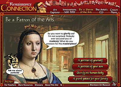
Figure 1. Screenshot from "Be a Patron of the Arts" activity in the Flash Version of The Renaissance Connection. http://www.renaissanceconnection.org
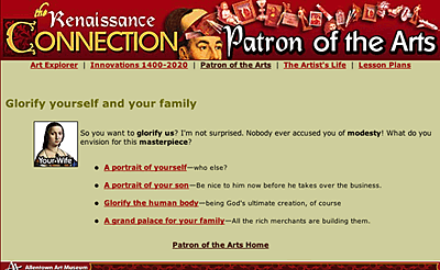
Figure 2. Screenshot from "Be a Patron of the Arts" activity in the HTML Version of The Renaissance Connection. http://www.renaissanceconnection.org
Participants and Data Collection
We conducted the study with two age cohorts: middle school students and college students. While middle school students are the primary audience, we know from experience that a much broader variety of users are likely to visit the Web site. Many of them will come with their own goals and interests. How would these users respond to the site? Through this dual study, we hoped to learn how usable and engaging The Renaissance Connection is to both the primary audience and a secondary audience.
Middle school focus group
Thirteen middle school (7th and 8th grade) students from public and private schools in St. Paul, Minnesota, tested the site:
- Group 1 (five girls, one boy) - Naturalistic exploration of the Flash-based Web site.
- Group 2 (three girls, four boys) - Naturalistic exploration of the HTML-based Web site.
Each session lasted approximately one and a half hours, with roughly 30 to 60 minutes spent directly interacting with the site and 30 to 45 minutes spent in discussion with the developer-evaluator (Schaller). Students were free to comment about the site as they interacted with it, but most of their feedback came during the discussion afterwards. Most students interacted with the site in pairs (reflecting common school practice), but owing to odd numbers at several sessions, a few students explored the site alone.
College study
Separately, fifteen undergraduate university students taking a usability class, ranging from 18-44 years of age, participated in the study. The college students were divided into four groups:
- Group 1 (n=4) - Naturalistic exploration of the Flash-based Web site
- Group 2 (n=4) - Naturalistic exploration of the HTML-based Web site
- Group 3 (n=3) - Users were given a series of tasks to complete on the Flash-based Web site
- Group 4 (n=4) - Users were given the same tasks to complete on the HTML-based Web site.
Each participant completed a demographic survey and post-evaluation survey. Users in the first two groups were asked to explore the site naturalistically with no instructions in order to assess overall engagement with the sites. The other two groups were given tasks to complete, and both time for completion and error rate were assessed for each user. All sessions were video recorded.
Instruments
Middle school focus group
Using a short set of discussion questions, we elicited feedback about students' experience, making written notes of their responses. No formal instruments used.
College study
A comprehensive usability evaluation method was use, employing four instruments:
- Consent form — A standard consent form was completed for each participant, giving us approval to conduct the evaluation and video record each session.
- Demographic survey — This five-item survey asks users their ethnicity, gender, and age, along with a question regarding experience with the product being tested and overall Web experience.
- Tasks (only groups 3 and 4)
- Flash tasks — 6 tasks were given to participants. Examples of these tasks include: "You want to find a Renaissance artwork and describe how it reveals at least one innovation of the Renaissance. What would you do?" and "You want to learn at what age a boy during the Renaissance would become an artist's apprentice. What would you do?"
- HTML tasks — 5 tasks were given to participants. These tasks were the same as the Flash tasks except for task 3 in Flash which involved designing an innovation in Flash (not possible in HTML).
- Post-Evaluation Survey — This nine-item survey asks each participant to provide satisfaction ratings (scale of 1-10) across traditional usability factors: efficiency, effectiveness, and satisfaction. In addition, the strengths and weaknesses of the interface were also collected. Examples of survey items include: 1. Task Completion: Were you able to complete your tasks? (Users rated this on a scale of 1 - 10, with ten being highest satisfaction) and 5. Time on Task: How long did it take you to complete the tasks ("Quickly," "Okay," "Too long")?
Procedures
Middle school focus group
Each tester evaluated the site in an informal environment at the Web developer's offices in St. Paul, Minnesota. After a brief introduction to the situation, students were directed to the site and allowed to explore freely and express when they were done (defined as when the site no longer held their interest). They were asked to share their opinions as they were formulated, and afterwards.
College study
Each participant evaluated the site at the Florida State University (FSU) usability center. They were first introduced to the study by the usability evaluator and then asked to sign the consent form and complete the demographic survey. Next, two groups were asked to explore the site and let the evaluator know when they were done. They were told that they had as much time as they would like. Two other groups were asked to complete a series of five or six tasks, depending on the group. Each task had an established critical path and a right or wrong answer. Both time and error rate were assessed for each task for each participant.
After the naturalistic exploration or the tasks were completed, each participant was debriefed by the evaluator using the post-evaluation survey.
Results
Middle school student study
Students' prior knowledge and interest in the subject matter varied. Several of them had studied the Renaissance for a month in fourth grade, but all espoused stereotypical views of the period: "Castles, kings, queens, jousting, like medieval times." A few knew that it had been an important time for art history. Their existing interest in art and art history ranged from high to low, but these differences did not appear to affect individual responses to the overall site.
Flash testing results
All six Flash testers appeared to be fully engaged with the site and even after thirty minutes did not want to be interrupted. After forty minutes, we stopped them in order to have time to discuss the site. Their comments reveal their attentiveness to the content and the overall appeal of the Flash site:
It's really fun and cool, the games are really fun. It's cool to be able to see what it's like to be an artist in the Renaissance.
It's informative and fun at the same time. Cool graphics and sound effects. It's not just your average boring information Web site on the Renaissance.
If you don't want to learn stuff, then there's the fun stuff, but you're still learning.
Tell me one thing you learned from the site:
The more money you had, the more respect you got. If you made a painting, like if you paid to have a painting made for a church, it would buy you into heaven.
The process of making a painting. You can buy paintings and earn respect. I learned some of the innovations of the time. The first ballet was in the 1400s.
The Renaissance was a lot about art — even though I really like art I never realized that. The Renaissance wasn't just kings and queens.
Although brief, these responses and the students' behavior during testing strongly suggest that these students were engaged with the site on several levels. They enjoyed the flashy superficial features such as googly eyes in period portraits, but the "real" content also engaged them in a substantive way, and they did indeed learn some of the things that the developers wished them to learn, including general concepts as well as specific facts and trivia. After the debriefing, one student noted:
When I was doing it, I didn't think about what I was learning, but when you asked me, I realized all these things I had learned.
HTML testing results
The second group of middle school students explored the HTML-based site. They also appeared intent as they explored the site, but there were noticeable differences in student behavior. Some spent many minutes in the expository sections of the site, closely reading long stretches of text. Others spent most of their time in the Patron role-play game, systematically trying the many branches of the interactive story. These latter students tended to skim or skip over the long expository sections. Holding power was surprisingly long for all students, ranging from 20 to 30 minutes, although several students later said they had grown tired of all the text and would have spent less time at the site in a normal situation.
In the subsequent discussions, these students made similar comments about the site as the Flash group had, but some also noted the volume of text:
It's a really interesting site. In the Art Explorer, I liked the descriptions of the artworks, how they connected the pictures with the people and the history and stuff. The Patron game was really fun, seeing how decisions affect how things turn out.
I loved how the information was tied into the story in the Patron game — the paintings that you end up with, in an art museum you'd just walk right by them, but since they were made by you, I mean you commissioned them, choosing the artist and the paint and stuff, they're more interesting and meaningful.
I liked some of it, but kids could get very bored with some parts, they'd skip over long text.
Tell me one thing you learned from the site:
Technology differences: the Internet and copying machines have been around longer than I thought. And how lots of things influence art, it wasn't just what an artist wanted to paint.
TV was invented in 1942. Kiwis weren't imported until recently. The 1500s were really modern, not medieval like I thought.
Differences between the Flash and HTML testers' comments are idiosyncratic; the latter tended to be more fact-oriented than affective, but testers from both groups mentioned important concepts of the site.
Following these discussions, the HTML testers were shown the Flash site and given some time to explore it. An immediate change was obvious as students smiled and laughed at the Flash intro animation and other humorous Flash elements. Their subsequent comments comparing the two versions of the site varied, but most greatly preferred the Flash version for its greater interactivity, humor, and personality.
I loved the intro animation. It's funny, really good. It gets you excited about the site. But it went by kind of fast, it was hard to take it all in. But the Patron game intro is great — it was more effective in Flash than in the other version.
I would have spent a lot more time on the Flash version [than I did on the HTML version].
You shouldn't let people use the HTML version unless they don't have Flash. It's so much better.
A few students thought that both versions had merit: "The non-Flash version felt more in-depth. You can focus on the information, read through it and learn it better." This came from a student who had intently read long passages of text. Other students, of course, reacted negatively to the "in-depth" appearance of the HTML site and skipped over text-heavy sections.
A key insight came from an eighth-grade girl:
You need both versions. The non-Flash is good if you are researching something. It feels more in-depth. The Flash version is good too. It's better for learning about something in general. It makes you feel good about the subject.
She pinpointed an important and deliberate function of the Flash visual and audio effects: forging an affective connection with the user so they felt fondly about the subject. The affective impact of the Flash version was clearly greater for all students, and their responses during that exploration and in the subsequent discussion were more energetic and enthusiastic.
College student study
Naturalistic exploration group results
In a separate effort, Chow employed formal usability evaluation instruments to test the site with fifteen college students. We used two measures of engagement with the two naturalistic exploration groups: dwell time (longer times were considered a sign of continued interest in the site) and self-reported overall satisfaction level. In both measures, the HTML naturalistic exploration group gave the site its highest ratings among the groups:
Flash naturalistic exploration:
- Dwell time ranged from 4.5 to 21 minutes, with an average of 13 minutes.
- Satisfaction ratings averaged 7.5 out of 10.
HTML naturalistic exploration:
- Dwell time ranged from 8 to 19 minutes, with an average of 14 minutes.
- Satisfaction ratings averaged 8.1 out of 10.
Qualitative comments reveal clear differences in the ways that testers responded to the two versions of the site. When asked to describe the strengths of the interface, everyone in the Flash group mentioned the presentation and Flash animation:
Original presentation to keep from [being] very boring. The visual graphics were appealing and appear designed for a younger age group. The site reminds me more of a video game than a Web site, where you would go to seek information.
The motion/Flash parts and the characters that help you with information.
Animation. It just looks fun, enjoyable; if I had kids, I would want them to interact with this to learn about the Renaissance.
HTML testers mentioned interesting information and the overall quality of the graphics as the strengths of the interface:
The information is interesting, the links work. It's not hard to read the interface. I can get what I want.
Graphics, contrast, satisfying use of color to highlight categories [sic], and would be able to do a report if so desired.
It is interesting and attractive. The content and information was very interesting — also the color and pictures were good for me. I have a humanities background and recognized many of the painters and paintings, so I spent a lot of time looking for ones I liked.
Task-based group results
Both of the naturalistic exploration groups rated their satisfaction higher than the task-based groups, who were told to find specific content on the site:
Flash task group:
- Average satisfaction: 6.7 out of 10.
HTML task group:
- Average satisfaction: 7.0 out of 10.
Flash testers also reported more errors and deviations in completing the assigned tasks than HTML testers, as these comments suggest:
It's slow. Flash gets in the way
The only problem was the timeline — too spread out.
There were certain sections that were unclear as to where I should go, so I had to search around to find them
These users with a defined information-seeking goal clearly found this particular implementation of Flash to be cumbersome, with too many impediments to allow efficient completion of their tasks. Some of these problems arose from the nature of the site, which as noted above was not designed as an information clearinghouse but a discovery experience. In addition, certain sections of the site (such as a directory of lesson plans) would be better suited as simple HTML pages, but were developed in Flash to preserve overall site consistency. And some parts of the site do present usability issues, due to complex interactivity and the limitations of Flash technology (especially Flash 5, chosen for compatibility with older school computers).
Discussion
The process of planning this comparative evaluation was an educational experience for the authors. Schaller and Allison-Bunnell learned much about specific usability factors and testing methodology, while challenging Chow and company at FSU to reconsider their paradigm of Web usability. FSU's Usability Lab assesses Web sites under the rubrics of efficiency, effectiveness, and satisfaction within the overall context of fundamental utility, assessing what users want and need, and whether they access the information they want as quickly and efficiently as possible.
This, however, is not the overall goal of The Renaissance Connection, which is to engage young, middle school age learners (approximately 10-14 years old) and entice them to explore the site and learn about aspects of the Renaissance along the way. Previous research indicates that different users groups prefer different types of on-line learning experiences. Adults and experts in a subject domain tend to prefer Web sites offering straightforward information, while children and novices respond more positively to highly facilitated sites offering interaction and choice within an environment that specifies the user's goals (Schaller et al. 2002).
Another key goal of the site was to connect Renaissance art and innovations with a student's everyday life, revealing that the Renaissance is not moldy old history, but rather surprisingly recognizable to modern eyes. To achieve this, we drew on other research into affective learning that outlines ways to engage the user's emotions and imagination in meaningful ways (Egan 1998, Schaller and Allison-Bunnell 2003).
With this research in mind, The Renaissance Connection was deliberately designed as a media-rich immersive experience with several guided goal-based activities along with several interactive reference resources. Quirky animations, sound effects, and visual effects were employed to emphasize the fresh, innovative spirit of the Renaissance. The Patron game in particular was developed to highlight (and poke fun at) familiar human desires and foibles. Through these varied strategies, the developers hoped that students would develop an emotionally-rich and contextualized understanding of the Renaissance, rather than use the site simply to seek out specific information according to the traditional task-analysis model of usability.
Thus, the site breaks several standard Flash usability tips (Macromedia, Inc. 2001), particularly:
- Avoid unnecessary intro animations. Such animations are rightly condemned when the user has a tangible goal to accomplish as efficiently as possible. But when the user is typically a novice learner in the subject domain and lacks the mental schemas to assimilate site content quickly and efficiently, an intro animation can provide a crucial cognitive orientation, much as an anticipatory set or advance organizer does in exhibits and classrooms. Intro animations for educational Web sites can quickly and clearly present the "big idea" of the site, cast this idea in dramatic terms to forge an emotional connection with the user, and whet the user's curiosity to delve into the site to learn more.
- Don't overuse animation and audio. The site uses animation and audio to communicate content, signal important changes in interface states, bridge between sections of content, pace content delivery, and create an emotional context. Some users may find these elements to be intrusive and obnoxious, but we have calibrated their usage based on middle school student feedback.
With these goals and strategies in mind, we revised standard usability methods, employing both naturalist evaluation and more broadly defined tasks for the task-based groups. We were able to conduct a comprehensive usability evaluation only with college students, and a more informal evaluation with the middle-school age cohort. College students, of course, more closely match the adult and expert learner profiles that prefer efficient ways to seek and digest information. Loaded down with multiple classes, with many working as well as attending school, the college student population is not an ideal match for the objectives of this site. Defining and achieving specific goals is of paramount importance for such users.
With these learner preferences in mind, it is not surprising that college students preferred the HTML versions of the site, which provides the most efficient and effective way to seek and retrieve information with maximum user control. As one college tester noted, he does not want "window dressing, just access to the information I'm looking for." Even if the Flash site had no usability problems, these users would probably still be frustrated with what they might reasonably consider "interference" with task-accomplishment. Another college user recognized this as a difference between audiences rather than labeling it as a failure of the site: "It seemed like this site would be more appropriate for junior high kids; for me it is all about the meat and the potatoes."
The college testers' high satisfaction ratings are also noteworthy in light of the simple, perhaps even crude by current standards, graphic design in the HTML version. These users apparently valued simple and direct presentation of content over aesthetic aspects of the site. For this group, at least, it may be that plain HTML pages are not as disadvantaged compared to Flash as Web developers often assume. We might also speculate that Flash and HTML are indeed equal in these user's eyes, which are focused on content rather presentation.
But efficiency is not everything. Museums must capture hearts as well as minds if they are to fulfill their educational missions, as audience research has shown the importance of affect in free-choice learning (Falk and Dierking 2001). Few would argue that a PBS documentary offers more efficient access to information than a book, but the broader educational value and affective impact of such television programs is rarely doubted. Similarly, middle school student responses to both versions of The Renaissance Connection make clear the value of Flash. While the HTML version fared surprisingly well with these media-saturated students, they all responded to the Flash version with markedly greater energy and enthusiasm. Most middle school students strongly preferred it, rating it higher (by several points on a ten-point scale) than the HTML version. Among the students who saw both versions, nearly all said unequivocally that they would choose the Flash version if they visited the site again. Their behavior and responses suggest that the Flash site will hold students' attention longer, increasing their contact time with the content and the chances that they will learn something from the site. Even one of the college Flash testers remarked, "It was so much fun that it was almost impossible not to learn something."
While the flashy elements certainly "stole" some of students' attention away from the content, arguably lessening their educational experience, those elements were also designed to convey key messages as well, by suggesting that the Renaissance was as lively, bold, and silly as our modern era. In this way, Flash was used in the service of the larger site goals. Of course, the short history of Flash Web sites shows that this is not always the case, and we do not make any claims about overall superiority of one format over the other. Indeed, both middle school and college student responses reveal that HTML remains a sound choice for a wide variety of uses and users, and it is easy to imagine many currently Flash-based sites having equal effectiveness in HTML. Flash has many drawbacks. It has greater development costs, requires a browser plug-in, usually requires longer downloads, and offers limited accessibility for disabled users. Developers must always justify the use of Flash. If Flash isn't necessary to achieve critical goals, then the relative simplicity, accessibility and familiarity of HTML may be the wisest choice. There is no easy formula for deciding between Flash and HTML, of course, but a thoughtful planning process clarifying both site and user goals will lead to an informed decision and greater chances of a successful Web site.
Limitations and Future Research
The small sample sizes of this study (13 middle school participants and 15 college level participants) preclude statistical analysis and restrict any general conclusions we can make from our results. We hope to continue this study with larger sample sizes (involving one or two entire middle school classes), and on the Web. With larger sample sizes and on-line statistics, we hope to further examine user preferences and behavior and gain a better understanding of the advantages and disadvantages of Flash vs. HTML sites.
References
Gagne, R., L. Briggs, W. Wager (1992). Principles of Instructional Design. Belmont, CA: Wadsworth/Thomson Learning.
Egan, K. (1998). The Educated Mind: How cognitive tools shape our understanding. Chicago: University of Chicago Press.
Jordan, P. (1998). An Introduction to Usability. Philadelphia, PA: Taylor & Francis.
Falk, J. H., & Dierking, L. D. (2000). Learning from museums. Walnut Creek, CA: AltaMira Press.
Kennedy, Tim (2000). Repent from Flash Sins, Streaming Media World, http://smw.internet.com/symm/voices/flashsins/index.html.
McAlester, D. and M. Capraro (2002). Skip Intro: Flash usability and interface design. Indianapolis, IN: New Riders.
MacGregor, Chris (2001a). Developing User-Friendly Macromedia Flash Content (Macromedia, Inc./MacGregor Media, http://www.macromedia.com/software/flash/productinfo/usability/whitepapers/usability_flazoom.pdf).
MacGregor, Chris (2001b). Are You Designing for Your Eyes Only? Flazoom.com, http://flazoom.com/news/legibility_09252001.shtml
Macromedia, Inc. (2001a. Macromedia's Top 10 Usability Tips for Flash Web Sites Macromedia.com, http://www.macromedia.com/software/flash/productinfo/usability/tips/
MacGregor, Chris, Crystal Waters, David Doull (2003). The Flash Usability Guide: Interacting with Flash MX, (APress).
Nielsen, J. (2000a). Designing Web Usability: The Practice of Simplicity. Indianapolis.
Nielsen, J. (2000b). "Flash: 99% Bad" Alertbox Column, http://www.useit.com/alertbox/20001029.html
Loranger, Hoa and J. Nielsen (2002). Usability of Flash Applications and Tools: Design Guidelines For Flash-Based Functionality On The Web Nielsen Norman Group, http://www.NNgroup.com/reports/flash
Schaller, D.T. and S. Allison-Bunnell (2003). Practicing what we teach: How learning theory can guide development of on-line educational activities. In D. Bearman and J. Trant (Eds.), Museums and the Web 2003: Selected Papers from an International Conference. Pittsburgh: Archives and Museum Informatics. 103-114. available: http://www.archimuse.com/mw2003/papers/schaller/schaller.html
Schaller, D.T., S. Allison-Bunnell, M. Borun, M. Chambers.(2002). How do you like to learn? Comparing User Preferences and Visit Length of Educational Web Sites. In D. Bearman and J. Trant (Eds.), Museums & the Web 2002: Selected Papers from an International Conference. Pittsburgh: Archives and Museum Informatics. 167-177. available http://www.archimuse.com/mw2002/papers/schaller/schaller.html
Schaller, D., S. Allison-Bunnell, and S. Nagel. (2001). Goal-Based Scenarios. http://www.eduweb.com/goalbasedscenarios.html
Spool, J.R., T. Scanlon (1998), et al. Web Site Usability: A Designer's Guide. Morgan Kaufmann.
An Unknown Flasher, Message Board Comment, March 16, 2002. (Flazoom.com, http://flazoom.com/cooler/986413931,58113,.shtml)