
Peter Samis, San Francisco Museum of Modern Art, USA
Abstract
What impact does having an array of interpretive content - both analog and digital - have on the visitor experience? What kinds of interpretive content do museum visitors prefer to use? Which kinds of help do visitors appreciate in order to have meaningful experiences with complex works of art? Findings are presented from the 2006 Randi Korn & Associates evaluation of interpretive media used in the Matthew Barney: DRAWING RESTRAINT exhibition, which included audio tours in three formats, an exhibition brochure, and an in-gallery 'Learning Lounge' with video, multimedia kiosk, books, and wall graphics.
The device-independent audio tour was the result of a first-of-its-kind collaboration between SFMOMA, Antenna Audio, and Guide by Cell in which the same audio content (developed by Antenna) was presented on Antenna's Gallery Xplorer, available at no additional cost with the Museum's permanent collection tour; as a free podcast or download from the Museum's Web site; and finally, for those who had arrived in the disorienting landscape of Barney's sculptures without prior preparation, via just-in-time phone calls to Guide by Cell's server.
The results of the Randi Korn study are detailed and augmented by statistics on usage patterns for the Barney Learning Lounge, which mixed analog and digital resources. The conclusion summarizes implications of this research for museum interpretive strategies moving forward.
Keywords: visitor studies, analog/digital, audio guides, cell phone tours, podcasting, learning lounges, on-site visitor support
The work of Matthew Barney encompasses a diverse array
of media and a wide range of symbols and references that defy easy interpretation.
(opening line of brochure)
SITUATION: CONDITION: PRODUCTION – Matthew Barney
Give me some time to let it all sink in.
(visitor comment)
1. Situation: The Matthew Barney Show
From June to September 2006, the San Francisco Museum of Modern Art (SFMOMA) presented the exhibition Matthew Barney: DRAWING RESTRAINT in its expansive fourth floor galleries. Expansive is the operative word: skylights were bared, walls torn down, and the space opened up for the first time since the Museum’s construction in 1994. Never had the Swiss grid of gallery cubes conceived by architect Mario Botta been so thoroughly gutted; coincidentally, never had the normal interpretive scaffolding typically offered by a museum been so utterly removed. The exhibition checklist contained relatively few items: apart the framed photographic film stills that lined the perimeter walls like a ribbon of conceptual celluloid, there were roughly a dozen large scale works in the 14,000 square foot landscape of gallery (Fig. 1a-c). Not one of these had an extended caption label. In fact, there was only one curatorial walltext for the entire floor: on the landing before the visitor entered the galleries.


Fig 1a-c: Installation views of Matthew Barney: DRAWING RESTRAINT exhibition at SFMOMA. From top to bottom: Torii; Holographic Entry Point; and Occidental Restraint (detail). All works © Matthew Barney. Photo: Ian Reeves
Barney aficionadoes find his work out-of-the-box inspiring; detractors find it hermetic, off-putting, even arrogant – and beyond the art world, most have still never heard of him. It was clear that a floor-wide installation of enormous objects from his latest venture, a film called Drawing Restraint 9 (DR9) – produced on a Japanese whaling ship at the request of a new museum in Kanazawa, Japan – would need some contextualization for the average art museum visitor. For in spite of the Antarctic theme of much of the imagery, the Museum did not intend to leave its visitors entirely out in the cold. A pervasive yet unobtrusive program of gallery interpretation would need to be developed as well.
2. Condition: The Interpretation Plan
It is not within the scope of this paper to deliver a sustained analysis or appraisal of Barney’s controversial work. But our responsibility at the Museum was to provide museum visitors to this signal summer show with enough of a framework so that this landscape – comprised principally of enormous sculptures molded in white plastic or solidified petroleum jelly – would feel coherent, meaningful, even poetic. The approach we designed comprised both mobile and fixed components.
Mobile
To provide on-demand information as visitors moved through the galleries, we co-developed an audio tour with Antenna Audio; it was delivered through three channels, each with its own dedicated device:
- An Antenna Gallery Xplorer MP3 gallery guide, available at the atrium information desk on entering the Museum. This option was not free, but could be had at no surcharge when renting the $3 permanent collection audio tour.
- A podcast downloadable in advance from the SFMOMA Web site (http://www.sfmoma.org/podcasts/)
- Cell phone access in the galleries themselves, thanks to a trial arrangement with the San Francisco-based company, GuideByCell
Fixed
Foreseeing the need for resources on the fourth floor gallery level, the Museum administration also reserved one small gallery to be transformed into a Barney Learning Lounge. In this space (Fig’s 2a-c), both digital and analog media offered visitors multiple ways to access information, including:
- An interactive multimedia feature published using Pachyderm 2.0, delivered both at kiosks and over the Web (http://www.sfmoma.org/barney/)
- A video loop of Barney talking about his work, derived from an interview we had conducted, followed by the trailer for the Drawing Restraint 9 film. These played on a large plasma screen dead ahead as you entered, visible from the landing. The interview videos were also included in the interactive feature.
- Barney FAQ wall graphics, combining large-scale texts and images, engaged both walls of the Lounge.
- A brochure co-written by Curatorial, Education, and Publications staff, explaining the artist’s cosmology in detail.
- Books on Barney, laid out on a shelf
- Comfortable stools for watching the plasma screen and consulting the resources lining the two walls


Fig 2a-c: Views of the Matthew Barney Learning Lounge, from top to bottom: kiosks and FAQ wall graphics on left wall; plasma screen showing artist interview clips and trailer for DR9 film mounted on back wall; books and continuation of FAQ wall graphics on right wall.
To evaluate the relative success of these components, as well as the introductory exhibition walltext, docent tours, and the DR9 film being screened daily in the ground floor theater, SFMOMA hired museum evaluation experts Randi Korn & Associates. At an inter-departmental meeting prior to the exhibition’s opening, goals were articulated for the exhibition, the interpretive media, and the evaluation itself. Among the goals listed:
1. Visitors will perceive the exhibition as visually stimulating, enjoyable, enticing, stimulating, provocative, entertaining, educational.
- Visitors will experience the exhibition as a beautiful environment.
- Visitors will recognize that there are multiple ways to approach artwork in the exhibition…
2. Interpretive media will:
- provide context for Mathew Barney’s work and personal relevance to visitors
- provide an invitation for visitors to explore the exhibition
- motivate visitors to return to the museum, become members, and tell friends about the exhibition
- communicate to visitors that SFMOMA cares about them…
3. The interpretive media evaluation will:
- determine whether visitors perceive interpretive media as helpful in providing context for artwork
- identify demographics/psychographics of visitors’ preferences for various types of media
- determine whether informed audiences (visitors familiar with Barney’s work) use interpretive media
- determine which interpretive media visitors use
- determine whether visitors perceive technology as cutting edge
It was understood that a primary focus of the evaluation was on visitor preferences for one or another kind of audio tour delivery device; that said, the opportunity to simultaneously evaluate visitor responses to both the exhibition and the full range of interpretive media resources was not to be missed. With that in mind, the evaluation was designed in two parts:
- a set of oral interviews of visitors who had used one or another form of audio tour
- a written survey administered by two attendants hired specifically for the purpose, and conducted during two-week periods in July (when the Museum hosts many American tourists); August (when there are more foreign tourists); and September (when the audience once again becomes predominantly local). (While the results were not compared on a month-by-month basis, the feeling was that this would give a more representative sampling of our visitorship than lumping all the surveys into a shorter period) (Randi Korn).
Audio Served Three Ways
The audio tour was kept to a modicum of ten stops, each reflecting a zone or major installation work in the exhibition. Antenna’s sound engineer Peter Dunne designed a musical treatment to underscore the narrated texts, and excerpts from SFMOMA’s Barney interview were liberally sprinkled throughout. Exhibition curator Benjamin Weil added his perspective, as did Nancy Spector, who had organized the Guggenheim’s Cremaster retrospective three years before. During testing, the music track proved distracting on the cell phone tour, as the tinny mono phone speaker held up to the ear was already competing with ambient gallery noise: conversations, crowds, guards, and videos. This was not a problem with either the podcast or Gallery Xplorer, which were typically used with earbuds and headphones, respectively. Therefore, the music was suppressed on the cell phone tour; we also added the necessary administrative prompt: “Enter another item number followed by the # sign, or you may hang up and call back later.” Otherwise, the tours contained identical content.
The cell phone tour benefited from an additional promotional push: cognizant that most visitors know cell phone use in museums is forbidden, we printed thousands of colorful info cards which were held in racks by the elevators, in the Learning Lounge, and at the gallery entrance (Fig’s. 3a-b). These brightly advertised a “FREE CELL PHONE AUDIO TOUR” and clarified that there was “No cost except for your minutes.” The verso of the cards gave a full stop list with accompanying thumbnail images of the artworks each stop discussed.
Finally, in rather small print, the revised rules of cell phone engagement for the purposes of this exhibition read as follows:
“Please refrain from cell-phone conversations, photography, and speakerphone use while in the galleries. Kindly set your phone to silent-ring mode.”

Fig 3a-b: Barney cell phone tour promotional card, recto and verso.
The podcast version of the tour was also offered free of charge, but visitors had to be enough of a Barney aficionado, or at least have thought sufficiently about their upcoming visit to SFMOMA, to have gone to http://www.sfmoma.org and downloaded it in advance. The podcast was accompanied by a downloadable PDF gallery map which showed the locations of the various stops (Fig. 4).

Fig 4: Matthew Barney exhibition podcast downloadable PDF tour map
As of this writing, Apple still has not implemented a synching strategy for visitors to download iPod tours at remote locations without threatening their own data; we viewed the cell phone tour as the personal device for those who had not planned in advance and yet desired interpretive enrichment just in time in the galleries.
As for the standard issue Antenna Galley Xplorer, we offered it in tandem with our permanent collection audio tour at no added cost to keep the parallelism in place with the other two platforms. For logistical reasons, it was only offered (and hence promoted) in the atrium; the podcasts, for their part, were only promoted on the Web, and the cell phone tour was only promoted on the 4th floor.
3. Production: The Evaluation
What did we discover through the evaluation study? We knew that Barney’s audience skews young, and 50% of respondents were in the 18–35 age range. (Interestingly, there was a higher survey refusal rate among older visitors. Were they insecure and afraid of being put on the spot about the show??)
The majority (58%) were from California. Overall, the responding visitors rated their knowledge of modern art at 4.1: a hair above the midpoint on a 1-7 scale. But while they knew something about modern art, most knew virtually nothing about Barney: the median self-assessment was 1.0 on that same 1–7 scale! That said, the 22% familiar with Barney’s art – a minority who self-rated between 4–7 – knew enough to raise the average (mean) level of familiarity to 2.3. In fact, familiar or un-, 45% of respondents came to the Museum specifically to see this exhibition. A demographic breakdown of responding visitors is presented in Fig. 5.

Fig 5: Demographic overview of visitors responding to survey
Having established visitors’ level of familiarity with modern art in general and Matthew Barney in particular, the survey went on to assess visitor use of interpretive resources. Traditional interpretive media such as the introductory wall text and brochure are still far and away the most consulted resources; in other words, our visitors know the protocols of how to visit a museum! But there is a discrepancy between how frequently these resources were consulted and how helpful they were in helping visitors appreciate Barney’s art. The gap between quantity of use and value delivered is wide. (See Fig’s 6 and 7 below.)

Fig 6: Use of interpretive offerings by visitors (%)

Fig 7: Visitors’ ratings of value of interpretive offerings (on a 1–7 scale)
So while everyone knows you start an exhibition by reading the introductory wall text, recent research has shown that the value of these grand overviews is minimal. They are a rhetorical mode that addresses high concepts which visitors don’t yet have visual references to anchor. In the case of the Barney show, 78% of respondents had read the text, and yet its value was rated a meager 4.7 on a scale of 1–7, last on the list of interpretive resources. (Note, for example, the Detroit Institute of Art’s recommendations to forego introductory walltexts in favor of ‘advance organizers,’ panels that briefly explain the importance of the show and include a map of the exhibition’s thematic zones. The theory is that few if any will retain the theoretical points made before they are in the presence of the actual artworks. Once the visitors are in the exhibition proper, section panels introduce the themes relevant to the specific works around them. [DIA 2002]) Similarly, the brochure, which was full of information, was used by 55% of respondents; yet one can wonder how many actually had the opportunity to consult it in the gallery during their visit.
In terms of interpretive payoff, the most highly rated resources were, interestingly enough, the cell phone tour and the podcast, which both earned 6.2 out of 7 possible points. I, for one, find this fascinating. For these are the two technologies that map most closely to the younger demographic – the very same demographic that typically steers clear of headset audio tours! The fact that the content on these tours was identical to the headset tours would seem to indicate that Device Is Everything – especially when it comes to younger viewers.
This extrapolation is borne out by a question in the SFMOMA survey asking visitors to select their top two reasons for selecting their device (Fig 8).

Fig 8: Reasons for selecting an audio tour by device
Across the board, familiarity and comfort with the device and being able to access information as needed are common themes. But different age groups are “familiar and comfortable” with different devices! In fact, the determining factors for younger museum-goers seem to be:
- I prefer to use my own device rather than renting
- It was cheaper or free
An age:device correlation, while not deemed statistically significant, was clearly indicated in the Korn study, where 61% of the under 35 age group chose to use their iPod or cell phone.
This data correlates squarely with Antenna’s Global Visitor Survey, compiled and released in late 2006 (Antenna). It appears that while veteran museum-goers over forty may be comfortable taking headset audio tours and paying a supplement for them, their children and grandchildren may not. In the Antenna study, close to half the visitors surveyed aged 18–34 said a lower price point – especially when combined with special interest in the subject matter – might prompt them to take an audio guide. The same study found that two-thirds of visitors in this age group owned MP3 players, and 79% of them would consider downloading an audio guide program to their own device. Do we have a critical mass here?
Maybe. It now appears clear that many in the younger demographic don’t want to pay to take what is perceived as “their parents’ audio tour” – at least on their parents’ audio device. Witness the 83% of SFMOMA podcast users who were aware of the audio guide headset option but chose not to use it, and the 52% of cell phone tour users who felt the same way (Fig. 9). That said, it is not yet clear whether these same visitors will show up for tours on their own devices in large numbers. First indications are promising, but as yet inconclusive.

Fig 9: Awareness of audio alternatives among those who chose a device
For while the statistics from the Korn survey imply that as many as 47% of Barney exhibition visitors may have availed themselves of an audio option, an internal audit of counts of audio guide sales, unique phone numbers calling the Guide by Cell server, and podcast downloads implies a far lower number. It appears that traditional media – read: walltexts, brochures, and films or videos – consistently trump all our new media mishigas, at least in terms of use habits. That does not mean the old media work better – Figure 10 gives the lie to that; only that museum-visitors are by-and-large an educated, highly literate crowd who feel comfortable with text and have learned to use it over long years of gallery-going practice. Our kiosks, touchscreens, PDAs, and podcasts still appeal to a distinct minority of our total visitors.
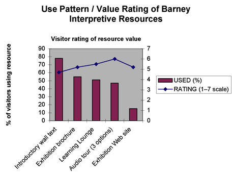
Fig 10: Comparison of usage and perceived value of interpretive resources
Data supplied by GuideByCell enabled us to further differentiate the cell phone experience from that of podcast and audio tour users. Cell phone users who had not planned to take a tour prior to arriving on the gallery level seemed to adopt an à la carte, or “cafeteria” approach to audio use. The tour was free, so they reached for their phones for information on demand. There was no compunction to take the whole tour. The Korn survey respondents self-reported listening to an average of 6 stops out of 10 on their cell phones, and the Guide by Cell server logs put the average at just under five. This contrasts with the typical headset audio tour behavior in a special exhibition, where the purchaser is conscious of buying a complete immersive experience. It remains to be seen where free iPod tours fall in this spectrum, although since the visitors have gone to the trouble of downloading them in advance and have the advantage of immersive earbuds that provide far richer audio quality than the phone users get, it is probable they see it as a custom experience they want to enjoy fully.
Mixin’ It Up in the Learning Lounge
After the introductory wall text and the exhibition brochure, the Barney Learning Lounge as an aggregate was the most consulted resource; more people used it than the audio tours, docent tours, or Web site. A mix of analog and digital, the space comprised widescreen video, large scale wall graphics, books, multimedia – and lots of seating. (As with so many contemporary art spaces, seating was virtually non-existent elsewhere.) Visitors loved seeing the artist talk: his thoughtful formulations of ideas infused the recondite landscape of large scale objects outside with a kind of out-of-the-box reason eliciting, “I never thought of that before” responses. SFMOMA director Neal Benezra is fond of recalling a moment when he witnessed three elderly women with walkers all nodding with appreciation as Matthew described his processes and concerns. They were getting it. As the MasterCardcommercial says: Priceless.
At first, the video played all the time. It so dominated the room that no one could do anything but watch. Adjustments were made to the timing: we inserted a 10-minute interval between screenings with an onscreen countdown – an image that changed once a minute. This freed the room up for other activities: reading the FAQs graphically displayed across the walls, immersing oneself in a kiosk or a book, or just talking with a friend. After this fine tuning, the popularity of resources with visitors ran in the following order:
- FAQ wall graphics
- Artist Video Interview on plasma screen
- Computer kiosks with interactive feature
- Books on the artist
But visitors did not just use a single resource. They browsed, they grazed… and sometimes they dived in. Knowing from the countdown when the video would begin gave them an opportunity to either go back into the gallery or examine the other interpretive resources. Sometimes by the time the video came on, they were so immersed in a kiosk or a book that they ignored the program. But let’s not delude ourselves: widescreen video of the artist on a plasma screen trumps all.
The Randi Korn study reveals some interesting unseen patterns behind these observable behaviors, most notably:
- the large number of visitors who used multiple interpretive offerings
- the tendency of people already familiar with Matthew Barney to use more interpretive resources than those who knew nothing about him
- the increase in exhibition ratings by respondents unfamiliar with Barney’s art who used multiple interpretive offerings

Fig 11: Rating of Matthew Barney: DRAWING RESTRAINT exhibition by a) # of interpretive offerings used and b) prior familiarity with Barney’s art
Figure 11 shows the discrepancy between those arriving in the galleries already familiar with Barney and his work and those who have had no prior exposure; furthermore, it tracks members of these two groups as they use more and more interpretive offerings. Let’s call them initiates and non-initiates, with full cognizance of the ‘art world insider’ implications of those terms. Non-initiates who did not avail themselves of any resources left the show feeling ripped off. They rated it 2.6 out of 7, and their comments were on the order of, “Don’t go,” “”Don’t bother,” “Waste of brain cells,” and “It’s good for the loony people who like things that look like garbage on a polished wood floor.” But as soon as they used even one or two resources, their rating of the exhibition as a whole rose significantly, to an attitudinally neutral 4. They saw that something intelligent was going on that they could respect, even if they didn’t fully get it or connect. Their comments were more on the order of, “Due to lack of comprehension/ meaning/purpose of the work I was a little lost” or “I haven’t listened to the audio tour yet so I don’t really feel I get it all but I know that if I put effort into it, it would become more meaningful.” There is the sense of a cosmos in these remarks, of something to understand.
As these uninitiated visitors used three or four resources, they got initiated. A cognitive psychologist would say they got scaffolding. That doesn’t mean they came away liking everything they saw, but their exhibition rating rose commensurately, to 4.6. By the time they used five-plus resources, they were immersed in Barney’s mythic world, and rated the exhibition at 5.4, a level of stimulated satisfaction. They made comments like: “A great experience to learn more about the artist” and “Do the free cell phone tour – it gives good context and you get to hear from the artist.” The net gain with interpretive offerings was from 2.6 to 5.4 – more than doubling of the rating, and more importantly, an index of real engagement. (Of course with Barney fans, the gain is smaller – from 5.6 to 6.1 – but the numbers who use multiple offerings are significant.)
In the final analysis, the presence of multiple interpretive resources, including free audio options, was noticed by some visitors and appreciated:
It is very accessible. [SFMOMA is] willing to get the information to everyone however they want it. If [visitors] don’t want to pay, then there are other ways [to get the information]. It seemed very open-minded and cool.
One person said that once. When more of our visitors say that all the time, we’ll know we’re doing the right thing.
Conclusions
What are the takeaways from this experience/experiment and research?
- In terms of mobile audio, different audiences prefer different devices. No single option clearly trumps all. Younger audiences seem to favor using their personal devices, be they iPods or cell phones; older audiences are more likely to rent standard headset audio guides, but they may also use their cell phones.
- Cell phone tour users seem to take a more à la carte approach to listening, while people who pay for standard headset audio tours are more likely to listen to the majority or all of the stops.
- In terms of sheer numbers, traditional interpretive media such as wall texts and object labels are the foundation on which visitor experience is built. Digital or electronic media acts as a supplement, used by a minority of the visitors.
- The most effective interpretation strategy is born from a mix of the analog and the digital, providing visitors with a menu of diverse yet complementary offerings.
- Visitors love videos of the artist, but a video that plays all the time overpowers other quieter forms of interpretive resources nearby.
- Those conversant with an artist’s work may be more enthusiastic in their use of interpretive resources than those who have never heard of the artist before.
- For those unfamiliar with a contemporary artist’s work, presence of interpretive resources may make the difference between alienation and engagement.
- Use of a greater number of interpretive resources correlates directly with enhanced meaning-making, greater appreciation of the artist, the exhibition, and the museum experience.
References
DIA Reinstallation Steering Team, (2002). Re-Vitalize, Re-Interpret, and Re-Install: The Detroit Institute of Arts Reinstallation Project, July ’02-September ‘06. Detroit: Detroit Institute of Arts.
Discovery Communications, Inc. Networks Research & Planning Group (2006). Antenna Global Visitor Survey. London and Sausalito: Antenna Audio.
Randi Korn & Associates (2006). Matthew Barney: DRAWING RESTRAINT Interactive Educational Technologies & Interpretation Initiative Evaluation. San Francisco: SFMOMA
Cite as:
Samis, P., Gaining Traction in the Vaseline: Visitor Response to a Multi-Track Interpretation Design for Matthew Barney: DRAWING RESTRAINT , in J. Trant and D. Bearman (eds.). Museums and the Web 2007: Proceedings, Toronto: Archives & Museum Informatics, published March 1, 2007 Consulted http://www.archimuse.com/mw2007/papers/samis/samis.html
Editorial Note